| Bay Park Press / False Bay Editions ~ California (Sibyl Rubottom & Jim Machacek) |
|
| Bay Park Press: "Bay Park Press was founded in San Diego by proprietors Sibyl Rubottom and Jim Machacek in 2000 to foster the production of artists' books and prints, and to promote interest in the letterpress process." | |
Alphabet books by Rubottom and Machacek About the Artists & Bay Park Press |
|
Portraits for Nancy Morgenstern 12 x 5.5"; 16 pages plus free end pages of handmade paper. Text set in 10 pt. Times Roman. Printed on Chartham English vellum. Cover papers Rives BFK grey, Classic Crest tarragon and handmade washi. Illustration letterpress printed from photo-polymer plates. In envelope sleeve. From Otis Rubottom: "This poem is in memory of Nancy Morgenstern, who was among the thousands who died in the World Trade Center attacks on Sept. 11, 2001. She was my friend. We rode bikes together and raced them in the predawn hours in Central Park. She was my travel agent, and knew when and where I took vacations & how to find me a good ticket. I liked that she took care of me that way. She is survived by her parents and siblings, and by many friends who carry her broad smile through the world... We remember her." |
|
The New Rule 6.75 x 9.5”. Letterpress from Bodoni and Times Roman on Fabriano Rosaspina Bianco with Fox River Confetti wrapper. Images created using polymer plates, monotypes, linocut, and screen printing. This mysterious, though-provoking, eminently hopeful poem about reinventing ourselves out of the broken bits of our lives is itself broken into enigmatic sense units. "Last night the moon came dropping its clothes in the street. I took it as a sign to start singing . . ." Dynamic typography expresses the passion behind the words as the printer's change font size for emphasis and visual impact. Well-integrated color images–whirling cosmos, surging ocean, tumbling letters, the glassblower plying his craft–complete, encircle, and amplify the themes of the text. The layered approach to this book is like the approach to mystery. A flecked, navy wrapper is folded in three and houses the primary sheet which is, in turn, folded into three, unequal sections. The title page of this inner unit is blind-stamped with a floral pattern and serves as gateway to the text. The main sheet functions as a broadside when opened, and a brief side text about sacred verse is hidden in a fold of the wrapper, easy to miss. The book opens as the text opens, small revelations toward an ultimate perception. This premier publication from Bay Park Press is beautifully and thoughtfully composed. |
|
| Sibyl Rubottom and Jim Machacek have created a series of alphabet books. These books are lovely to look at for their printing and color but are interesting to read for the evident research behind the content. | |
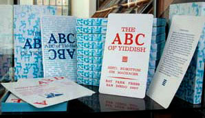
The ABC of Yiddish 4 x 7"; 26 cards. Housed in a slide box that opens to reveal the twenty-six 4 x 7" cards. Cards and box wrapper. Original drawings by Anthony Lukens. Facsimile of the original 2006 letterpress edition printed at Bay Park Press. Text is Bodoni and various sizes of Clarendon. Signed and numbered by artists. Each letter-card contains an English transliteration of a Yiddish word (sometimes words, S is particularly crowded) with derivation, pronunciation key, definition, and picture. This book was designed especially for the Gotthelf Art Gallery at the San Diego Center for Jewish Culture as part of the show entitled" Book Art: Celebrating the Books of Bay Park Press", Dec 2006. From the Introduction: "Yiddish is a rich, descriptive language, probably derived from a form of German heard by Jewish settlers along the Rhineland over a thousand years ago. Yiddish in not Hebrew but does use the Hebrew alphabet. About 15 to 20 percent of Yiddish vocabulary is Hebrew, 70 percent is German, and the rest Polish, Russian, Romanian, and English. It borrowed words from whatever country Jewish people lived in. This linguistic mélange spread and flourished in Eastern Europe, becoming the native tongue of the Ashkenazim." |
|
O is for Opera 9.4 x 6.75"; 90 pages. Accordion fold with pop outs and multiple other movables. Letterpress printed on Velata paper using Bernhard Modern type and images by photopolymer plates. Calligraphy design by Judythe Siecke. Set page drawings by Stephen Hendrickson. In wine-colored cloth-covered 7.25 x 10 x 2.75" box. The interior of the box is lined with paper in a Fortuny (Mariano Fortuny, 1871-1949, textile designer) design. The same fabric design becomes the accordion spine of the book so that it spreads like a stage curtain. Pick up your program (provided) and opera glasses (non-functional paper version provided) and begin an alphabetic romp through opera, from Aida to Die Zauberflote. Presentation surprises throughout: Aida comes with a 3-dimensional pyramid and the march of the elephants (plus a giraffe, lion and bear), Die Zauberflote [The Magic Flute] with an inventive volvelle. I is for Intermission at the Café Intermezzo where “the audience was abuzz about the soprano’s voice” and a collaged plate of pastries awaits. S is for Sets/Set Design. Open the doors and find yourself in a modified tunnel book back stage, peering through flats at the audience. The innovation and attention to detail never stop. Even the confetti at the post-show champagne party (which faces the colophon) was printed and tipped on. Bay Park Press: "O is for Opera was conceived in March, 2003 and printing began in April. We printed through several life crises (ours, our families, our interns), numerous teaching assignments, other letterpress projects, press breakdowns and new puppies, births and deaths. And so it probably goes with all long-term projects. But at times we wondered if we would ever make our end. But we kept on printing, and printing, some pages having at least 15 color runs through our trusty Vandercook I.... We estimate we cranked the press 19,853 times in this edition of 45. It is Spring 2006 and our opera odyssey is finally finished. We hope yours is just starting." O is for Opera is the sixth letterpress artist book produced by Sybil Rubottom and Jim Machacek. A masterwork of invention. |
|
| Spice Market: An Alphabetical Melange of Spices | |
By Sibyl Rubottom & Jim Machacek 4.5 x 5" accordion fold book in drawstring bag with tag. The BFK tan pages, some of which have an intoxicating 14 runs through the press, were hand tinted with color, infused with curry, cinnamon, and paprika. Fonts include Bernhard Modern & Tango and Albertus. Another beautiful book from Sibyl & Jim at the Bay Park Press! This time it not only looks good but smells fragrant and mouthwatering! Books on Books: “The double-sided accordion incorporates flaps that allude to gathering and selling. The technique of collage and the variation of the botanical images are perfect for the theme of mélange. Likewise, the colors shifting across the panels. The effect of the tinting is just as striking — perhaps more so — on the reverse panel.” |
|
| False Bay Editions (Sybil Rubottom & Jim Machacek) Out of Print Titles: | |
The ABC of Yiddish 4 x 7"; 26 cards. Housed in a slide box that opens to reveal the twenty-six 4 x 7" cards. Printed on Arches cream rag paper using 14 pt. Bodoni for the text and various sizes of Clarendon. Cards and box wrapper letterpress printed on a Universal I Vandercook press. Original drawings by Anthony Lukens. Signed and numbered by artists. Each letter-card contains an English transliteration of a Yiddish word (sometimes words, S is particularly crowded) with derivation, pronunciation key, definition, and picture. This book was designed especially for the Gotthelf Art Gallery at the San Diego Center for Jewish Culture as part of the show entitled Book Art: Celebrating the Books of Bay Park Press, Dec 2006. From the Introduction: "Yiddish is a rich, descriptive language, probably derived from a form of German heard by Jewish settlers along the Rhineland over a thousand years ago. Yiddish in not Hebrew but does use the Hebrew alphabet. About 15 to 20 percent of Yiddish vocabulary is Hebrew, 70 percent is German, and the rest Polish, Russian, Romanian, and English. It borrowed words from whatever country Jewish people lived in. This linguistic mélange spread and flourished in Eastern Europe, becoming the native tongue of the Ashkenazim." |
|
The Alphabet of Time 6.5 x 6.5" with 54 pages bound on a deckled fore-edge. Text printed in various fonts of Clarendon, Bernhard Modern, and Bodoni. Visuals created with photo-polymer plates, wood type, marbling, silkscreen, acetate overlays, collage, and hand painting. A visual feat of fifty colors printed on Rives BFK tan paper. Two color book cloth cover. More cosmic wizardry from Rubottom & Machacek after "The Cosmic Sidereal Galactic Abecedarium of the Universe". |
|
| The Cosmic Sidereal Galactic Abecedarium of the Universe (& Other Tangential Star Ephemera) | |
By Sibyl Rubottom, Jim Machacek 8 x 8" 20 page. As the title promises, this ABC extravaganza covers a lot of (mostly) extraterrestrial territory. Each letter of the alphabet boasts five representative words: "N is for Newton Neptune Nova NASA and Nebula." At least one word from each list is expounded upon either textually or pictorially. Pages come alive with windows, fold-out features, tipped-in plates, simple pop-ups and books within the book, including a small accordion and a rotating flexagon. Full of brief quotations from such sublunary luminaries as Shakespeare, Whitman, Byron, Wilde, et al. Longer textual excerpts from Eudora Welty and Floyd Skloot convey contemplations of the night sky. A sense of playful exploration abounds. Each name or term is explained briefly in a glossary that is three vertical pages mounted onto a printed card that slips out of a planetary pocket like a Tarot card. Letterpress text from Venus and Clarendon types with visuals created using photopolymer plates, wood type, monoprinting, digital imaging, and a zinc plate for the cover. Papers are Somerset Book, Fabriano Rosaspina Bianco and Rives BFK. The wraparound cardstock cover is fully printed and tabs closed at the front. It prominently features the Taurean Bull emerging from among the constellations. Star-speckled translucent end sheets complete the effect. A colorful cornucopia of the cosmos! |
|
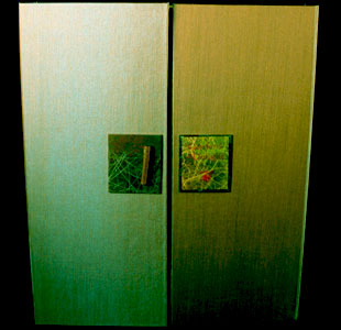
The Gardens of Delight 9.5 x 13.5 x 1.5"; 13 unnumbered leaves. Poetry for each garden was set in Venus medium and title pages were set in Edwardian Script and Palatino. Original garden flora drawings and photo images were created with photopolymer plates. All pages are 250 lb. Fabriano Rosapina Bianco and printed using letterpress, monoprint, or intaglio techniques in combination. Laid in a green silk-covered box with gatefold lid. Colophon: "Welcome to our Gardens of Delight. The noted English writer Vita Sackville-West said that gardeners are always optimistic, always enterprising, and never satisfied. They always look forward to doing something better than they have ever done before. "It was in this spirit that we began our garden book, the eighth collaboration from False Bay Editions at Bay Park Press. Perhaps the creative seed for this book sprouted from Sibyl's longtime interest in all things botanical. Or maybe its roots are from Jim's ancestors who dug in the midwest earth for a living. But as gardeners do, we have nurtured this book into a riotous colorscape for your senses. And we hope it is better than we have ever done before."
(Out of Print) |
|
Page last update: 04.25.2025
Home | About Us | Contact Us | New Arrivals | Fine Press & Artists' Books | Broadsides |Resource Books | Order/Inquiry
Copyright © 2023 Vamp & Tramp, Booksellers, LLC. All rights reserved.


