|
Women's Studio Workshop ~ New York |
Share this page: |
Women's Studio Workshop: " WSW’s mission is to operate and maintain an artists’ workspace that encourages the voice and vision of individual women artists, provides professional opportunities for artists at various stages of their careers, and promotes programs designed to stimulate public involvement, awareness and support for the visual arts. “Artist Books Unshelved: Celebrate with us” episode features the history and titles of WSW. |
|
War, peace, politics bookworks |
|
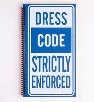
Dress Code Strictly Enforced 26 x 17 cm; 40 pages. Silkscreen and digital printing. French Speckletone, French Construction, Colorplan papers. Century Schoolbook and Century Gothic types. Spiral bound paper covers. WSW: "''Dress Code Strictly Enforced' draws on the artist’s experience as a Spanish interpreter in the U.S. courts. Wilson compares attorneys, defendants, judges, and people in other key roles to theatrical players, wearing predetermined costumes and participating in staged dialogue. “The heads-bodies-legs mix and match structure of the book allows readers to create new combinations. Doing so, they redefine the fifteen characters and create absurd, contradictory messages. The postface quotes the song ‘There but for Fortune,’ reminding readers that the role played by any given person is governed by chance as they move through interlocking systems of power." “Official Notice”, Kathryn Scudier, April 25, 2018 (WSW): “When on a job, Tona’s in the company of social workers, prosecutors, judges, and countless others who pass through the courthouse door. She walks us through this portal as well using a blue, spiral-bound artist’s book with screenprinted images and text. On the inside cover we’re met with a metal detector in a room of wooden paneling, drawn from her time in town courts. Page one greets the reader with an officer warning them to turn off their phones “Fifteen hand-drawn characters—ranging from officials to inmates—are printed and bound in an edition of 75. On the spread’s right side, they are divided into a head, torso, and legs in the style of mix-and-match books. Opposite an image is a sentence the person would either say or hear in court. These sentences become more absurd when creating new combinations of people. … These portraits and collected soundbites are likened by the artist to a play. When anyone walks into a courtroom, their identity is determined among a hierarchy of clothing and dialogue. In the back of the book, she presents testimony of how wearing the right shoes or necktie may sway a jury’s decision, or the side effects of wearing a gun belt. Even in this rigid system of power, so much is left to nuance and chance.” |
|
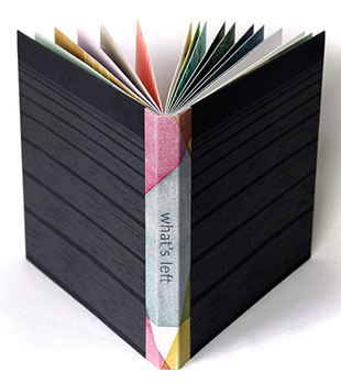
What's Left 20 cm: 13 pages, 13 unnumbered pages. Lato font text printed using photopolymer plates. Hard carved woodblock images. Letterpress printed on Mohawk Superfine paper. Numbered and signed by the artist. WSW, Rosie Odhiambo, January 31,2019: "'What’s Left' is the result of a collaboration between the artist and a group of high school students who immigrated to the United States as children. The artist interviewed each student and asked 'What is the most memorable thing you left behind when coming to the United States?' “ What’s Left consists of thirteen uniform woodcut prints executed in two colors. Each of these pages also locates the country and city in which the object was left behind and a brief statement from the student’s interview. The economy of text allows the viewer to develop their own entry points into the images while the specificity of location enhances the singular experience of each student and their narrated object. The book’s endsheets are also woodcut prints illustrating the classroom in which the interviews took place therefore grounding the stories shared in a physical space. For further context into the process, the book also includes brief essay giving further insight into Tracey’s teaching practice and her goal to build community and share stories in a classroom setting. “Furthermore, to create a unified reading of the text and images, Tracey established a narrative arc by ordering the prints to follow a sequence of leaving their home country to arriving in the United States. For example, some of the earlier illustrations in the book allude to leaving in a rush, and not being good at goodbyes while later in the book, the images are accompanied by statements such as Starting Over, Starting New and Isn’t the same here.” |
|
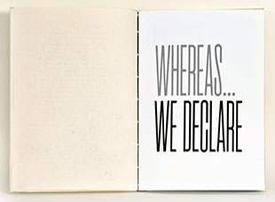
Whereas, We Declare 13" x 9"; 64 pages. Silkscreen and digital printing on Somerset book paper. WSW: "Whereas, We Declare compiles the text from the Universal Declaration of Human Rights (UDHR), proposed to the United Nations by Eleanor Roosevelt in 1948, with drawn images and statistical information about immigration. These texts celebrate accepting immigrants to the USA as historically essential to defining the nation, both by enriching the cultural horizons and contributing significantly to science, industry, and the humanities. Themes of imposed boundaries and borders run throughout the book’s imagery; the inside covers are the UDHR preamble annotated by Roosevelt." Artist Statement: "In these contentious times, as we’re devolving into an era of historical amnesia, when the memory of the horrors of the past ultra-nationalistic regimes have been forgotten, and new tendencies to control societies are clouded by misinformation and fear- mongering, it is important to remember and celebrate the Declaration of Human Rights, when the leaders of the world came together to establish moral principles of basic human rights and protection from persecution." |
|
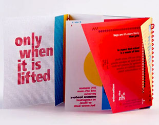
The Veil is Seen Only When It is Lifted 32, a-w, 3 pages; 14 x 15 cm. Silkscreen in four colors. Frutiger LT Std 95 Ultra Black typeface. Coptic stitch and spiral binding. Signed by the artist. Colophon: “This book is made of two parts: the first is based on statistical data, generally on global samples. Pages are from 1 to 32. The second is based on surveys of reported data (perceptions, sensations, beliefs. Pages are from a to w [that is, a to v] You can read the two sections separately, or you can use the index to find links between the two. Choose your subject, match the numbers and letters, and then overlap the pages. "All data came from research done between October 2016 and January 2018, through different databases, reports and surveys." WSW: "'Frequently, the debate regarding gender equality becomes a clash of opinions, impeding any real inquiry. In ‘The Veil is Seen Only When it is Lifted’, the artist provides accumulated data as an instrument for breaching this impasse. Origoni visually restructures this conversation, arranging statistics with simple, playful design and breaking up the codex’s linear narration. The book is composed with two studies; their bindings fall on opposite sides of the book. A Coptic-bound section presents quantitative data and the spiral-bound section reports experience-based data. Viewers are invited to read these parts separately or simultaneously, pages can be overlapped in patterns that unveil new information. ” These Key Truths, May 10, 2018, Kathryn Scudier (WSW): “’The Veil is Seen Only When It is Lifted’ … explores the relationship between design and social issues. … A few years ago, Carlotta felt she had to arm herself with statistics during an interactive, theatrical show by Femmes Nomades … Once she began searching for information on inequality between cisgender women and men—starting with the lofty 400-page ‘World Economic Forum Gender Gap Report’— the roles it played in her life became much more apparent. The book’s materiality echoes themes of unveiling, as pages are meant to overlap one another in ways that either amalgamate or obscure information. “Bound on either side of the book, the text is divided into two parts. One section of 32 Coptic-bound pages compile quantitative statistics. The second is spiral-bound, semi-transparent pages reporting the prevalence of qualitative perceptions, what the artist refers to as ‘reported data.’ For example, the first infographics of either section represent numbers just over one-half. The quantitative page states that the average progress of closing the gender gap sits at 68%. The reported data reveals that, in one study, 6 of 10 women agreed that they enjoy the same equality and freedom to reach their aspirations as men. Page numbers on the edges of both pages indicate that they match together. “Carlotta’s not looking to flood readers with sterile facts, but asks that they consider methods of reading the subject. … Instead, she’s focusing on ways of seeing. Basic shapes of red, yellow, blue, and black—adopting very simple, familiar design to parse meaning and relevance among the facts pulled from global reports … Key shapes or text interact when the context illustrates a mutual point; viewers may choose to read the sections simultaneously or separately.” |
|
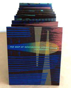
The Map of Neighboring Bodies 17 cm x 14.6 cm (6.7 x 5.7") closed; 35 pages. Silkscreen printed. on Neenah Astrobrite Eclipse Black 80 cover and 60 text. Accordion fold in hard covers. Numbered and signed by the artist. WSW: "The Map of Neighboring Bodies is a book of invented iconography related to bodies of water. The artist plays with the definition of territory by breaking down boundaries across an open sea and systematically rebuilding them with pictograms. With these symbols, the book maps the natural, political, historical, and fantastic regions across five environments. Graham's interest in symbolic imagery hearkens back to an early affinity for 8-bit video games and ancient cartography. Designed to be cyclical, the book connects along a seamless path that wraps horizontally around the entire book. A key is provided on the front side to help the reader decipher the environments." Kathryn Scudler, "Into the Ocean with Veronica" (WSW, April 18, 2017): "Looking at the swiftly changing human footprint on the American West and, more specifically, her home in the Bay Area, Veronica Graham transcribes her curiosity and concern into her own fictional narrative. In the silkscreen studio, she printed and bound her newest artist’s book, …, a journey and investigation into territorial divides across open waters. "Interested in conquests over the unbound oceans and the resulting natural, political, mythical, and historic boundaries, Veronica created a map of environments both imaginary and recognizable to viewers. Beginning with a kelp forest and lost continent, an intertwined space of science and fantasy, readers then land ashore a booming port city. The book continues through the disputed territories of polar waters and into an archipelago of regionally-bound, culturally divergent islands. "Multiple systems of hand drawn iconography are meticulously printed in precise, overlapping registers while more isolated illustrations of planes and cargo ships seem to float above the surface. Throughout the book Veronica layers colors and changes ink opacity to stretch the limits of her palette. "For the final print, Veronica reversed the rigid order of the book, running four inks together into a gradient. A split fountain print, it is as technically demanding as the grids which make up the previous pages. All four colors were carefully pulled in the same pass and on the same screen, flowing together as though these imaginary spaces were suddenly washed away. "Veronica Graham is an Oakland-based printmaker, designer, and graphic artist who also works under the moniker Most Ancient. She draws her inspiration from the rapidly changing Californian landscape, marked by historic endeavors, natural formations, migration, and industrialization. Veronica holds her BA in Painting and Printmaking from San Diego State University." |
|
Studies for Studies Fold out cover containing three items: book (80 unnumbered pages, 21 cm); booklet (16 unnumbered pages, color illustrations, 17 cm, stitched pamphlet); folded sheet (both sides, color illustrations; 42 x 59 cm folded to 14 x 12 cm). Papers: Gmund Bier, Gmund Action, Gmund Treasury, Marlmarque, Masa, French Papers. Printing methods: Laser print, photocopy, silkscreen. Typefaces: Fournier, Futura. Text by Max Porter and an essay written with Alex Bildsoe. Book design by Catrin Morgan. WSW: "St. Jerome is associated with kindness (removing a thorn from a lion’s paw) and scholarship (translating the Bible into Latin). The studies found in paintings depicting St. Jerome are open to incursions from the natural world—they are neither outside nor inside and appear temporary, as though waiting to be folded up and taken away. ‘Studies for Studies’ is an exploration of Renaissance depictions of St. Jerome which expands on the idea of translation as an artistic exercise. “The book has three sections: ‘Typologies’ considers the necessary elements for building a study for St. Jerome, ‘A Study’ is a split format essay which examines the studies in detail, and ‘Studies’ is a series of isomorphic translations of paintings with written responses from Max Porter.” Catrin Morgan’s Interior Studies, Kathryn Scudier (WSW): “Renaissance Christian historical and biblical paintings depart from medieval portraiture of holy figures found in older works and altarpieces. Studies for Studies traces this added embellishment and architecture, focusing on the provisional room in which the saint performs his translation. … “Saint Jerome’s studies are framed in the language of a book with walls folding in on the spine. Time passes with each turn of a page and throws Saint Jerome and his belongings about. Though the paintings’ artists attempted to substantiate a moment in the life of a saint, the walls which hold him swing, diminish, tessellate, then disappear across the book’s spreads. Windows slide across the room and grow into archways. The study closes along its invisible binding and opens again in an unrecognizable form. “When we open Studies for Studies, the covers move like the walls of the room, changing the space that holds our attention. The poster, Studies, unfolds to change shape and a gap is left in the pocket that holds Typologies. When we reach the end of the argument, the study closes one a last time.” |
|
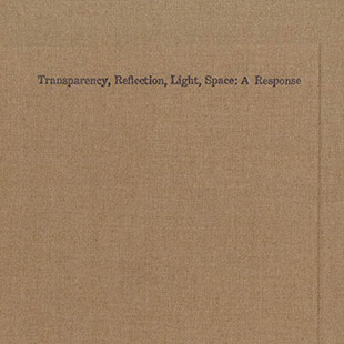
Transparency Reflection Light Space: A Response 20.5 cm x 20.5 cm (8 x 8"); 56 pages. Letterpress, photocopy, and laser printed, saddle stitch pamphlets in hard covers. Signed and numbered by the artist. WSW: "Transparency Reflection Light Space: A Response was created as a response to a 1971 exhibition catalog interview with the artist, Larry Bell. Prior to the publication of the catalog, Bell removed the vowels from his answers. Leah Mackin read Bell's obfuscated responses as inherently gendered in the context of the masculine legacy of Minimalism. They are defiant, brusque and, when read aloud, Bell's words are unpronounceable, guttural noises. Mackin presents the remaining vowels as a sort of harmonic vocalization, since vowels give shape and rounded-out sound to the English language." Kathryn Scudier, "Light, Space, Action: Leah Mackin's Response" (WSW, May 12,2017): "Leah describes her first encounter with the text. 'I read Bell’s responses as a brusque bravado— that he didn’t feel the need to answer the questions. He intentionally, maybe aggressively, refused to participate in the interview with this masculine ego associated with the history of Minimalism. Men would both strip space and take up space with large-scale installations. "As a response, Leah accentuates this gender divide in her book with two saddle stitch pamphlets. The first pamphlet presents the missing vowels along with photographs of Leah deciphering the text. Scaled to the 1971 catalog and printed on white paper, it’s followed by the second pamphlet containing photocopies of the original text on semi-transparent paper. An extra panel in the book’s cover separates the two sections, accenting themes of absence and presence, clarity and concealment which run throughout both texts. "Research for Transparency Reflection Light Space: A Response gradually reshaped Leah’s first impression of the artist. … 'After spending time with the text, I wanted the [interview] to be a conceptual piece in itself, with Bell’s extraction of the vowels in direct correlation to his sculptural practice.' "Instead, Leah found a later interview where Bell admits to being evasive in his early career. In the same vein of making his words unreadable, he would submit short stories in lieu of artist statements to avoid speaking about his work. Where Leah once read as arrogance in Bell’s motives she sees vulnerability and uncertainty. "True to the original catalog, neither section of Transparency Reflection Light Space: A Response discloses the artist’s full responses; Bell’s ambiguity is preserved. The book serves as an exploration of two artists’ actions, four decades apart, in relation to an art movement that allowed no space for gesture or expression. Just years after the rise of American abstraction championed evidence of the artist’s process, Minimalists restrained from showing the mark or hand of the artist. "Larry Bell’s removal of vowels divulge process, and Leah’s still researching the extent of role he played in their elimination. As the catalog was published before the digital era, someone—possibly Bell—had to hand-scrape the letters from printing plates. While Bell’s action is implied, Leah’s are featured through the pages. To balance these gestures, she letterpress printed circles indicating both mistakes in the 1971 text and words she could not decipher. … "Photocopied, sewn, and bound, Leah’s book unfolds in two parts, a response and call. Between the sections, she offers readers a brief editorial note and leaves them to their own investigation. "Leah Mackin is a book artist and conservator based in Pittsburgh, PA. In her work she addresses multiples, abstraction, art research, preservation, and performance, … She holds her BFA in Printmaking and Book Arts from University of the Arts, Philadelphia, and her MFA from the School of the Art Institute of Chicago." BIMA: “In this episode of Artist’s Books Unshelved, we look at two artists’ books that respond to artistic predecessors and invite consideration of our social, political and creative relationships with them now. Featured books are ‘Transparency, Reflection, Light, Space: A Response’, by Leah Mackin, and ‘Memento Civitatem’, by Alice Maher and Jamie Murphy.” |
|
The City Within 8.5" x 14" closed; 34 pages. Modified tunnel and flag book structures. Black and white etchings. Silkscreen. Housed in a wooden box with slide out lid. Signed and numbered by the artist. WSW: "The City Within is a kinetic bookwork exploring cartography and fantastical anatomy. Juxtaposing bird's eye maps and hand-drawn street-level maps with a ribcage of text centered around Montreal's downtown core, The City Within overlays the heart of a city with the interior body of a city dweller. Both a bookwork and a sculptural object, this multi-layered book is able to be read and explored through many pathways. Using metaphoric imagery and a transforming book structure as an open-ended narrative, Natalie Draz combines traditional print media of intaglio and screenprinting with flag, tunnel book, and pop-up structures." Chelsea Campbell, "Anatomy and Architecture: Natalie Draz's 'The City Within'" (WSW. June 8, 2016: "A city is a living thing. Its heartbeats match up with our own. It inhales as we exhale. We feel our hometowns in our very bones; we feel our current city in every step we take. "Through bookmaking, … Draz investigates the structure of her body in relation to her urban surroundings. The sculptural pages … take readers on an adventure in cartography and fantastical anatomy via the streets of Montreal. Combining different bookmaking and printmaking techniques, Natalie’s clustered buildings and winding streets come alive, inviting readers to explore the correlation between interior and exterior spaces. "The City Within is modeled after a rib cage: the front and back covers resemble the pelvic bone, anchoring the paper ribs that jut out of the book’s accordion-folded pages. To create this book, Natalie designed a hybrid of two different structures: the tunnel book and the flag book. When the book is opened and unfurled, the folded pages form two parallel, zigzagging walls to create a tunnel. When lifted up, it shakes and dances fluidly, like a real torso. For Natalie, physically interacting with the book is essential for fully experiencing it. "Natalie Draz is a multi-disciplinary artist currently based in Toronto, Canada. She has a BA in Anthropology and Printmaking from University of Toronto and an MFA in Print Media from Concordia University." |
|
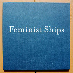
Feminist Ships 9.375 x 9.375"; 12 pages. Accordion structure. Silkscreen printed. Hardcovers. Signed and numbered by the artist. WSW: "Feminist Ships, at its core, is a history lesson, celebrating the life and achievements of women on the water. On colorful pages mirroring the color palette of nautical signal flags, this book describes seven ships throughout history and the women who sailed them. The accordion bound book is cased in a navy blue hardcover which was lightly sanded to give the allusion of being touched by the salty air of the sea. The linework of each ship is a perfect blend of fine art and the artist’s own illustrative style." Chelsea Campbell, Setting Sail with Megan Piontkowski's "Feminist Ships": "Feminist Ships, at its core, is a history lesson, celebrating the lives and achievements of women on the water. It begins chronologically, and fittingly, with an Inuit boat called the umiak nicknamed the 'women’s boat' because it was paddled by women to transport people and belongings. The book continues to move across centuries and around the world, including the ships of notorious female pirates like Grace O'Malley and Ching Shiih; Molly Kool, the first licensed female sea captain in North America; Sisters Under Sail, a sailing education program for young girls; and Women on Waves, an organization that provides abortions and women’s healthcare in international waters exempt from restrictive laws. The last page features the rowboat built by writer Julia Holmes who takes solo expeditions retracing an ancestor’s journey from New York to New Orleans. ”Intimate, handwritten notes on the book’s pages allude to sailors’ personal log books. The loose cursive describes the female sailors and the illustrations of their ships, from a sailboat to a Chinese junk, from a canoe to an Irish galley. "Megan’s illustrative style renders her screen printed ships in flat, wiry line work on bright, colorful paper that extends the palette of her maritime signal flags. Every few pages, the color switches abruptly from charcoal, to intense blue, to stark white, to goldenrod, ending with a vivid red. These pages become a unified pictorial field as each boat’s bow or stern intrudes into another page. This implies an interconnected history which can be fully seen when the book is unfurled like a scroll. When completely laid out, the pages resemble a series of flags that belong hung amongst the sails of a ship, signaling new untold stories. "The idea that sailing is the exclusive domain of thick-bearded, ruthless pirates and burly male sailors in white and blue uniforms is false. Megan’s book begins to scratch the surface of women’s rich history on the water, and invites readers to question where else our narratives might be lacking." |
|
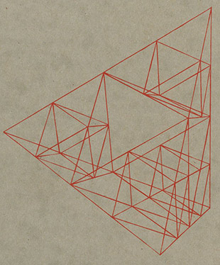
The Tang of Height 8 x 7.75"; 80 pages. Screen-printed illustrations on newsprint, brown paper, and Seawhite sugar paper. Digitally printed text in 10 point Sans and Adobe Garamond Pro on Mohawk superfine paper. Coptic bound, with a wraparound board cover. Signed and numbered by the artist. WSW: "The Tang of Height was inspired by Phyllida's discovery of recurring appearance of box kites in the biographies of nineteenth-century scholars. Taking that shape as a metaphor for philosophical method and 20th-century thinking, the artist ties together the lives of Ludwig Wittgenstein, Alexander Graham Bell, and Nan Shepherd through archival fragments - images and ideas that resonate. These details connect across disciplines, flickering between the abstract and the particular; the philosophical and the personal - a poetry of facts. The screen-printed illustrations, as inserts, float freely of the text and reveal non-linguistic connections between the stories." Kathryn Scudler, "Taking Off: Phyllida Bluemel in the Studio" (WSW, November 19, 2016): "Her artist’s book, The Tang of Height, began when Phylly noticed the recurring appearance of box kites in the biographies of nineteenth-century scholars. The drive to rise above the earth seemed to pervade the era, and Phylly began to seek out more evidence of it in history and literature. The book’s title quotes Scottish Modernist writer and mountaineer Nan Shepherd, writing in the 1940s: 'At first, mad to recover the tang of height, I made always for the summits and would not take time to explore the recesses.' "In her research, anything that grabs Phylly’s attention is saved in a computer folder containing thousands of files, ranging from simply appealing images to historical finds buried deep in digital archives. … [S]he saved an image from 1903 of Bell and his wife Mabel under a tetrahedral kite. It looked almost as if the kite were a superimposed graphic, not part of the original scene. The deception of that picture stuck with Phylly for years before she pursued it in the book. “'I’m drawn to photographs that look like 2D and 3D elements are clashing,' she explains. 'I find that quality related to the book in a vague but metaphorical way, so I take an image like that and try to enhance that feeling.' "To achieve this using silkscreen printing, Phylly sketches the figures and kite from the photograph, digitally alters the sketch, then makes it into two screens. She discards the picture’s background and separates the grainy, hand drawn figures from the kite through color and style. The geometric layers printed over the figural forms visually mimic how Phylly imposes a narrative structure on historical coincidences. "The photograph of Bell and Mabel became another starting point for Phylly’s research, leading her to examine the other forgotten offshoots of Bell’s life. Working in this way, she brings together themes spanning from flight to the Scottish Highlands to Darwin’s theory of evolution, building The Tang of Height as a constellation of charts, maps, excerpts of letters, and other photographs. "Although this research project began with kites, it ultimately circles back to Phylly’s background in philosophy. Twentieth century schools of thought, including Wittgenstein’s work, sought to analyze the nature of reality by defining the structure of language. Conceptually, Phylly connects this attempt to 'put language under a microscope' with the aeronautical dream to look down on the earth. Theorists and engineers hoped that if they dismantled, mapped, and flattened the world, they would expose its underlying composition. "Phyllida Bluemel is a graphic designer, illustrator, and book artist based in and traveling through England. She holds a BA in Philosophy from Cambridge University and her MA in Illustration from Falmouth University. Her recent projects explore themes of language philosophy, interdisciplinary research, and structures of thought." |
|
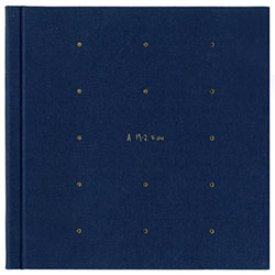
| A 19-2 View By Libby Scarlett Rosendale, New York: Women's Studio Workshop, 2015. Edition of 50. 10 x 10"; 40 pages. Letterpress printed on Mohawk superfine 100 text paper. Digitally cut. Perfect bound in cloth-covered boards. Numbered. WSW: "A 19-2 View depicts the artist’s observations of the fifteen balconies she overlooked from her apartment in the east of Amsterdam. After a request to take a photograph and meet a neighbor went by without a single reply, she made up stories of the inhabitants and their surroundings: the things they might have told her had they accepted her offer. Through modular circles cut into the pages, readers get a glimpse of each balcony, beginning with all fifteen illustrations on the first page. Each subsequent page is dedicated to one balcony and its narrative." Lizz Thabet, WSW: "A 19–2 View opens to a modular grid of circular cutouts, mirroring the apartments’ architecture. They act as windows to each apartment, sketched in Libby’s delicate, graphic line work and rendered in the same midnight blue as the cover. A 19–2 View is an intimate experience of discovery and exploration: every page turn reveals another balcony, another neighbor, and another narrative, gently guided by Libby’s hand and voice. The structure invites us to interact with the pages; to peek through, to skip ahead, or to return to a particular apartment. "Throughout the book, Libby’s writing acts as field notes, running between the grid of diecut circles in haiku-like clauses. The stories she tells are as fragmented and ordinary as the moments of daily life she glimpses from afar. Each detail becomes a clue, printed and impressed into the paper by the Vandercook press. Her poetically precise language infuses each person we meet with charm and absurdity." $425 |
|
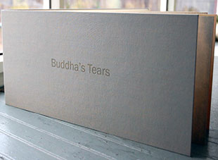
| Buddha's Tears By Wei Jane Chir Rosendale, New York: Women's Studio Workshop, 2015. Edition of 50. 20.75 x 46.5 cm; 13 pages. Accordion. Paper: Somerset Book 175 g. Typefaces: Helvetica and Heiti. Silkscreen, letterpress, and digitally printed. Bound in cloth-covered boards. Signed and numbered. WSW: "Buddha’s Tears exposes the hidden story of organ harvesting in China from prisoners of conscience, such as Falun Gong practitioners. Statistical information is juxtaposed with poetic rendering of a legend of a statue of Buddha, who weeps in times of crisis. Each page is filled with dates, graphs, maps, drawings, and stories, concluding with a sutured image of China, a symbol of healing. The accordion pages unravel to form a long scroll, a traditional form of storytelling to lay out the facts of China’s cruelty." Chelsea Campbell, "Still Beating: Wei Jane Chir's Buddha's Tears": "Award-winning investigative journalist Ethan Gutmann estimates that in China, 64,000 prisoners practicing Falun Gong may have been killed for their organs between 2000 and 2008. Falun Gong practitioners have been persecuted for their spirituality and arrested as prisoners of conscience since 1999 for their direct opposition to the state’s communist ideology. Only recently, through detective work by journalists and human rights activists, have details of China’s illegal transplanting practices come to light. "Artist’s Book resident Wei Jane Chir came to WSW to edition her artist’s book Buddha’s Tears, about China’s decades-long history of organ harvesting. As a practitioner of Falun Gong herself, she’s using her tools as an artist to make this information reach a wider audience. "The cover of Buddha’s Tears is complex and mysterious, mirroring the very narrative inside. Twenty different colors of ink combine to make the title almost invisible, hidden much like the story of organ harvesting has been for years. In certain lights and angles, the oranges and browns of the cover melt into a sea of blue with the golden title floating in the center. "Wei Jane’s title comes from the legend of a Buddha statue in China that, in times of crisis, weeps. By referencing it, Wei Jane posits that the undisclosed horror of organ harvesting brings the Buddha to tears. The book opens on a pair of downcast eyes, then a bronze ocean, then a somber quote to prepare the viewer for the story about to unfold. ... "Buddha’s Tears thirteen tryptic pages are dense with visual and textual information. Combining digitally- and screen-printed imagery, each page is filled with the history of Falun Gong, its persecution, and the legal cases brought against China. Graphs and tables of transplant numbers are paired with meditating Falun Gong practitioners; harvesting processes broken down in hand-drawn images sit beside covers of books and documentaries on organ harvesting. Wei Jane is an artist-meets-journalist, providing facts and charts on the subject while injecting her own artistic vision throughout. "The cover of Buddha’s Tears is wrapped in silk, the accordion-bound pages unraveling to form a long scroll. Using the materials traditionally used in ancient Chinese storytelling, Wei Jane ironically lays out the facts of China’s contemporary cruelty. This sense of irony is reflected in the book’s final image: a bright red China stitched together with black thread. Wei Jane’s niece, a surgeon, taught Wei Jane how to do a surgical stitch over the silkscreened China." $1,000 |
|
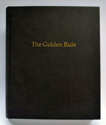
| The Golden Rule By Ann Kalmbach and Tatana Kellner Rosendale, New York: Women's Studio Workshop, 2015. Edition of 45. 8 x 6.75"; 124 pages. Printing methods: letterpress, silkscreen, and digital. Typefaces: Book Antigua and Helvetica. Printed on Revere Book and UVII Ultra papers. Casebound. Signed and numbered. WSW: "The Golden Rule is about the basic tenants phrases of various cultures and religions that in the non-sectarian world are equivalent to the ‘The Golden Rule’. This book looks at 13 golden rule texts. Upon opening the book, the reader is confronted with a blind embossing of the text in one of the original languages, followed by handwritten, slowly dissolving translation. Only after leafing through to the next page is one able to read the dictum. This is contrasted with newspaper clippings of petite crime and punishment. " $700 |
|
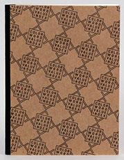
| The Color-Word Value Index By Anne Thompson Rosendale, New York: Women's Studio Workshop, 2013. Edition of 50. 8.75 x 6.5"; 16 pages. Printed silkscreen and letterpress on Rives heavyweight paper. Case bound. Signed and numbered by the artist. WSW: "A reference volume and playful devotional object based on the author’s research into color theory informed by psychology, mysticism, and early modernism. The Color-Word Value Index has 44 word pairings; 10 colors; 5 suits; and values of positive, negative, and neutral. The book follows a relativist ideology that calls for reversals such as backward writing, mirroring, and the kind of doubling and flipping that is represented in the book’s structure and imagery. With references to decor and architectural spaces such as a library and cinema, the book functions as a mini-exhibition space and reflects Thompson’s interest in the early modernist Gesamtkunstwerk." $800 |
|
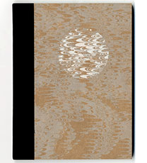
| The Moon Has No Weather By Sarah Peters Rosendale, New York: Women's Studio Workshop, 2013. Edition of 50. 23 x 15cm; 34 pages. Papers: Magnani Arturo, Thai mulberry, Hahnemühle, handmade abaca pages from 1984 Polish electronics manual. Silkscreen and letterpress printed with Fox typeface. Bound in letterpress printed boards with cloth spine. Signed and numbered by the artist. WSW: "This book features a short text by the artist drawn from scientific research on lunar geology to poetically explore the idea of the Moon as a book. Illustrations borrowed from engineering diagrams and printed on three different papers are folded into the signature to interrupt the prose and create layers of visual information. Each book includes a removable cotton casting or 'moon card' nestled in the back cover." $350 |
|
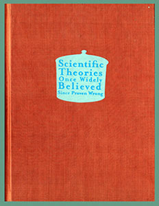
| Scientific Theories Once Widely Believed, Since Proven Wrong | |
| By Alisa Byrnes Rosendale, New York: Women's Studio Workshop, 2013. Edition of 60 26 x 19.5 cm; 45 pages. Text digitally printed in Garamond, Copperplate, and Mrs Eaves. Images screenprinted on Rives Heavyweight, Hahnemühle Bugra papers. Cloth-covered boards with drum leaf binding. Signed and numbered by the artist on the colophon. WSW: "This book features 10 images interpreting occasions when truth took a circuitous route. From Einstein’s Cosmological Constant, to Alchemy, to Geocentricism, and seven others, the screen prints are inspired by medieval illuminations and Mughal miniatures to encapsulate moments from the history of science using various narrative strategies. The book inverts the relationship between word and image, with written descriptions of each scientific theory accessible behind a gate-fold, enabling the images to take precedence." Jenn Bratovich, WSW: "The book … is a delightful romp through some of our most ambitious and spectacular scientific failures. How do mammals reproduce? What is the mysterious nature of fire? How do bodily fluids or the brain’s topography account for our temperaments? Alison’s book reimagines ancient and early modern investigations into these and other quandaries, turning ordinarily dry material into a humorous and truly accessible catalog of obsolete scientific breakthroughs. ... "The book contains nine more silkscreened prints (upwards of 10 colors each) in which Alison uses compressed space and skewed, competing perspectives to stack disparate visual components to convey narratives as a pictorial whole. By contrast, each theory is accompanied by a short, digitally printed piece of text that explains how the theory was developed and reassessed by later discovery. "But in a curious twist, the text is tucked behind a gatefold that the reader must open to read, which cleverly turns the historical relationship between words and pictures on its head. The images are primary, and the text is supplemental." $750 |
|
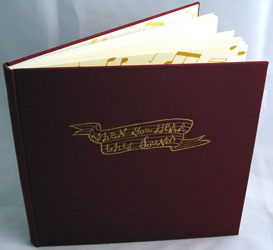
When You Hear This Sound Artists’ Books Unshelved / For the Record: “In this episode … we look and listen to artists’ books that include vinyl records. The featured artists books … connect not just books and music, bust also the unique people and histories of specific places.” |
|
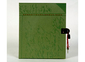
| None of Your Damn Business By Barbara Leoff Burge Rosendale, New York: Women's Studio Workshop, 2009. Edition of 55. 8.5 x 9.25"; 18 pages. Double-sided accordion structure. Screenprinted with digital printing (inkjet) on Fabriano paper. Paper-covered boards with metal attachment and padlock for closure. Padlock key attached. Women's Studio Workshop: "None of Your Damn Business, a story about Yang Huanyi, the last writer of the Chinese women's secret language 'Nushu,' is written in shorthand, the secret language of former stenographers. [The shorthand version appears on one side of the accordion, a cursive version appears on the other.] Its curves and arabesques closely resemble Islamic script whose celebrated practitioners are exclusively men. This book is dedicated to all who by dint of necessity or for the sheer mischief of it write their own secret language." Burge is one of the four founding artists of Women's Studio Workshop. $425 |
|
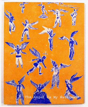
The Angel is My Watermark 9.5 x 12"; 56 pages. Typeface: typewriter, Book Antiqua , Century. Paper handmade from abaca, cotton linen, raw flax, and linen rags. Watermarked sheets heated using flexible screens. Concertina bound with multicolored etchings, silkscreen, and encaustic drawings. Illustrated paper covered boards. WSW: "Inspired by Henry Miller's story The Angel is My Watermark and a 17th-century poem the "Song of Paper" by Father Imberdis, the artist meditates on the emancipation of the watermark." Barbara Beisinghoff: "From January to March 2009 I produced an rtist's book titled The Angel is My Watermark at WSW in Rosendale, New York, which is the largest publisher of hand printed artists' books in the United States of America. In my book art residency I wanted to do a book about birth and creation. "I handmade each paper of the book from raw flax as well as linen rags, added abaca and cotton linter to make pulp for 900 sheets. I experimented with different beating times to get paper which would be crisp and create a rattling sound so when the pages are turned the song of paper is heard. The signatures are sewn on an accordion folded spine and open up widely. Three voices speak out of the book: the "Song of Paper" of Father Imberdis, Barbara Beisinghoff's voice about the emancipation of watermarks, and Henry Miller's The Angel is my Watermark. ... "The first one is "Song of Paper," written by Pater Imberdis, 1693. I silk screened the song handwritten on the spine and end sheets and in the book in Antiqua font. Jean Imberdis had written the "Song of Paper" in Latin. In this book it is translated in six languages: English, German, Spanish, Italian, French and Czech.... "The second voice describes Henry Miller's story The Angel is My Watermark. I printed the etchings, when the new-made paper was still damp. 'Every birth is miraculous and inspired.' Miller's voice is silk screened in a typewriter font. "The third voice is my own one, about the watermark angel and the Barbara Beisinghoff has been the recipient of various art prizes including the Senefelder Prize, the Mainz City Printer Prize, Art Prize Heitland Foundation, and the Georg-Christoph-Lichtenberg-Prize. |
|
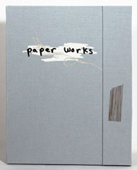
Paper Works 11.25 x 14.25"; 9 loose leaves. Silkscreen. Printed on Mohawk Superfine paper. Laid in grey cloth bound portfolio. WSW: "In Paper Works, a portfolio of nine silkscreen prints, Grimyser examines the possibilities of a piece of paper. With a humorous tone and playful imagery the artist explores paper, its dimensional qualities, the vastness of a page and the interaction of writing and drawing." |
|
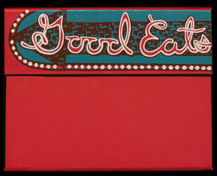
| Good Eats By Carissa Carman and Gretchen Hooker Rosendale, New York: Women's Studio Workshop, 2005. Edition of 80. 6.75 x 5.25"; 18 cards. Screen printed on Mohawk Superfine 160 lb. paper. 18 illustrated, loose leaf recipe cards. Art work on front of each card, a recipe on the back. Laid in four flap portfolio box covered in red cloth. Colophon tipped on interior of portfolio. Women's Studio Workshop: "With its striking red portfolio case printed to reference a flashing marquee sign, Good Eats welcomes you to a roadside diner. Through the sharing of imagery and personal accounts the functional recipe cards portray the intimate connection between food, place, comfort, and memory." Benjamin Genocchio, Artworks with Pages to be Turned and Savored, Art Review, New York Times March 12, 2009: “Good Eats (2005) by Carissa Carman, with recipes contributed by members of the Women’s Studio Workshop along with little illustrations for each of the dishes. It is cute and fun and probably one of the few books here you could use. Among my favorite-sounding recipes is the Vietnamese-inspired 'Magic Rainbow Rolls With Legendary Peanut Sauce.'" $250 |
|
| Speaking the Stone By Patricia Wilson-Adams Rosendale, New York: Women's Studio Workshop, 2001. Edition of 100. 5.375 x 7.5"; 8 pages. Accordion fold from back pastedown. Letterpress printed. Etching and aquatint illustration. Printed on white Rives BFK. Set in Bookman. Bound in handmade paper wrapper with tie closure. Title blind embossed on front cover. Text from Fugitive Pieces by Anne Michaels. Women's Studio Workshop: "The artist references her native Australian high country, where the ancient stones evoke feelings of loss for past generations." Tana Kellner: "Speaking the Stone is a meditation on an Australian landscape in a foldout format. The etchings were inspired by a poem 'Fugitive Pieces' by Anne Michaels, which is printed on the first page." Patricia Wilson-Adams, University of New Castle, Australia: "Patricia Wilson-Adams’ career as a Printmaker began with a commitment to community based workshops following three years spent in the late 60s and early 70s at Atelier 17, Paris. The workshop was run by the famous surrealist artist S.W. Hayter. Her time in Paris was supported by a French Government scholarship for a place at the Cité Internationale des Artes. She then went on to help establish the Islington Print Workshop in London and became the first artist-in-residence at the now well known Kalã Institute in Berkeley California (1975/76). Since then she has been associated with the Newcastle Printmakers Workshop." Canadian writer Anne Michaels' debut novel, Fugitive Pieces (1957), reaped praise and awards, including the Trillium Book Award, the Orange Prize for Fiction, and the Guardian Book Prize. $ 100 |
|
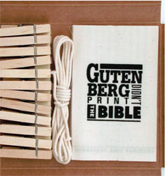
On the Line 5.75 x 5.25"; 12 pages. In cardboard book housing. Includes rope for hanging pages, cotton muslin printed pages, and ten wooden clothes pins. Silkscreen on cotton muslin text panels. Offset lithography on box. A collaborative work designed by Johnson and Lewis. Women's Studio Workshop: "On the Line is a collection of stories, rumors, little known facts, and folk tales about well-known artists relayed through word of mouth. The book is designed for the viewer to interact with the piece in a symbolic way of hanging out the dirty laundry of stories and rumors." Linda Johnson: "On the Line is an artist book that utilizes a non-traditional format designed to reflect the content of the book. It is a collection of little known facts about artists and designers. The little known facts are silkscreen printed on individual cotton muslin panels. They are housed in a box that comes complete with a five foot clothesline and twelve miniature clothespins. The book is designed to encourage the reader/viewer to interact with the piece by symbolically hanging out the dirty linen ... To collect the facts, letters were sent to artists, designers and art historians asking for interesting tidbits about well known artists or designers. Twelve of the facts submitted became the content." Paul Klee painted camouflage on military aircraft. Kristy Lewis Andrew, a native of Oklahoma, received a Master of Fine Arts from the School of The Art Institute of Chicago and a Bachelor of Fine Arts from the University of Kansas. www.fau.edu: "Linda K. Johnson, Professor of Art in Graphic Design, focuses her creative research in the design of artist books. She received her B.F.A. from the University of Houston and M.F.A. from Virginia Commonwealth University." |
|
| Women's issues: societal roles, social restrictions | |
Repair Manuals for a Femme Fatale I9 x 6.25" lidded box with two sections containing four 11 x 16" folded sheets and four bookboard title pages, one per sheet. Inkjet, screen printed, and letterpress. Ribbon lifters for each section. Title printed on lid. Signed and numbered by Smith. WSW: "Repair Manuals for a Femme Fatale is a boxed set where 1970s repair manuals collide with 1940s Femme Fatales. It is a compilation of information that may help women escape their cinematic fate in the hands of a film noir. From how to give the kiss of life, to maintaining Venetian blinds, the repairs enclosed are film-specific, inspired by events that occur or objects that may appear within each film. Repair manual for femme fatale features a prologue and three film noirs: Double Indemnity, Leave Her to Heaven, and The Postman Always Rings Twice. " WSW blog: "Rose Smith’s work features instructional text, multiples, light, discovery, subversion and comedy – her book residency at Women’s Studio Workshop will allow her to bring all these themes together in one. The book, Repair Manuals for a Femme Fatale will be a can-do, problem-solving guide where 1970’s repair manuals meet 1940’s and 50’s screen stars. "Born in Wolverhampton, England, Rose now lives and works in London, completing an MA Fine Art: Drawing at Wimbledon College of Art in 2006. She has shown widely in England, and also internationally." |
|
IRON 12.25 x 11 x .75"; 86 pages. Silk-screened and digitally printed on Stonehenge Warm White and Glama Natural Clear papers. Casebound in tan bookcloth with scorched iron illustration on front board. Women's Studio Workshop: "Inspired by the artist's installation of the same name, where an automated iron reveals text as it irons out a white dress shirt. The text examines the history of domestic labor and immigration, while the images document the technological progress of ironing appliances (patents included). Printed in invisible ink, the viewer reads the book by ironing the pages. DVD of the ironing installation is included." Interactive bookmaking at its most exciting and nerve-wracking? "Instructions for use: The text in this book is revealed by ironing the pages. Set your iron up for steam on the cotton setting. Iron each page front and back and watch the text appear. If you ado not want to do your own ironing, you can keep the book in its original state. You can also send the book back to be ironed out by the artist. Additional charges apply for this service. To save money, have a significant other or a family member perform this task. Iron at you own risk." Artists’ Books Unshelved “Irreversible Actions: “We take the daring steps of … applying steam heat with an iron to “Iron” by Tatana Kellner, to rad the pages of these artists’ books. The irreversible actions complement the artists’ message and intended experiences.” |
|
Conceal 4.25 x 6"; 10 pages (one strip). Accordion structure. Handmade pigmented cotton paper. Images (giclée prints) and text are letterpress printed on No. 4 Vandercook Printing Press using photopolymer plates. Typeface: Mrs. Eaves Italic 24 pt and Mrs. Eaves Petite Caps 24 pt. Text is author's adaptation of Genesis 3: 7-10. Casebound in brown cloth. WSW: "Using the body as a site of intense investigation, this book exposes the physical manifestations of denial, shame and oppression. These conditions are revealed by examining the impact religion has on the construction of femininity, sexuality, and identity." |
|
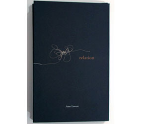
relation 3.75 x 6.5"; 14 pages. Flag book structure. Offset printing on Mohawk Superfine paper. Paper covered boards. WSW: "relation explores the constantly shifting network of connection and separation inherent in the fabric of intimate relationships. The book's binding structure is designed to fold flat, and expand into a sculptural, interwoven front when opened. Delicate images of fabric form a rich visual field for interlocking, shifting texts"
|
|
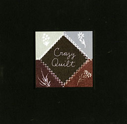
| Crazy Quilt By Maureen Cummins Rosedale, New York: Women's Studio Workshop, 1998. Edition of 100. 10 x 10"closed, extends to 30 x 30"; 16 pages. Hinged pages unfolding in four directions to reveal quilt-like patterns, colors, and shapes. Intaglio and letterpress printing. In black cloth boards with inset illustrated title label. Designed, printed, and bound by Maureen Cummins. Signed and numbered. Califia Books: "A collection of excerpts from narratives written by women imprisoned for madness. Descriptions span from the Civil War period to the present and feature unknown women as well as such celebrated figures as Kate Millet and Frances Farmer. These extraordinary tales are related with keen intelligence, rage, and mordant humor. Silkscreen and letterpress printed on squares of white coverweight Folio. Each page is a patch work of black alternating with rich color blocks (over seventy-five in the edition); text is in the form of stitch-like handwriting. Hinged pages unfold in four directions to reveal myriad shapes and patterns resembling a large, crazy quilt." Women's Studio Workshop: "Crazy Quilt assembles the experiences of women who have been institutionalized for insanity in the last century. Square pages of richly colored patterns and text unfold into one large quilt-like square. The text resembles sewn handwriting from the women such as Charlotte Perkins Gilman and Frances Farmer." $2,800 (a few copies remaining) |
|
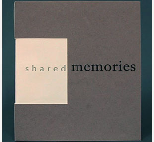
shared memories 7.5 x 8.75"; 39 pages. Pop-up book. Silkscreen and letterpress printed. Handsewn signatures with decorative stitch in soft cover. Paper: Rives heavy weight paper. Issued in paper box folder with tab closure. WSW: "Explores the importance of memories and how they continually evolve. Eight memories are described; one on each double page spread with Lori's account consistently on the right page, her sister's on the left. The main details of the story are told in a square that pops out in the middle of the page spread, while peripheral information fills the rest of the page. The image of both sisters, surrounded with textural collage, are revealed throughout the book by the die cuts of the pop-up page. The structure of the book reflects the relationship between two sisters who spring from the same environment." |
|
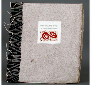
| Bent Like the River By Terry Schupbach-Gordon Rosendale, New York: Women's Studio Workshop, 1994. Edition of 100. 9.75 x 11"; 12 pages. Japanese stab binding with Indian handmade covers. French fold book with woodcuts. Papers: Gekkekon, Gampi, Toronoko, and Kitakata paper. Women's Studio Workshop: "A short, lyrical poem is brought to life by a series of powerful woodcuts. The contents celebrate and affirm the lives of people living with disabilities. The rhythmic quality of the verse is echoed by the syncopated marks of the gouge and the movement of the bodies and waterways depicted over the pages." Terry Schupbach-Gordon: "In my work, I draw the body bent, bending, able, and disabled. It has been my deeply personal attempt to reclaim grace for a body often considered outside the conventional definition of 'normal.' Living beautifully or gracefully with disability requires me to redefine the words 'beauty' and 'grace', and to give them visual form. Work inevitably mirrors our personal experience. The body that I work with is my own." $400 |
|
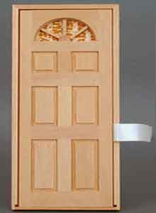
Family 3 x 7.5"; 7 pages. One folded strip of Guttenberg Laid paper producing 7 pages in an accordion structure. Silkscreen and letterpress. Housed in a wooden box with a front door, which opens by ribbon pull to reveal the accordion, which has one end attached to the box. Verso of box stamped with dictionary entry for Family. WSW: "This book is housed in a wooden box with a front door which opens to reveal a collection of household utensils used as portraits of individual family members. On alternating pages these objects are layered over definitions of the roles to which the family members are predestined. The book investigates the idea of the family unit as a tool of socialization; creating and perpetuating gender stereotypes. The images explore our place and role within our families and beyond." |
|
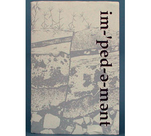
Impediment 6.5 x 9.75"; 20 pages. Letterpress and color photographs. Printed on Curtis Tuscan Terra, Rives BFK, UV Ultra, and handmade paper with toenails and hair, and a seed packet. Handsewn pamphlet binding with a two-leaf pull out, which contains a pop-up. Within the pocket-like pop-up is an envelope containing a miniature metal shoe and instruction card. WSW: "This book investigates the abuse of women's feet and footwear through the ages-from the ancient Chinese foot binding to high heeled shoes of the present. Personal and historical narratives illustrate the results of cultures' enduring foot fetish. After reading this one, you'll never be tempted to squeeze into 'just a half size smaller' again. Nested within is a pop-up which presents the reader with a packet of 'seeds' for change." |
|
| War, peace and politics give continuous food for thought especially for the artists making books at WSW. | |
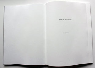
| Facts on the Ground By Toby Millman Rosendale, New York: Women's Studio Workshop, 2011. Edition of 50. 8 x 11"; 53 pages. Digitally cut. Letterpress, silkscreen, and archivally inkjet printed. Typeface: Adobe Caslon Pro, Gill Sans. Printed on Mohawk Superfine. Hardbound book with drum leaf binding, cloth spine. Title stamped on front board. WSW: "Oral testimonies, maps, and excerpts from personal accounts, from and about occupied Palestine, are the subject of this book. Maps and testimonies were collected from various Palestinian, Israeli, and international human rights organizations and governmental agencies with additional writings and drawings by the artist." WSW, blog: "Her book, Facts on the Ground, talks about Palestine and the plight of the Palestinian people. It is an important piece that presents information rarely, if ever, available to most westerners. Toby is another fine letterpress printer." $475 |
|
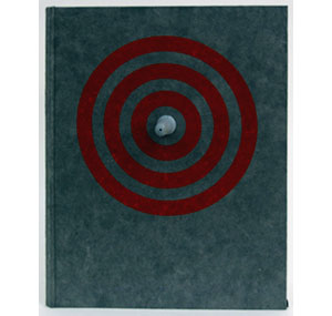
Skim Milk & Soft Wax 9.5 x 12 x 2.5"; 40 pages. Printed on Mohawk Superfine and Rives Lightweight. Intaglio, letterpress, and silkscreen processes. Other materials: pencil, inkjet, and magic marker. Cover pages made of kenaf and rye fibers grown on the WSW Artfarm. Cover design of red circles resemble target with 2" rubber bullet protruding from the center. Housed in an archival grey lightweight cardboard box with clear plastic lid. WSW: "The author, who was raised to believe that Israel is the 'land of milk and honey,' explores her Jewish identity. Leventhal’s personal experiences of Israel collide with this idyllic image. Skim milk, a substance of reduced nutritional value, and wax, the stuff of religious offerings, are used as metaphors for the complex, shape shifting, and often disappointing policies of the state of Israel. Includes 44 minute movie." |
|
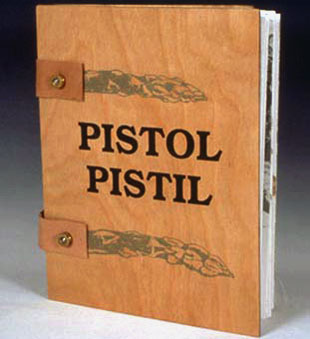
Pistol/Pistil 7 x 8.75 x .75"; 24 pages. Additional pages and enclosures sewn in. Accordion structure with end pages adhered to boards. Silkscreen printed on Mohawk Superfine, UV Ultra, and handmade abaca fiber paper. Bound in wooden covers with leather straps held with bullet casings. This was deigned and printed while Kalmbach and Kellner were visiting Artists-in-Residence at the University of Southern Maine with help from their students. WSW: "This accordion fold book examines the use of ordinary words in both botanical and military context. These definitions are juxtaposed with stories and statistics relating to farming and violence." Judith Klau, Books as Aesthetic Objects: "Pistol/Pistil: Botanical Ballistics is bound in wooden boards held by leather and bullet casings. This book plays graphically and etymologically with the language of agriculture and the language of ordnance. "The message of the book points primarily to the irony that many words of vegetative growth are identical to words of military destruction, beginning with 'shell' (as in peas and in guns), but immediately reminding the viewer that war alone is not responsible for all the damage inflicted on the environment: the first page details pesticide use: Farmers- 2 lbs per acre, Homeowners- 10 lbs per acre, Golf Courses- 15 lbs per acre; and the later reproduction of a news clipping reports on a woman killed by lightning in her garlic patch. "Other cognates, like 'mushroom' and 'squash,' are illustrated by razor thin sections of actual dried vegetables in their own envelopes, by lists of 112 varieties of tomatoes surrounding a sardonic folder about using fertilizer to make bombs, and by detailed illustration of the title pair, 'pistol,' and 'pistil.' Through ironic comparisons in language and image the book presents the innocence and productive qualities of nature next to the increasingly antithetical creations of human beings." |
|
Presidential Quiz 4.25 x 17.25"; single folded sheet, six leaves. Silkscreened accordion fold book. WSW: "Match the hairdo to the president and test your knowledge of America's political history. This funny book, inspired by a student's info ruler, tests your visual memory." |
|
Other bookworks printed / supported by WSW |
|
Women's Studio Workshop SOLD and/or Out of Print Titles: |
|
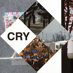
4 3 2 CRY 'Affixed to the condensate tanks were diamond-shaped, Mondrian-like signs in ironically playful primary colors, emblazoned with peculiar numbers and codes. 'I didn’t understand; these signs looked like they were for children,' says Kathy, 'and then I found out they meant this stuff could kill you.' |
|
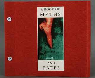
A Book of Myths and Fates 7.75 x 7"; 30 pages. Printed digitally. Post-binding with extended fore-edge paper cover. Gatefold pages alternate with printed leaves. In wraparound cover. WSW: "Inspired by Sophocles' Oedipus Rex, this book expresses the essential mystery of fate in terms of the spiritual, sensual, and intellectual parts of Self." Inspired by three characters in Sophocles' ancient Greek tragedy, Oedipus Rex. The Oracle, Jocasta, and Oedipus correspond respectively to the spiritual, the sensual, and the intellectual parts of ourselves. Three sections illustrate the three states. In each section, the pages fold out from a central pair of black and white images. Birds represent the spirit; water suggests the body and senses; land stands for the intellect. The book expresses the essential mystery of Fate itself. |
|
| Channel & Flow By Sarah McDermott Rosendale, New York: Women's Studio Workshop / Kidney Press, 2014. Edition of 50. 3.5 x 6"; 20 pages. Letterpress and screenprint on Shikoku paper. Printed from polymer plates with Avenir typeface. Modified long-stitch binding in covers of handmade paper from milkweed collected and retted at Ruocco Family Farm in Sandgate, Vermont, mixed with cotton and abaca. Signed and numbered on the colophon. WSW: "Channel & Flow documents an attempt to follow a stream on its path through a dense suburban neighborhood. It uses the structure of the book’s page turns and fold outs to represent how the stream has been contained and fragmented by the built environment." Channel & Flow afterward: "Tripp's Run originates near I-66 in Fairfax county, Virginia, near Washington, DC. It runs above and below ground for approximately five miles before draining into Lake Barcroft and ultimately the Potomac River and the Chesapeake Bay. "The surrounding area developed rapidly following World War II, and Tripp's Run was mostly channelized or piped underground to prevent seasonal flooding and consequent property damage, with the unfortunate effect of exacerbating flash floods and degrading the stream's ecological complexity. A combative relationship has emerged between human actors and water's inherent propensity to flow, spread, and cling to itself. It is debatable whether Tripp's Run can today be called a stream, or just a channel for stormwater events, maintained with groundwater inflow. "Despite the changes of the last century, Tripp's Run persists in some form, a presence we experience like an echo, appearing and disappearing, perhaps most reliably visible as the negative space inside an environment that has been built under, over, and up to the edges." (SOLD/out of print) |
|
| The Complex of All of These By Abigail Uhteg Rosendale, New York: Women's Studio Workshop, 2009. Edition of 35. 11 x 14"; 36 pages. Letterpress printed in 8 and 10 point Spectrum types on a Vandercook No 3. Rosin aquatints with etching and drypoint printed on Rives BFK. Case bound in flax and abaca paper-covered boards (paper by Chris Petrone) with paper title on front board. Women's Studio Workshop: "In a poetic language the author contemplates the world around her. Images and words become parallel languages, here the distinction between ground and sky, past and present collapses. One conceit after another feels its way over the tiny words before sinking deep into the dark of the etching ink to linger, trembling." Printmaker and bookmaker Abigail Wendler Uhteg works in New York City. This book was made possible with funds from the New York State Council on the Arts and the National Endowment for the Arts. (SOLD/Out of Print) |
|
A Darning Stitch 25.4 x 28cm (10 x 11"); 44 pages. Silkscreen and letterpress printed on handmade paper. Fabric imagery printed in silkscreen. Text and sewing diagrams letterpress printed from photopolymer plates. Handmade overbeaten abaca and overbeaten cotton paper created using the blowout method. A two-pamphlet-stich casebound book. Signed and numbered by the artist. WSW: "This book explores the concept of an invisible mend, contrasting the mend of a garment with the attempt to mend a relationship. A darning stitch is a sewing technique used for repairing worn areas in fabric, an attempt to make the repair as neat and invisible as possible to restore a piece of clothing to its original state. Instructions and diagrams for darning are printed on overbeaten abaca paper, while on cotton paper are images of fabric alongside a narrative of a marriage. The cotton spreads are visible beneath the translucent abaca sheets, juxtaposing this story against the clear and straightforward instructions for mending clothing. " Kathryn Scudier, "The Last Thread: Sue Carrie Drummond's Darning Stitch" (WSW, August 30, 2017): "There came a point where, when most people would see cloth, Sue Carrie Drummond saw scars. A fraying seam, a rip in a shirt were scratches on an outermost skin. The most loved, often-held garments would be the ones riddled with snags, irreparably stretched and faded. "First Sue Carrie would draw these marks in paper pulp and prints, wanting to render the subtle accumulation of life’s wear and tear. She turned to her own wardrobe to find the metaphorical marks they told of her life. After learning to puncture sheets of freshly pulled paper with water using the blowout papermaking technique, she could make these abrasions rather than record their residue "A Darning Stitch … collates sewing instructions between a narrative of a strained but ultimately rescued relationship. Sue Carrie wrote the text after listening to accounts of marriage from her mother and other women, then based the darning instructions on vintage craft manuals. "Sue Carrie Drummond is Assistant Professor of Studio Art at Millsaps College in Jackson, MS. She was both a studio assistant in papermaking at Penland School of Crafts and the artist-in-residence at Minnesota Center for Book Arts during the summer of 2015." |
|
| Going to camp: A Meditation about Aids, Quarantine, Exile, and Personal Loss | |
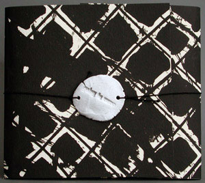
| By Lyman Piersma Rosendale, New York: Women's Studio Workshop, 1987. Edition of 65. Two book housed in thick folded-paper envelope, which is held closed by an elastic string attached to a clay seal embossed with the words "Going to camp." Book I, Illustrations (8.5 x 9.25", 18 pages) is an accordion structure which unfolds to a cross shape. Printing methods: silkscreen, photocopy, rubber stamp, photographs. Book II (5.9 x 5.9", 16 pages) is pamphlet stitched and contains five short prose pieces. The camp referred to here is not summer camp, but the concentration camp like isolation that faced AIDS victims, especially in the early years of public misinformation about the disease. Twenty artists and writers contributed to this project: "We dedicate this project to those we have lost. Artists' proceeds from this project will benefit the Gay Men's Health Crisis, New York City." John Neely: "How does one introduce such a book? I could write about the history of AIDS or the art contained within, but I think not. Instead I want to instruct you to hold this book with great care in your hands. Be gentle, for it is full of dreams, lost lives, and lives yet to be lived. ... "All of us gathered here have experienced the loss of life from AIDS. We worry about our own lives, about the possibility of camps and death, but each of us has become a stronger person because of those who are gone." (SOLD/Out of Print) |
|
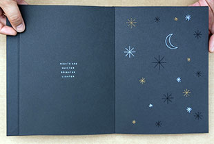
| Nights, The Cosmos, and I By Natalia Zapella Rosendale, New York: Women's Studio Workshop, 2015. Edition of 60. 6.2 x 8.5"; 19 pages. Accordion fold extending from fore edge of back pastedown. Screen print and embroidery on Astrobright 216 g/m2 paper. Bound in black paper boards with illustration and title on cover. Signed and numbered by the artist on the colophon. WSW: "Nights, the Cosmos, and I is about the geometry of the cosmos. It investigates the aesthetic quality of the sewing thread as a graphic resource, using embroidery to illustrate an original poem about nighttime and its wonders. Using the principles of subtlety and minimalism, three colors of thread merge with silkscreen-printed lines, encouraging you to take a more attentive look at the details, thus revealing their texture and tactile quality. The binding choice—an open accordion book cased in a hardcover—makes it possible to keep the thread ends out of sight, but still not completely hidden, for the process counts here as much as the result itself. " Lizz Thabet, WSW: "Brazilian graphic designer and Artist’s Book resident Natalia Zapella often stays up all night. Mornings, she says, are for sleeping. Nights are for working under the still canopy of stars. “'There are so few things interfering with your thoughts. It’s all about you and the stars,' she says, describing the kinship she found with the twilight. 'I would wonder, looking at stars, what is it like out there?' Natalia’s long nights spent gazing at the sky inspire her newest artist’s book, "Nights, the Cosmos, and I pairs eight celestial illustrations with lines from a poem, which describes Natalia’s fascination with a star-lit universe beyond her grasp. Oscillating between the personal and cosmic, it hints at the galaxy’s underlying order, reimagined through scientific diagrams and geometric systems. … "Nights, the Cosmos, and I is deceptively simple: using screen printed NASA imagery and astronomical charts, the book interprets highly accurate scientific diagrams with precise geometry. But upon looking closer, you’ll notice every straight line in the book’s illustrations is actually made of sewing thread. White, black, and sepia threads run across the black pages to compose the Fibonacci sequence overlaid a spiraling galaxy; the Earth’s axis tilted just so during summer solstice; and constellation points connected to form a triangle. A complex dodecahedron—created by over fifty lines of white thread—presents a theoretical model for the universe’s shape. "Guided by Natalia’s first-person narrative, the pages act as windows through which readers can stargaze at the book’s illustrations. Its sewn linework interacts with white screen-printed elements to create the illusion of a purely two-dimensional surface, inviting readers to determine which lines are printed and which are stitched." (SOLD/ Out of Print) |
|
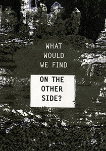
On the Other Side 4 x 5.5"; 24 pages. Two-sided accordion, folded lengthwise to permit the accordion to be turned inside out revealing dual readings. Instructions for viewing printed on interior of case. Silkscreen and letterpress printed, with die-cut windows and accordion binding. Signed and numbered by the artists. Laid in a four flap paper cover with slip and slot closure, window cut out to view title. WSW: "On the Other Side is a collaborative work between French artist Claire Fouquet and American book artist Patty Smith that addresses issues of emigration. The concept originated as a response to the fences built by the United States to keep out illegal immigrants and by the French government’s policy on immigration. "The book is a two-sided accordion with the recto side listing the fears that might be experienced by the emigrant. The cut windows entice the viewer to turn the concertina inside out. The verso side describes potential advantages, opportunities, and joys that might lead one 'to appreciate the unfamiliar.' The work is also a comment on internal anxiety that prevents us from moving forward in our personal lives. Some obstacles, seemingly threatening and impossible to surmount, may be the product of our fear of failure or the unfamiliar. These illusions, manufactured by uncertainty, can be transcended through personal resolve and collective effort." |
|
Shoot to Kill 11.75 x 17.5"; 20 pages. Silkscreen. Spiral bound with covers of corrugated cardboard. WSW: "Images of targets found at police firing range are paired with words which record/question/critique the use of guns in our society." |
|
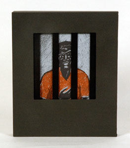
| Stories Behind Bars By Tona Wilson Rosendale, New York: Women's Studio Workshop, 2010. Edition of 50. 8.5 x 10.25"; 64 pages. Silkscreen printed on Stonehenge warm white and Dur-O-Tone. Four pamphlets, 16 pages each. Housed in a cloth covered slipcase with cutout like a jail's barred window. Women's Studio Workshop: "Stories Behind Bars was inspired by the author's job as a Spanish interpreter in the US courts. It consists of four individually bound silkscreen printed booklets: in one, a young man is deported using video teleconferencing, another gives some brief history of immigration detention, and all tell stories of immigrants in U.S. prisons and jails. The stories give the reader an insight into the complex issues surrounding the immigration debate." Tona Wilson: Gained in Translation," Ross Rice. Roll Magazine. March 2010: "A single box will hold four pamphlet-stitched sections of the book—which is really more like a hand-drawn graphic novel, to be accurate—with prison bars in the window on the box's front. Through the bars, a portrait can be seen on the cover of the sections, each of which tells that person’s story, as well as others. 'It deals with jail and prison. It was originally going to be (about) prison in general, but obviously my experiences with immigrants (added to it). This is going to sound really dry, but (it’s now about) the "‘immigration consequences of criminal convictions."' Once seen through the bars, the books can then be manually examined and experienced ... "Without her beating you over the head with them, Tona makes her feelings about immigration justice understood. But when asked directly, she firmly replies: 'I would like to see more humaneness in the treatment of immigrants. That’s a general thing. I’d like to see actually more discretion (in sentencing) for people who are in deportation proceedings. I’ve seen even the judges complain that they don’t have any discretion anymore. I’d like to see ICE (U.S. Immigration and Customs Enforcement) treat people better, and in a more honest way.'" (Out of Print) |
|
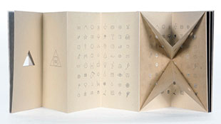
| Taxonomy of Shapes By Pandey Radha Rosendale, New York: Women's Studio Workshop, 2015. Edition of 50. 10.16 x 20.32cm; 16 pages. Letterpress printed on Sakamoto and Kitikata papers. Die cuts, encaustic, pop outs. Case bound. Signed and numbered by the artist. Colophon: "What would our world look like if everything around us from slices of pie to octopodes were identified and categorized according to three simple geometric shapes? Taxonomy of Shapes does just that, and questions the arbitrariness of our current system of classification." WSW: "Taxonomy of Shapes challenges the readers' perception of their environment and current systems of scientific classification. The book represents elements from both natural and man-made environments with hand-drawn icons. Hand-waxed translucent overlays use geometric cut-outs to organize the items according to circle, square, and triangle forms. Taxonomy of Shapes introduces a new system of classification in which we find that a mountain is in the same category as a nose, a slice of pie, and a bunch of grapes." Lizz Thabet, WSW: "Radha Pandey, an Indian-born book artist and papermaker whose love of materials, technical precision, and fascination with nature drive her work. She continues to explore human relationships to the natural and manmade world in her newest book, Taxonomy of Shapes. … (SOLD/Out of print) |
|
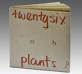
| twentysix plants By Susan Mills Rosendale, New York: Women's Studio Workshop, 2013. Edition of 50. 8 x 8.75"; 24 pages. Handmade paper. Digitally cut. Letterpress printed. Non-adhesive linkstitch binding. Signed and numbered by the artist. WSW: "twentysix plants is literally 26 pages of paper handmade from 26 everyday plants grown or foraged at the Women’s Studio Workshop ArtFarm. The names of the plants are digitally cut out from each page to make the text/image and the pages nest one into another, without glue, to make a paperback book. The book references Ed Ruscha’s iconic road book ‘Twentysix Gasoline Stations’ – a slim and elegant paperback. ‘twentysix plants’ is rough and chunky and celebrates standing in one place. " Jenn Bratovich, WSW article: "In Susan Mills’ newest artist’s book — comprised of 26 sheets of paper hand-made from 26 different fibers — no two pages are alike. Some sheets are coarse, like peony; others, like rhubarb and leek, are smooth and even. Burdock resembles a healthy smoothie stippled with variegated greens, while kenaf has delicate hairlike fibers running throughout. "Susan spent her Artist’s Book Residency in November and December producing the labor-intensive and unique book twentysix plants, which directly references Ed Ruscha’s Twentysix Gasoline Stations. Minimal and literal, Twentysix Gasoline Stations contains 26 photographs of gas stations along Route 66, meditating on sequence, banality, and seriality. "'Twentysix Gasoline Stations is a road book from the perspective of a lone American cowboy with a car; twentysix plants is about staying in one place,' explains Susan." (SOLD/Out of Print) |
|
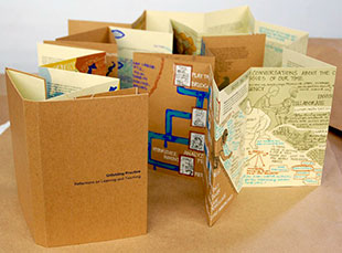
| Unfolding Practice: Reflections on Teaching and Learning | |
By Arzu Mistry and Todd Elkin 7.875 x 5.25"; 56 pages. Double-sided accordion. Hand- and laser-cut. Silkscreen and digitally printed on Construction Cement Green and Brown Box Kraft French Paper. Helvetica Neue 9 point type. Numbered. Signed by the artists. WSW: "Unfolding Practice: Reflections on Learning and Teaching is a conversation between two artist-educators. Flowing across five chapters, the double-sided accordion book has been curated from ten years of recorded conversations, field notes, planning, sketches, reflection, and teaching. The front of the book weaves text, illustration, cutouts, and screen prints, journeying through artistic process and educational practice. The back of the book is a guide, expanding on the practice of using accordion books as a tool for capturing, visualizing, and building upon reflective thinking. The brown paper alludes to the craft paper that is ubiquitous in schools and captures process more than the preciousness of a final product. " Colophon: "This book is a collaboration between Arzu Mistry and Todd Elkin. The prototype was developed collaboratively dring a residency at the Montalvo Arts Center [Saratoga, CA] in July 2015. The book has been designed, printed, and assembled by Arzu Mistry at the Women's Studio Workshop." |
|
What's Happening with Momma? 6.25 x 11.5 x 2" closed; extends to 38". Multiple accordion structure: a larger horizontal structure of 6 panels and 6 vertical accordions affixed to the horizontal panels of 8 panels each. Silkscreen and letterpress. Housed in a clear plastic box. This dimensional, house-shaped book literally unfolds to tell an autobiographical story full of pain and confusion from the author's childhood. Clarissa Sligh, Making Artist's Books (2002): "The emergence of a memory of a younger sister being born at home set into motion the making of What's Happening With Momma? It seemed like a simple idea, but while building and combining text with photographs, I found myself groping for the physical form it would take. "Making book dummies led me to realize that the container had to be a small safe space. But my biggest challenge was to create a structure that would also provide a way for the viewer to interact with the book in order to 'read' it. How could I evoke with photographs, mark making and text something of the way that the Baptist preacher and the gospel and rhythm and blues singers and musicians used repetitive, rhythmic fragments to elicit the audience response necessary for the satisfactory completion of their work? Here too 'the reader' needed to interact with the art. "After agonizing over it for months, I visited Keith Smith's home in Rochester, New York. There I saw a videotaping of a book artist, Susan Share, perform her book in order for it to be seen by the viewer. I knew immediately that her process of 'unfolding' was exactly what my piece was about. That night, a multiple accordion structure came to me in a dream. Waking up, I drew it in my sketchbook on the table beside my bed. The next morning I saw that it was the solution to the problem for which I had been searching. "Initially the book was made using a Van Dyke Brown alternative photographic process. Negatives were pieced together and contact printed for the house-shaped accordion structure. The interior accordion pieces, printed separately on a different paper, were cut, folded and adhered to the interior of the house structure with adhesive. Using these methods, I was able to make a very small and ephemeral edition. The following year, Women's Studio Workshop in Rosendale, New York, awarded me an artist residency fellowship. While there I made a different version of What's Happening With Momma? Ann Kalmbach guided me in strengthening the structure and in printing an edition of 150 books with silk screen inks and letterpress." |
|
Page last update: 05.11.2025
Home | About Us | Contact Us | New Arrivals | Fine Press & Artists' Books | Broadsides |Resource Books | Order/Inquiry
Copyright © 2021 Vamp & Tramp, Booksellers, LLC. All rights reserved.
