|
Spaceheater Editions ~
Arizona |
Share this page: |
| Philip Zimmermann: “I have been making artists’ books and multiples under this imprint since early 1979. I produce open-edition and limited-edition works that use photography, printmaking and design. Although I have been making photographs, books, prints, drawings, animations, and video since 1971, the main focus of Spaceheater Editions is the editioned narrative artists’ book. Under Spaceheater Editions (and several other press imprints) I publish my own books and posters as well as those of a number of exceptional artists. My own work deals with political, cultural and social issues in my life. The book form is an extraordinarily rich vehicle for investigating these concerns.” | |
| Work of other artists published by Philip B. Zimmermann | |
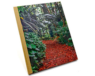
Accelerated Entropy Hand-bound hardcover. Signed and numbered by the artist. Philip Zimmermann: “’Accelerated Entropy’ is another in a series of books on climate change that I started in 2017 with the publication of ‘Landscapes of the Late Anthropocene’, followed by his 2023 book ‘Melt’. It has been published at the same time as another title with the identical format and similar climate change subject matter, ‘In the Desert’. This book uses a series of photographs of lush vegetation and flora that gradually decays and disintegrates by way of the use of various halftone patterns. The images get rougher and more dystopic as the book progresses. Included on a colophon page is a poem that uses prepress process and photomechanical terms to describe that decay. “Since I was in graduate school in the 1970s, I have been playing with halftone screens and using them as more than just a way to translate continuous-tone photographs to ink on paper. In those pre-digital days, everything was done photomechanically, using specialized half-tone screens and lithographic film and lots of hand skills. For part of my graduate thesis, I made a portfolio of portraits of various friends at the Visual Studies Workshop in Rochester, NY, and gave them different halftone treatments that roughly aligned with my perceived interpretation of their personalities. That portfolio was called Portrait Constructions. Later I published a 1984 book, Civil Defense, that was a dystopic comment on Ronald Reagan’s Cold War. The book’s images slowly disintegrated (by way of more and more discordant and larger halftone dots and patterns) as the book progressed. “In this current book, ‘Accelerated Entropy’, I have used a similar technique, but this time using contemporary digital methods, where the progressive computer-derived halftone patterns and various types of rasters, act as a metaphor for the damage and degradation that climate change is having on the grown environment. The original photos were all taken in the lush undergrowth of a rainforest in Oahu, Hawai’i in 2012. I wrote the poem … as a tongue-in-cheek name-checking device for both the disappearing vegetation as well as the old beloved taxonomy of vintage pre-press skills and techniques.” |
|
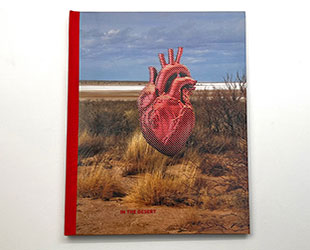
In the Desert Hand-bound hardcover. Signed and numbered by the artist. Spaceheater Editions: “’In the Desert’ is another in a series of books that Zimmermann started in 2017 with the publication of 'Landscapes of the Late Anthropocene', followed by his 2023 book 'Melt'. The title of this book comes from a famous poem by Stephen Crane, written in 1895. It is a dark poem often described as being about greed, human nature, and self-destruction. It seemed the perfect metaphor for the way the human race is ignoring the way we are slowly destroying our fragile and life-sustaining Mother Earth. “I visualized pictures of the Southwestern desert as an obvious choice to go along with the poem, and I recalled a series of photographs that I had taken in New Mexico in 2003 when I was on sabbatical. I located them and determined that they would work well with the poem. They were taken at Lake Lucero, a dry gypsum lake located in the White Sands Missile Range near Las Cruces. It is in a restricted part of the missile range and open to the public only a few times a year when National Park Service rangers take visitors holding US Passports on closed busses in to visit the dry lake. The dry gypsum crystals from the lake blow to the northeast and are the source of the famous white dunes in White Sands National Park. The park is located, as is the entire Missile Range, in the great Tularosa Basin. “In the last 125 years, there has been much discussion about the meaning of Stephen Crane’s’ In the Desert’. It is a dream-like parable that can be taken many ways, but the creature is most often interpreted as a primal version of mankind, located in a barren lonely landscape. Most analyses see the bitter heart-eating as a reference to man’s tendency to be self-destructive. Since the conceptual metaphor for this book is that humans have been short-sighted and self-destructive with how we have taken care of our planet, I prefer that reading to the one that some ascribe to it: that Crane is calling out his belief that human nature is ‘inherently sinful and corrupt’.” |
|
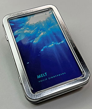
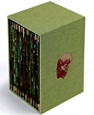
Melt Spaceheater Editions: “13 cm x 8.2 cm x 2.5 cm (5.125" x 3.25" x 1"). The 200-page self-covering smyth-sewn Melt was printed by one of the latest updated printing technologies, high-speed UV-cured inkjet. It was printed on a Komori Impremia IS29s digital press at Spectrum Printing in Tucson, Arizona. It is a new and improved version of that digital inkjet sheet-fed printing method that is not only very fast, but also light-fast, and uses stochastic imaging, which means there are no halftone dots. The finished prints rival or exceed the quality of high-quality offset lithography. The paper is Neenah Classic Crest, an archival sheet, using 80lb text for the text block and 100lb cover stock for the front and back cover. The folding, some of the foil-stamping, smyth-sewn binding, and corner rounding was by BindTech-Roswell in Phoenix, Arizona. Summary: “Melt” is the second in a series of four books on climate change. Although it is primarily about sea-level rise due to climate change, it is also a conversation with two different generative artificial intelligence entities, ChatGPT and DALL-E, both from OpenAI: one generates the text, the other the pictures. What results is an unsettling combination of wisdom from an artificial human creation talking into the void as the ice melts and sea-levels rise. Philip Zimmermann: "’Melt’ … is a small, complex hybrid book that comes in a metal box. Its theme is climate change in its two paradoxical manifestations: rising sea levels and spreading droughts on land. It uses a variety of interwoven media, from AI-generated images of melting icebergs, video stills of ice cubes liquefying in a glass, to maps of parched landscapes, ChatGPT-generated texts, and poetry. A description accompanying the book provides detailed information about the production process and its parameters. In this sense, ‘Melt’ is an example of a multimedia book that emancipates itself from the classic photobook and deals transparently and responsibly with the new challenges of AI. “The book is housed in a hinged metal case with a clear window, a tongue-in-cheek device protecting the book from water coming from melting ice. All of the ‘photos’ of calving and melting icebergs were produced by using the generative AI app ‘DALL-E’, from OpenAI. (The exception is the flip book images of ice melting in a glass which were derived from a stop-motion video that was taken on a 114 degree day in Tucson Arizona.) The Robert Frost text, the rather bad fake ‘Charles Bukowski’ poem, and almost all other text are from queries to ChatGPT 3.5, also an app from OpenAI, the generative AI text resource. I included the prompts as some of the text for the book. ChatGPT 3.5 was used since I started working on the book in December 2022, and ChatGPT 4 was not released until March of 2023. “The map images were scans of some cast-off University of Arizona Geography Department maps that Karen Zimmermann salvaged before they were thrown out. The maps on the right side of each spread were meant to be a counterpoint to the images of ice and water on the left. I do not currently live near the ocean or any body of water, but we will all suffer from the effects of climate change, and our most direct change here in the southwest where I live will be heat and drought...so completely different from sea-level rise but in a way complimentary and from the very same reasons. I wanted to have both worlds there on each spread, like two sides of the same coin. “The maps are all from very hot locations, Arizona, Mexico and parts of central Africa. I wasn’t so interested in the exact location but more the patterns and cartographic marks. Most important was the progression of the way the landscape became visually overwhelmed by heat, getting redder and hotter incrementally as the book progresses and the ice melts on the opposite page of each spread. “I have used a number of time elements throughout, not just by using the flip book of the melting ice. The background map images get warmer and warmer as the book progresses, as I mentioned. On the far left is a scale showing the rise in sea-level and the point at which each coastal city is overwhelmed, according to a Google-Generative AI beta-test module called SearchLabs. I assume that it is correct, although I know that AI is not always to be trusted. “Below the melting-ice flip book is a short flip-sequence with a snorkeler, who disappears as the flip-action progresses. I am a big aficionado of snorkeling, something that will disappear with sea-level rise since most shorelines (and fish and coral life) will all be completely overcome. On a recent trip to Costa Rica, we were scheduled to go out on a boat to do some snorkeling on a reef offshore. Because of shifting currents that were unusual for that time of the year, (and blamed on shifts caused by climate change,) the water was very cloudy and did not allow for snorkeling because of extreme low visibility. “The poem/song lyrics that runs though some of the book, ‘A Life on the Ocean Wave’, was written first as a poem by an American, Epes Sargent, on the Battery in lower Manhattan in 1838, at the dawn of the Industrial Revolution. That social movement helped start the greenhouse effect that contributes to climate change. A British friend of Sargent’s wrote music to accompany the poem shortly after. It became famous later as the iconic Regimental March of His Majesty’s Royal Marines. It seemed to contribute a note of irony that is, I hope, not too overwhelming.” |
|
Swamp Monsters 14.5 x 10"; 56 pages. Printed on newsprint paper. Full color in an unbound tabloid newspaper format. Photographs by Phil Zimmermann. Edit and design by Mike Slack. Phil Zimmermann, blog 09.30.20: "The year 2020 has been quite an earthquake for all of us living on this stressed-out planet. Aside from the terrible COVID-19 pandemic, we have been in the middle of the most unusual and stressful election cycle for president that this country has ever seen. This is thanks to the amoral, narcissistic, criminal conman who inhabits the White House. "In order to try to attempt to fight against his reëlection campaign and the morally bankrupt Republican Party, I decided to try to do something that would use their own 2020 Republican National Convention against these forces of evil and anti-democracy. "Here is the result: The Ice Plant (Los Angeles) and Spaceheater Editions (Tucson) announced the co-publication of 'Swamp Monsters' on September 21, 2020, just three and a half weeks after these photographs from the 2020 Republican National Convention were taken. "'Swamp Monsters' is a limited newsprint edition of 666 copies and commemorates that historically frightful 2020 Republican National Convention (August 24-27, 2020) with a series of photographs made by me (Philip Zimmermann) as the spectacle unfolded on the television screen. This rogue's gallery of hideous video portraits was printed in Paris, France by printnewspaper.com in full color in an unbound tabloid newspaper format." |
|
Trophy 7 x 7"; 52 pages. Perfect bound in illustrated paper-covered boards. Accordion (6. 5.75" closed; 9 pages) insert attached to back pastedown. Interior text block printed by HP indigo. Accordion insert at the rear of the book printed by archival pigmented inkjet. Printed on acid-free Mohawk Superfine paper. Signed and numbered by the artist on the back free end page. Spaceheater Editions: "Trophy is a reaction to the current social and political state of the United States of America and the criminal and immoral administration that currently wields the power in our country. Although superficially the subject matter is the cruelty of the Trump sons, their activities are an indicator of the worldview of the morally bankrupt family and administration of Donald J. Trump." In 2012 the Trump sons went big game hunting in Zimbabwe. The photos in Trophy are of the sons posing with their kills from the trip – an elephant, kudu, civet cat, and waterbuck. |
|
Celsius 233 |
|
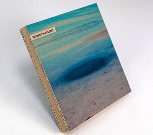
| Incident in Deseret By Philip Zimmermann Tucson, Arizona: Spaceheater Editions, 2014. Edition of 30. 8 x 8"; 30 pages. Printed by archival inkjet on uncoated oatmeal Speckletone paper made by The French Paper Company. Drum-leaf binding. Signed and numbered in silver ink on the back board by the artist. Prospectus: "The book is a slightly off-kilter investigation into the nature of faith and its relationship to scientific evidence. The interior narrative text is relatively straightforward but the covers hold other informational text in a circular or spiral manner that is not conventional. "Created as a series of two-page board-book spreads that minimize the visual distraction of a traditional 'gutter'. The edges of the book cover have text that goes around the entire book and includes some text that is set in a type face that is called Deseret, created by Mormons in the 1860s and abandoned after a few years." Philip Zimmermann: "On January 5th, 2014, seven book artists were in Salt Lake City to attend the national conference of the College Book Art Association at the University of Utah. A Nissan Armada SUV was rented and the group traveled to Robert Smithson's canonic land-art piece The Spiral Jetty, about an hour or two out of town in the nearby great Salt Lake. To commemorate the visit, it was decided that each of us who were there that day would create a book with the Spiral Jetty as theme, and complete it within one year – or earlier if possible. The only restriction would be that all books in the series would conform to a common dimension, 8 inches by 8 inches. Incident at Deseret is my contribution. The other participants are Clifton Meador, Karen Zimmermann, Robbin Ami Silverberg, April Sheridan, Daniel Mellis and Elisabeth Long. "I am fascinated by faith, and how so many religious people throughout the world are able to ignore what many would think of as logical thinking in order to make the leap to belief. In some ways, I admire that ability as it suggests a certain innocence and magical thinking that I am not able to summon up. The danger is when those folks start to think that they are the only people in the world able to communicate with god and travel the true path to heaven. I think of the location of the Spiral Jetty and Salt Lake itself as ground-zero for the Church of Latter Day Saints and the Mormon faith. Although my book uses terminology that comes from the LDS belief (picked due to the location of the Spiral Jetty) I could have just as easily have used nomenclature from any number of other world religions. Stylistically, I think of this book as the meeting of Jean-Luc Godard's Alphaville with The Book of Mormon. Deseret is the original Mormon name for Utah and was originally comprised of a large section of the American West that included not only Utah (and the Great Salt Lake where the Spiral Jetty is) but also large portions of Colorado, New Mexico, Arizona and California. Brigham Young's petitions to the US Congress to recognize this huge new state were turned down numerous times and eventually became what is now the current, much smaller, state of Utah. "Deseret was also a language and an alphabet system that was developed but never widely used during the 19th century by the Mormons. The title also gives a little nod to a classic western book that I was impressed with when I read it in high school, The Ox-bow Incident and another book (and famous short film) called An Occurence at Owl Creek Bridge." ww.diaart.org: "Robert Smithson’s Spiral Jetty, located at Rozel Point peninsula on the northeastern shore of Great Salt Lake. With the assistance of a team operating dump trucks, a tractor, and a front loader, Smithson created the sculpture in three weeks in April 1970. Over six thousand tons of black basalt rocks and earth were formed into a coil 1,500 feet long and 15 feet wide that winds counterclockwise off the shore into the water. In 1999, through the generosity of the artist Nancy Holt, Smithson’s widow, and the Estate of Robert Smithson, the artwork was donated to Dia Art Foundation." $275 |
|
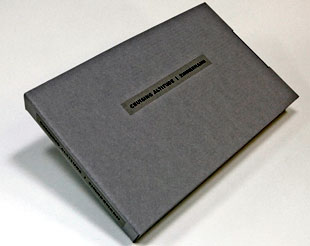
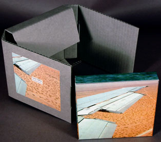
Cruising Altitude 8.5 x 5.25"; 108 pages. Dos-a-dos binding with each side having 54 pages. Double-sided book interiors were printed on an HP Indigo press. Gold and silver metallic foil titles on both covers. Bound by hand with archival book board and Kensington premium bonded red leather. Laid in an archival gray phase box. "A book about wanderlust, travel, and the quest for the exotic (on one side), and on the other, the subject is the darker side of being a stranger or foreigner in another country or culture. The section titled 'Above' explores the desire to travel away from one's normal and humdrum world, to see and experience the different and the exotic. Part of what drives wanderlust is an impatience with the everyday and the desire to expand or even destroy one's comfortable status quo. However, 'Below' (the other, mirror, section) is about the flip side of wanderlust. In this book the traveler or foreigner encounters a virulent and often jingoistic resistance from the inhabitants of the new locations that one enters as a visitor. Terms for 'the other,' usually derogatory or demeaning, appear over photographic views looking down from airplane windows. Living in Southern Arizona, on the border with Mexico, I am very aware of this viewpoint in some of the local population. In addition to the feelings that I have about this subject from my current living location, I was the child of an American diplomat, and although I grew up loving the many different places we lived, I never fit in to any of them, nor felt that any one of the places we lived was my home, always feeling like 'the other'." |
|
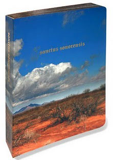
Sanctus Sonorensis 8.25 x 10.75 x 1.5"; 90 pages. Four-color offset lithography. Gilded edges. Self-covering. Philipip Zimmermann: "Four-color offset lithography printed book was created as a series of two page board book spreads that minimize the visual distraction of a 'gutter' on the panoramic view of each skyscape. The edges of the book are rounded and gilded in the fashion of religious breviaries or missals. "This is a book of border beatitudes. This work comments on the complicated attitudes of Americans on illegal immigration from Mexico. The cover shows a photograph of the area of Southern Arizona which is the most active in terms of migration across the Sonoran desert, and where thousands have lost their lives in the deadly desert heat. The interior pages show the progression of a typical high desert day from dawn to sunset with a single line of text on each two page spread." Zimmermann (Blog), March 8, 2010: "In December of 2002, I was driving back into the United States from Mexico through the Lukeville border road entrance. As I was traveling through the Organ Pipe Cactus National Monument just inside Arizona, I was stopped for a couple of hours by several groups of men each consisting of large number of heavily armed Border Patrol agents on some sort of special operations. They eventually lead out of the desert scrub a large number of illegal immigrants that had been hiding in the mesquite and cactus as they attempted to head north through the park. They clearly weren't drug smugglers. They looked too poor and were unarmed. They made for a rather moving and pathetic sight, and looked disheveled and dejected. I had never seen an operation like this up close and it was rather upsetting, and got me thinking about the life these folks were trying to make for themselves and the efforts that we in the United States make to prevent them from coming here. Sanctus Sonorensis was a work that came out of this experience." CJ Mace, review, JAB 27: "With gold-edged pages and title referring directly to a hymn of the Christian liturgy, Philip Zimmermann's book 'Sanctus Sonorensis,' is clear about its associations with the messages within gilded bibles. The main contrast between the structure of these books and Zimmermann's is the weight of the individual pages; while the pages of missals often rattle and are tissue paper-thin, the board-book structure of 'Sanctus Sonorensis' allows for the page and binding to merge into a seamless unit, and the pages turn silently. This silence suggests reverence and the apparent starkness of the Sonoran desert that forms the background photography, a landscape where light becomes sound in a sort of synesthetic radiance. ..." |
|
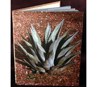
| Shelter By Philip Zimmermann Tucson, Arizona: Spaceheater Editions, 2009. Edition of 50. 11.25 x 8.5"; 52 pages. HP Indigo printed on Mohawk Superfine paper. Photographic images on boards with sewn binding. Variation of the floating hinge format creates a book within a book. Philip Zimmermann: "Shelter came out of an exploration of losing faith and questioning on of its opposites: the process of finding religion. This text came out of watching my dying father, who was never religious when I was growing up, become increasingly interested in faith and salvation as he became sicker from heart disease and cancer. I saw the desert with it's unfriendly flora and harsh environment as a metaphor for the difficult world towards the end of many people's lives. The desert is also used in many religious tracts as a place for contemplation and mortification. In this work roadside shelters and gospel ministries were used as signifiers of ways and places where people look (vainly?) to relive prospects of their approaching death." A wondrously complex book aptly suited for the knotty subject of dying (very much different than death and its aftermath). Turn the pages and cloud-laden skies, always with a gray cast, provide framework for an alternating chain of Southwest borderland secular shelters (Wayside Stops or Rest Areas in some parts of the US) and churches clad in the look of evangelism. Text at the bottom of most pages contains the tortured musings of a man with "the inevitable irritability that comes with a body surrendering to age," a man who would like "shelter and comfort: peace" both physical and spiritual. The book structure suggests that the comfort may be difficult or impossible because the beauty of blooming cacti is present but almost impossible to see. The final page contains the last lines from William Cullen Bryant's "Thanatopsis," a wish perhaps from Zimmermann to his father – no promise of an undiscovered country, but solace as a kind of shelter in the last moments on this side of the border. $850 |
|
Nature Abhors 5.25 x 5.25"; 30 pages in corrugated-paper fold-out box. Construction based on a model developed by Claire van Vliet from a form originally created by Hedi Kyle. Photograph on page six by Elizabeth Alderman. To be read through on one side, then on the reverse. Accordion-folded, each sheet affixed to the next with paper tabs illustrated with segments of spinal vertebrae. Housed in illustrated sleeve numbered by the artist. The whole housed in illustrated cardboard box also numbered by the artist. Signed by the artist. Philip Zimmermann: "In addition to being a great vehicle for communicating directly to an audience, artists' books have the wonderful advantage of being time-based like video and film. Static pictures on a wall seem and impoverished way of making an artistic statement after one works with sequence, rhythm, movement, translucency, narrative arc; the list goes on and on. I know I am biased: I have been in love with books ever since I was a small child, but the medium is so rich with possibilities that it is hard to go back to working any other way.... "My book entitled Nature Abhors is about loss, the inevitable by-product and, (perhaps pessimistically) the final result of love. In the past four years I have had a great deal of loss in my life. This book is a rumination on what loss has meant for me personally and also what I have found has been a more universal feeling of loss since 9.11. It is determinedly not about that disaster but more about the zeitgeist since that world-changing event ......." |
|
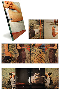
Long Story Short 10.5 x 8.5", 145 pages. Printed by offset lithography in Korea. Optical plastic title sheet. Fold-outs. Wire-o binding. Nexus Press: "Tells the story of early 50s American consumer culture through its own visual and verbal clichés. Quoted to abstracted, fragmented ways by means of extreme magnification of photographs (emphasizing and exploding the dots of the color separations) and jigsaw-like, segmented catch-phrases, the result is a poignant life-journey." Phil Zimmermann: "The book is semi-autobiographical. It uses images of hands as a connecting motif throughout the book. I have always found hands to be particularly expressive. For some time, I had had the idea of taking on the challenge of trying to tell a story through the use of aphorisms or truisms. The collection, editing and positioning of these little clichés so that they told a narrative story took a great deal of time yet was fun in the way that a puzzle is fun. "All of the images are from tiny sections of Look, Life, and other magazines from the fifties – the time period when I was born and was growing up. I wanted all of the blown up half-tone dots to be the same size, so I used a screen angle indicator to determine the line ruling of the originals and then used a calculator to determine the blown up size of the dots of the final image. I had a small rectangular mask that I would then place over the printed photo images to determine the crop. Then I scanned them in at very high resolution so that they could be blown up." |
|
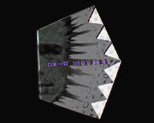
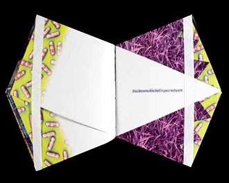
High Tension: Montage '93 5.5 x 7.9"; 96 pages. Pentagon with 4" spine and each of the other sides 4.25". Unmatched irregularly cut pages. Offset printed. Produced and printed for Montage '93, International Festival of the Image, Rochester, NY, 1993. Johanna Drucker, The Next Word: "The pages of [High Tension] are cut at the edge in that triangular shape. It's about anxiety, and it pricks your fingers as you turn the pages." Renee Riese Hubert & Judd D. Hubert, The Cutting Edge of Reading: Artists' Books: "[High Tension] overwhelms us with a surprisingly varied profusion of images. Each of the many double pages introduces at least one radically new picture having more often than not merely a marginal relationship with those that had preceded. We must process these words somewhat gingerly in terms of our own past experiences when immediate recognition fails. It would therefore appear that unpredictability characterizes the selection and succession of the graphics. Each new image has its own motif and its own color scheme. Dealing in its own way with representation, it imposes its own focus and its own scale to which the reader must adapt. Thus, each turning of a page practically guarantees a further disruption and reduces any hope that we may have entertained of discovering either a formal or a thematic continuity. Instead, it calls forth unsuspected resources within us. Surprise follows surprise without affording a moment of relaxation. Each page relentlessly renews the shock of novelty, but in so titillating a manner that we must dwell on each image without any desire to skip. The artist has of course abandoned or deliberately misapplied expected formats. The pages may overlap, but they never coincide with one another. Deviation happens on two levels: each page slants diagonally and, when turned, symmetrically prolongs across the gutter the preceding one. Thus, two successive pages point in opposite directions while jointly providing a partially coherent and integrated image — partially, because fragments of images from other double pages show a propensity to migrate or, if we may use a medical term in describing a pictorial and psychological venture, metastasize. As we move along, we can hardly avoid twisting and turning the book around for successive viewings of the double paged pictures. Obviously, we can no longer rely on the measured progress so characteristic of reading. Moreover, the angularity of the pages greatly increases the nervous energy of their graphic and verbal content. ..." |
|
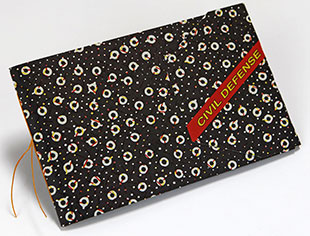
Civil Defense 5 x 8" closed, unfolds to 23.625". Printed offset in four-color plus white on a pale gray paper. Text, appropriated images, patterns reproduced in exaggerated dot screen. Saddle sewn with wrap covers. Phil Zimmermann: "In late 1983 I decided that I wanted to do a book that reflected the upcoming Orwellian year of 1984. The cold war was still at its coldest and most frightening. Ronald Reagan uttered the now famous words at a microphone that the USSR should not worry, the bombers were already on their way to hit the Soviet Union. He meant it as an adlibbed joke, but many of us thought that it was a Freudian indicator of his true feelings about the bomb and the Soviet Union as the Evil Empire. It would be hard for the youth of today to know how scary many people felt the times were there. I participated in a huge Ban the Bomb rally in Manhattan during the summer of 1983. No one remembers this million person peace demonstration today. But ‘Civil Defense’ was born in those times. “Although one cannot really see it, the book is printed in process four-color plus white on a pale gray paper. Any hoped-for chiaroscuro effect from using the white ink on the gray paper was sadly not achieved. "The book was about the paranoia of an advancing radioactive cloud approaching an inhabited area (the Hudson Valley where I lived) and the uselessness of trying to escape the radioactivity. I used a mechanical device of disintegrating and steadily enlarging halftone dots and patterns to show the increasing radioactivity. By the end the page images have become almost atomistic and unreadable because the scale of the dot components making up the image is so large . Tiny little boy scout icons futilely signal SOS.“ |
|
| Philip Zimmermann, blog: "During the summer of 2012, Spaceheater Editions published three books not by me, plus another book that I produced with the collaboration of Mexican writer and media artist Leon de la Rosa." | |
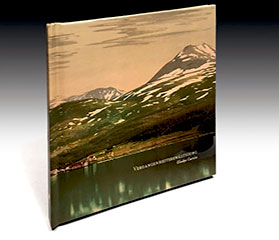
Vergangenheitsbewältigung "Gladys Estrellita Garcia was born and raised in Texas ... She has a BFA in Visual Communications and a BA in Spanish from Northern Arizona University." |
|
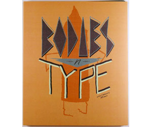
| Bodies 'n' Type written & illustrated by Jeff Lowry Tucson, Arizona: Spaceheater Editions, 2012. Edition of 150. 8.25 x 10.25"; 32 pages. Exquisite corpse structure, each page cut in thirds. Printed on archival paper by HP Indigo digital printing. Spiral bound. In chipboard protective sleeve. Signed and numbered. Philip Zimmermann, publicity card: "A wonderful quirky update on the classic flap-book, also know as an exquisite corpse book. Both sides of the pages are used to great effect." Philip Zimmermann, blog: "Bodies 'n' Type by Jeff Lowry is a flap book, also called an exquisite corpse book, after the Victorian parlour game. It is two- sided: on the left is type that combines to make different sentences that relate to the images on the right side of each spread. The wonderful quirky characters that Jeff has created for the right side are often humorous and sometimes touching and make wonderful combinations." $50 |
|
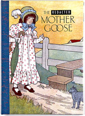
| The Redacted Mother Goose By Robert E. Wilson II Tucson, Arizona: Spaceheater Editions, 2012. Edition of 150. 5.25 x 7.25"; 32 pages. Printed on an HP Indigo digital press. Gold-foil stamped title on front cover. Codex bound with cloth spine and illustrated paper-covered boards. Signed and numbered by Wilson. Colophon: "This book is a small collection of stories taken from the 1916 The Real Mother Goose by Blanche Fisher Wright. Having been in print for almost 100 years - the most recent printing taking place in 1992 - The Real Mother Goose has influenced the lives of children over many generations. This book explores the evolution of language and image under contemporary connotations by obstructing and omitting portions of the original stories. The end goal of this remixed and redacted edition is to create a slightly different narrative calling on the linguistic differences created in the 100 year time span." Philip Zimmermann, blog: "The Redacted Mother Goose by Rob Wilson. This is a special redacted version of the venerable anthology of Mother Goose rhymes with illustrations by Blanch Fisher Wright, created in 1916, and in the public domain. Rob's redactions and blurred areas of the images completely change the innocent meaning of the original rhymes and pictures. His dedication reads: for changing times and changing meaning." $45 |
|
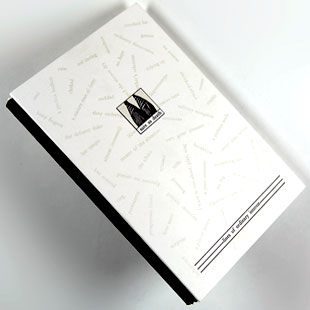
| Sure As Death By Willyum Rowe Rhinebeck, New York: Spaceheater Editions, 1986. Edition of 500 planned but about 150 actually printed. 4.75 x 7.25"; 72 pages. Printed offset lithography. Smythe sewn. Bound in printed boards and printed end pages. Cloth spine with titles foil stamped. Signed by the author. Numbered. Philip Zimmermann: "The book is about the onset of the AIDS epidemic. Willyum Rowe cut up an old Victorian book and rearranged the type and pictures to make a poetic and tragic story about the decimation caused by HIV in the gay community in the early nineteen eighties. With different subject matter, Tom Philiplips did similar things with his book Humument, but unlike Philiplips' book, which was originally a screen-printed unique copy, later reproduced to make a book, this volume was always designed to be an offset artists' book. "Printed by offset lithography by Kevin Begos Printing in Rhinebeck, NY. Cased-in by hand by Philip Zimmermann in an edition of 500, though only about 150 were actually bound because of production problems. Because of press issues most of the beige second color was misregistered. The book was smythe-sewn by Fort Orange Bindery in Albany NY. (I added foil-stamped spine material and then cased in the books.) At the time that I made this book, no one I knew had ever seen this type of binding with the boards set back away from the separate spine material. I had seen a copy of a book like this at the Newberry Library in Chicago that had been bound in Germany in the 1930s. By now this type of binding has almost become a cliché but at the time it seemed quite radical." $60 |
|
| Spaceheater Editions SOLD / Out of Print Title: | |
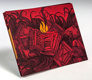
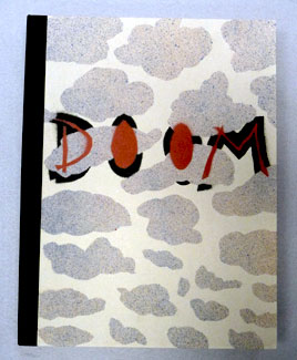
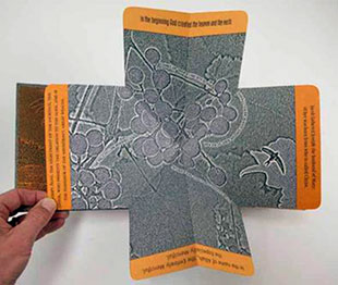
| Book of Doom By Clifton Meador Rhinebeck, New York: Spaceheater Editions, 1984. Stated edition of 50 (35 actual). 10.5" x 14" closed, 18" x 25" when fully opened. Hand-cut stencils. Pin-registered spray enamel paint on Rives BFK paper. Bound by Philipip Zimmermann with an accordion spine strip. Housed in a custom spray-painted clamshell box. Philip Zimmermann: "Spaceheater Editions published Clifton Meador's BOOK OF DOOM during the summer of 1984, in Rhinebeck, NY, USA. Clif used multiple pin-registered hand-cut stencils to spray enamel paint onto Rives BFK paper. The edition was to have been 50 but only 35 were made. Clif did all of the spraying. [I] made most of the boxes and did all of the bindery work. "Clif's text and images tell a tale of an end-of-millennial apocalyptic journey into the depths of hell. When the pages are flipped over at the end of the book, it forms a downward spiral that is very reminiscent of the circles of Dante's Inferno. "Clifton Meador writes: 'The initial impetus for this book was to complicate the experience of reading a book through an intricate sculptural experience. Like many other artists, I was interested in thinking about a book as a kind of performative sculpture, a complex structure that the reader has to manipulate in order to read it. I wanted to start with a simple story, so I could make the form as complicated as possible while maintaining a narrative thread. It was 1984, so I imagined the end of the world might be an interesting story to complicate. "The governing visual idea was that when the reader had finished unfolding all the pages and the book was completely open, the book structure would resolve into a mandala, with all the pages contributing to a final image. Since the book was about the end of the universe, an apocalypse of plastic and radios, I found medieval manuscripts were an important visual source for this work, and a Spanish-Mozarabic Apocalypse of the tenth century was a particularly rich source of color, pattern, and a flattened sense of space. "At the time I made this book, I had no access to printing equipment, so I produced the edition with pin-registered stencils that I sprayed with four colors of spray paint. When I started this project, I hoped I might be making positive plates from the spray paint separations, but the richness of the spray paint alone convinced me to produce the edition that way. Philip Zimmermann was very supportive of this project, and published it under his Space Heater Editions imprint. The clever spine structure that holds the page units together was an invention of Keith Smith, who took one look at it and saw the right way to put it together.” (SOLD/Out of Print) |
Additional features of the book can be seen in this video link: |
Delirium 37cm x 28.5cm x 1.5cm (14.5" x 11.25" x 5/8"); 60 pages. Printed by archival pigmented inkjet onto Mohawk acid-free paper. Text font: Northwoods, by Cultivated Mind Foundry in Vancouver, BC, Canada. Housed in an archival, protective, phase box. Handbound by the artist, and signed and numbered. Philip Zimmermann: "In 1866 Fyodor Dostoyevsky published ‘Crime and Punishment’. Towards the end of the book, his hero, Rodion Romanovich Raskolnikov, has a feverish dream. This strangely prophetic text, quoted and used as the narrative line in this book, is from Richard Pevear and Larissa Volokhonsky’s 1992 translation, published by Vintage Classics.” The text starts: “He had dreamed that the whole world was doomed to fall victim to some terrible, as yet unknown and unseen pestilence spreading to Europe from the depths of Asia. Everyone was to perish, except for certain, very few, chosen ones…. “During the early days of the pandemic, the news media and print and online media, started producing illustrations of what a coronavirus looked like. This came from an understandable public thirst for information about how this deadly virus and how it worked. Many of the images produced were stunning: surprisingly lush and jewel-like. The colors used were often saturated and seductive. “At the same time, columnists and essayists started publishing references to previous historic pandemics that humanity had survived. We looked to these stories of the past for solace and hope. Many had not heard about even the most recent global epidemic, that of the great influenza pandemic of 1918-1919 that had killed many of our grandparents or great-grandparents –including the grandfather of the 45th president of the USA. We read these articles and books to create context for the current spread of COVID-19. There were many examples cited of the numerous plagues of mediaeval times like the bubonic plague also known as The Black Death, which killed half of Europe. But the historical record went back much further, with classical references to The Great Plague in Athens in 430 BCE and The Justinian Plague of 542 CE. Newer books like Albert Camus’ The Plague, and recent movies like Contagion and Outbreak scared us, and were objects of fascination. “But the text cited above, one small paragraph from perhaps the most famous of Dostoyevsky’s novels, struck me as the most startling if for no other reason than it’s prescience. As I was looking for a text to use for the visual book I had started working on, this one seemed the most powerful and apropos. “The manipulated images I used were collected from the web during the first four months of the pandemic. As I mentioned above, they were originally made as small web illustrations to show the public what the coronavirus looked like. The original illustrations were then significantly manipulated and changed in color, and by being converted to large half-tone patterns. This was done by separating the four CMYK layers into discreet channels, converting each file into different dither or halftone patterns, and then reassemble them back into a new file with the four process colors. “The narrative text is driven by Raskolnikov’s delirium, his fever dream. I wanted the large full-bleed images to be the theatrical visual accompaniment to that short text: hallucinogenic and furiously color saturated, and using the highly lurid language of a feverish nightmare.” The Stuff of Dreams ‘ Artist’s Books Unshelved (SOLD/Out of Print) |
|
| Insult Toolbox By Abbey Withey Tucson, Arizona: Spaceheater Editions, 2012. Edition of 100. 3.25 x 7"; 100 pages. Pages each split down the center. Double spiral bound at right and left edges. Spiral bound into paper folder wrap with slip and slot closure. Hand-bound. Numbered. Publicity card: "A practical and funny book about what to say when confronting a situation that requires strong and immediate verbal response." Philip Zimmermann, blog: "Insult Toolbox by Abbey Withey is a book that allows you quick reference to an endless combination of insults that you can hurl at the appropriate person in any situation that requires it. ... Warning: has explicit language." (SOLD/Out of Print) |
|
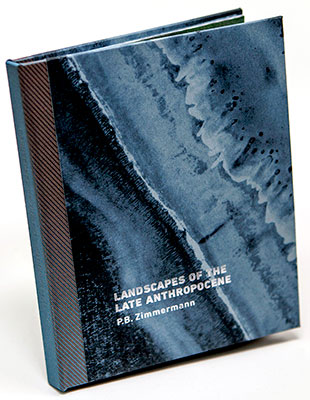
Landscapes of the Late Anthropocene 4.5 x 5.5"; Text block printed by offset at the Center for Book and Paper at Columbia College Chicago on their Heidelberg GTO. Printed done by Brad Freeman and his Columbia College Book & Paper graduate students. Bound in hard cover boards with end sheet pastedown. Covers and end sheets printed by Philip Zimmermann using pigmented archival inkjet. Foil-stamped on the cover and blind embossed title on the spine. Includes information pamphlet of 8 pages. Book signed, numbered and dated by the artist. Zimmermann combined three different interests to make a compelling book about climate change – the rising sea levels, airport control towers, and language. Phil Zimmermann: "Due to a general public concern about climate change, most people have become aware of the term 'anthropocene.' It’s a word relating to or denoting the current geological age, viewed as the period during which human activity has been the dominant influence on climate and the environment. For the last two years I have been thinking about a way to make a new artists’ book related to the issues that prompted that term 'anthropocene.' "When I thought of a sea level rise of two hundred feet and what that could mean in terms of our cities and our society, the future seemed incredibly bleak. For the landscapes in the book, I decided to create a dystopian set of images that hinted at a future watery world, one where the remnants of civilizations lived in armed and guarded towers, growing their food in vertical farms inside these towers. The rest of the world population would have mostly died off. Marauding remnants exist in small groups that would try to gain entrance into these armed tower structures. The backgrounds of these images were built using scans of steel engravings from several 19th century books. I used photos of water and waves to make the foregrounds. … The goal was to create a series of images of a forbidding and lonely watery world, one that was austerely beautiful but scary and thought-provoking "About two years ago I read an online article by Sarah Zhang, entitled 'The "Harvard Sentences" Secretly Shaped the Development of Audio Tech.' The article was about a fascinating subject, the creation of a series of text lines that were used to test the fidelity of spoken words when broadcast over military and civilian radio transmitters. What ended up being 720 lines of text started as a series of short sentences that were meant to test the accuracy of military communication systems towards the end of the Second World War. … What I found especially interesting about these 720 sentences –72 lists of ten sentences each– is that they are mysteriously poetic and timeless. But they can also be thought of as metaphor for determining (or not) meaning from the static, transmitted signal from noise. We, as the populations and governments of planet earth, certainly have not yet registered the dire warning message of global warming. "For the duotone pages I used two sets of images. For the blue background, I used Google earth satellite views of water and shorelines, printed in that deep blue Pantone color. NOAA images of maritime depth charts were used for the silver depth numbers and contour lines. Editing and selecting the Harvard Sentences was a great deal of fun. There were so many that I felt had poetic resonance with the subject matter, starting with the initial text line, 'There is a lag between thought and action' which seemed the perfect way of describing where we as earthlings are in regards to climate change." |
|
Paradise Lost “My given cards were:
“The tropical plant images used throughout were taken on Oahu, Hawai’i during the month of December 2012.” |
|
Reaper "The text that I wrote attempted to make a very short poetic version of this idea that would, I hoped, seem more generalized and universal.… "I tried to make the images in the book somewhat universal, hoping to evoke a timeless sense of the cycle of conflict and I attempted to include the faint hope that eventually, we may achieve some sort of resolution to this destructive cycle. I made a number of attempts to 'treat' the images so they looked more like images set in some sort of granite-like stone. I was inspired by the look of photocopied photocopies where each new generation starts to become more and more textured and deconstructed." |
|
Page last update: 02.04.2025
Home | About Us | Contact Us | New Arrivals | Fine Press & Artists' Books | Broadsides |Resource Books | Order/Inquiry
Copyright © 2021 Vamp & Tramp, Booksellers, LLC. All rights reserved.
