
|
Red Butte Press ~
Utah |
Share this page: |
| Marriott Library: "Established in 1984 when premiere Bay Area printers, Lewis and Dorothy Allen offered an 1846 Columbian hand press to the J. Willard Marriott Library, Red Butte Press honors and extends the traditions of fine press printing, producing finely crafted, limited editions." | |
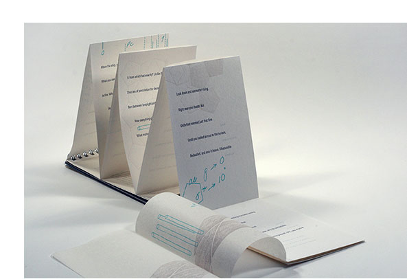
invisible shores 5 x 6"; 8 pages. Double-sided accordion. Photography, design, letterpress & digital printing, and binding completed collaboratively by Crane Giamo, Allison Milham, Hailey Rabdau, Marnie Powers-Torrey, Amy Thompson, and Emily Tipps. Numbered. Signed by Dubrasky. Belly band closure. Deluxe version includes a CD of Valley of Enchantment. In slipcase. Invisible Shores was produced at the Red Butte Press and released at the premier of Valley of Enchantment by Mark Dal Porto, performed by The Orchestra of Southern Utah on February 23, 2017. Danielle Dubrasky, Red Butte Press blog: "?As a Virginia native but a long-time resident of Southern Utah, I have written many poems layering the southern landscape of my childhood against the high desert of Cedar City outside my front door. When the Orchestra of Southern Utah commissioned composer Mark Dal Porto to write an original composition inspired by the National Parks, he requested that the OSU contact a poet whose work reflected the landscape of the local region. I corresponded with Dal Porto, sending him poems with imagery of the Great Basin that surrounds Cedar City, and he subsequently selected poems he thought would work best. I listened to his composition, pulled short excerpts from my various poems, and matched them to specific moments in the piece. "The compilation of the poetic fragments that correspond to Valley of Enchantment by Mark Dal Porto is unique to that collaboration. However, I thought it was important to have some of the original key poetry also available – thus, the beautiful artists’ book by Red Butte Press, Invisible Shores. Two poems that Dal Porto selected are published in their entirety in Invisible Shores: 'Great Basin' and 'Metamorphic.' The title of the book refers to the Permian sea that once covered much of the southwest, traces of which exist in the Great Basin through sedimentary rock and fossils. However, it also alludes to my own experience of leaving behind the east coast after my father’s death when I was 18 and moving to the desert. Utah-based artist Marnie Powers-Torrey, another 'transplanted' southerner having grown up in South Carolina, brought her own sense of place to the images. And she unexpectedly documented a moment in Cedar City history – the Shirts Canyon wildfire that burned 1500 acres in October 2016. These poems are part of a larger manuscript that explores the intersections of Utah geology, communal history, and personal narrative. This collaboration of art and poetry has inspired me to expand further the idea of landscape and metaphor – what lost places do we carry in our memory that transform into symbols over time?" Danielle Beazer Dubrasky is the director of the Grace A. Tanner Center for Human Values as well as an associate professor of Creative Writing at Southern Utah University. She is the poetry editor for Contemporary Rural Social Work and has worked with a research team at Southern Utah University to develop a curriculum for poetry therapy in groups. |
|
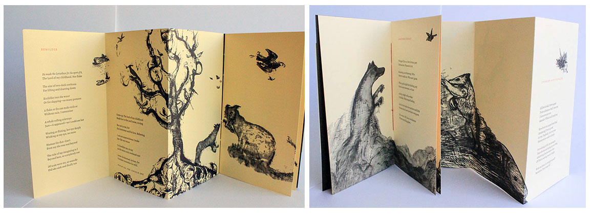
Stranger & Stranger 4.9 x 8.9"; 16 pages. Digitally set in open-source Alegria Sans and Alegria Roman. Printed from photopolymer plates on a Vandercook Universal 1 proof press. Text pages and outer cover are Arturo Cover; inner cover is Mohawk Loop Antique Vellum. Three-section long-stitch binding with an integrated accordion. Signed by both artist and poet. Numbered. Red Butte Press: "'Stranger & Stranger' is a result of the collaboration and friendship between poet Katharine Coles and painter Maureen O'Hara Ure, both University of Utah professors. Working alongside one another, the two have maintained an artistic dialogue for 25 years, sharing and responding to works in progress and periodically exhibiting together. In 'Stranger & Stranger', visual and textual beasts intermingle and romp on the page, inhabiting illustrated and reader-envisioned water, air, and landscapes. Imagery for the bestiary was extracted from Maureen's paintings, translated for letterpress printing into photopolymer plates, and arranged in dynamic interaction with Katharine's poems. These selections from an imaginary bestiary were drawn from North and South American, Asian, European, and particularly Byzantine art; from the rarely accurate bestiaries created by early explorers of the New World; from encounters with animals both homely and nonhomely; and from the co-creators' own strange minds. "The title—which begins on the back cover, crosses the spine, and continues on the front cover—is partially obscured by an outer flap (like a creature sheltering under a leaf). The flap frames two animals, snouts aimed at the fore-edge as if to suggest the opening. Inside the book, the rubrication of the poem titles alludes to a tradition of medieval manuscripts, including bestiaries, a popular convention of the time. Yet while acknowledging historical convention, this bestiary also breaks from it. Rather than presenting a one-to-one correlation between illustrations and text typical of a catalog of beasts, in 'Stranger & Stranger' image and text interact organically to form a web of connectivity throughout the book. The poems do not explain the fauna so much as revel in bewilderment." |
|
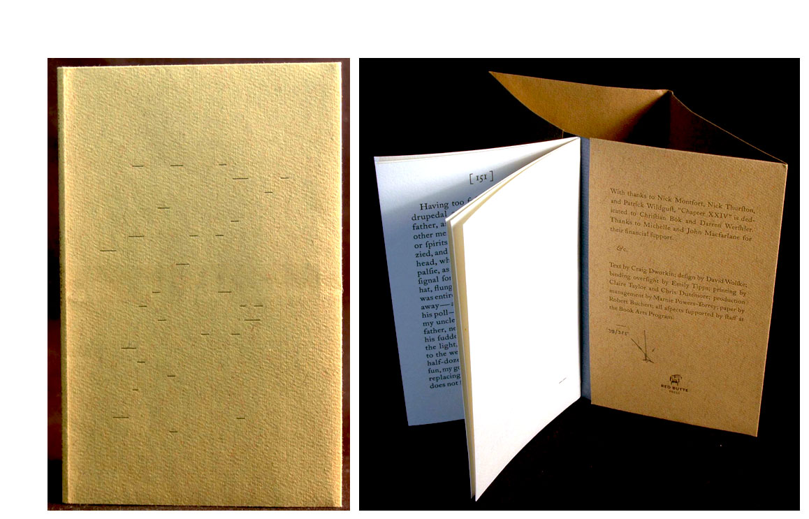
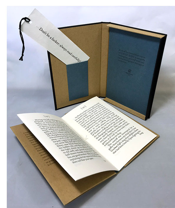
Chapter XXIV "A jump in pagination confirms Chapter XXIV is missing. Coinciding with the 300th anniversary of Sterne’s birth, here is the absent chapter—a single signature designed to fit neatly into the first edition (R & J Dodsley, 1761). Craig Dworkin’s interpolated text uses all historically consistent English words in which the letters f and s can be interchanged and result in a legitimate word. Each sentence is based on grammatical constructions found elsewhere in Sterne’s novel. "The type, ITC Founders Caslon, includes seven pre-existing ligatures and seven bespoke long-s ligatures created by the book designer. The project was letterpress printed from photopolymer plates on handmade paper including a custom Red Butte Press watermark. A typographically illustrated cover utilizes the placement of each dash that appears in the text and externalizes the 18th century typesetters’ practice of using any available foundry dashes. The varying dash length and humorous interplay of the letters f and s call attention to potentialities of punctuation, spelling, and meaning." |
|
| Problems of Description in the Language of Discovery: | |
| with apologies to Gilliam Beer, from whom I stole this title, and to Ken Golden, mathematician By Katharine Coles University of Utah: Red Butte Press, 2012/2013. Edition of 275 plus 26 lettered copies. 4 x 6" wire bound at top with sanded Mylar cover. Printed on Zerkall Frankfurt and Arturo papers with Minogami flyouts. Artwork by Mary Toscano. Signed by author and artist. Red Butte Press: "Katharine Coles, Guggenheim Fellow, University of Utah literature and creative writing professor, and former Utah Poet Laureate, wrote Problems of Description during a research trip to Antarctica, where, funded by a grant from the National Science Foundation, she worked and lived alongside scientists and engineers. Among these were a group of researchers from the University of Utah, including mathematician Ken Golden. Golden's rule of fives examines intersections between the temperature, salinity, and permeability of sea ice, and has been used to discern key data relevant to climate change. Coles's text engages with the rule of fives, and explores the language and apparent magic inherent to scientific discovery. A gloss, extracted from the researchers' handwritten Antarctic field notebooks, interlaces the primary text of the poem. The gloss's composition mirrors the process of percolation and embodies the concept of dialogue between disciplines and their respective dictions. The book's wire binding and sturdy Mylar cover allude to field researchers' weatherproof notebooks. Fully extended, the vertically oriented accordion resembles an ice core, and translucent flyouts and overlays reveal content as through layers of ice. "Problems of Description was produced in its entirety by Book Arts Program staff and University of Utah colleagues: Creative Director David Wolske designed the book in tandem with artwork by Mary Toscano, who drew from the same scientific field notes as the poet. Claire Taylor acted as lead printer, assisted by John Thorp, Chris Dunsmore, and Becky Williams Thomas, MFA candidates in creative writing and book arts, along with studio assistant Emiline Twitchell. Text set in Univers 47 and Chaparral and art were printed from polymer plates on Zerkall Frankfurt, Minogami, and Arturo. The cover was laminated using Don Glaister's sanded MylarÆ technique. Emily Tipps oversaw binding of the edition, completed by assistant printers and Book Arts Program staff, with help from students in the fall 2012 bookbinding course. Marnie Powers-Torrey directed production and lent a hand or eye as needed." $165 |
 Click image to enlarge |
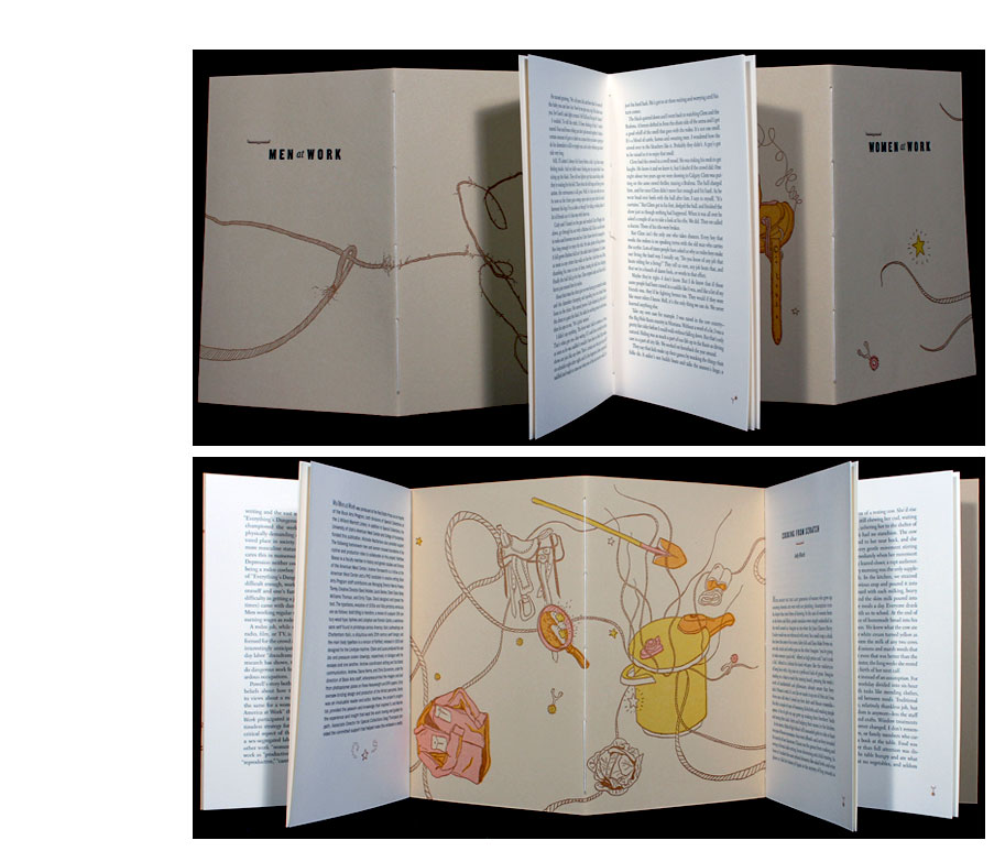
| Wo/Men at Work By Book Arts Program Staff at the University of Utah Salt Lake City, Utah: Red Butte Press, 2011. Edition of 200. 6 x 9"; 32 pages. Letterpress printed imagery and text from photopolymer plates. Printed on Rives Heavyweight and BFK papers. W-fold pamphlet binding. This is the first Book Arts Program imprint from Red Butte Press. Information from the book's introductory essay by Matthew Basso and Andrew Farnsworth: Wo/Men at Work is one part of a major and successful rescue operation. In 1940 under the auspices of the Federal Writers' Project "a left-leaning critic" Harold Rosenberg assembled thirty-four pieces of writing that were first-hand reports about work in the US. The title he gave the collection – Men at Work – is as dated as it is accurate in reflecting the project's – and probably the time's – slant. The collection made it to the copy editing stage. But World War II and cutbacks to FWP intervened, and Men at Work never made it to the printers. For the next seven decades the manuscript remained in storage at the Library of Congress. Because of the committed effort by many, Men at Work will finally be published by the University of Utah Press (forthcoming in 2012). Wo/Men at Work is a corollary to that rescue operation. It expands and brings up to date the discussion that Rosenberg directed seventy years ago. Included are an introduction '"Consuming Labor" by Matthew Basso and Andrew Farnsworth; "Everything's Dangerous" by Ralph Powell, one essay from the original Men at Work; and "Cooking from Scratch" by Judy Blunt, an essay commissioned specifically for Wo/Men at Work.. Colophon: "The typefaces, evocative of 1930s and '40s print shop vernacular, are as follows: bold titling is Hamilton, a revival of a popular 19th century wood type; bylines and colophon are Franklin Gothic, a workhorse sans serif found in print shops across America; italic subheadings are Cheltenham Italic, a ubiquitous early 20th century serif design; and the main body typeface is a version of Fairfield, released in 1939 and designed for the Linotype machine." Red Butte Press: "The book contains an introductory essay by Matthew Basso and Andrew Farnsworth; Ralph Powell's story about the rodeo, 'Everything's Dangerous,' from the Federal Writer's Project collection Men at Work (forthcoming from University of Utah Press, edited by Matthew Basso); and a contemporary response by Judy Blunt entitled 'Cooking from Scratch,' in which the author, who grew up on a Montana ranch, explores the notion of 'women's work.' "The production of Wo/Men at Work furthers its investigation of American labor through physical practice and through the integration of cutting-edge and antiquated technologies. Photosensitive polymer plates created from digital files are employed alongside letterpress printing and hand bookbinding – processes contemporaneous with those used during the Men at Work era. The body typeface is a version of Fairfield, released in 1939 and designed for the Linotype machine. ... "Wo/Men at Work is a cross-departmental, interdisciplinary project, on which numerous hard-at-work men and women collaborated. Matthew Basso, faculty member in history and gender studies and Director of the American West Center, initiated the project. Book Arts Program Managing Director Marnie Powers-Torrey managed production. Creative Director David Wolske typeset and designed the text. Claire Taylor and Laura Decker produced multi-panel cover illustrations in dialogue with the essays and one another. Emily Tipps devised the structure, and oversaw binding. Candidates in the University of Utah's graduate creative writing and book arts programs were instrumental in production. MFA candidate Becky Thomas was an invaluable reader and editor. Under the advisement of Book Arts Program staff, PhD candidate and American West Center fellow Andrew Farnsworth, MFA candidate Chris Dunsmore, and Dayna Kerns printed and bound the edition. "Special thanks are due to Michelle Macfarlane for her support, and to the University of Utah's American West Center, Creative Writing and English Departments, College of Humanities, Book Arts Program and Special Collections at the J. Willard Marriott Library, and in particular Associate Director for Special Collections, Greg Thompson." $125 |
|
To A Young Writer 10 x 13.25 x 1.25"; 28 pages. Printed on a 1846 Columbian handpress onto cotton paper handmade by Twinrocker Mill. Fournier typeface. Bound in wood, cloth, and calfskin. Housed in a clamshell box. Publication is in concert with the centennial celebration of Wallace Stegner's birth in 1909. The feature essay first appeared in The Atlantic (November 1959). The dedication by Wendell Berry and the introduction by Lynn Stegner appear here for the first time. Red Butte Press, publication announcement: "The book contains Wallace Stegner's vivid essay To a Young Writer, new writing by nationally distinguished writers Wendell Berry and Lynn Stegner [award-winning author and daughter-in-law of Wallace Stegner], and three original engravings by renowned artist Barry Moser. ... "The University of Utah's J. Willard Marriott Library, home of Red Butte Press, is the primary repository for Wallace Stegner's archives. ... "Wallace Stegner graduated from the University of Utah in 1930. He subsequently completed a Ph.D. at the University of Iowa, returning to the University of Utah to teach in 1934. He later taught at the University of Wisconsin, Harvard University, and Stanford University, where he developed the prestigious Creative Writing Program. Stegner taught for over forty years. In 1972, he was awarded the Pulitzer Prize for fiction. This Red Butte Press edition celebrates Wallace Stegner's vast legacy as a teacher, a writer, and an extraordinary human being." From the essay: "You think ten times where a lot of writers throb once." And: "I like the sense of intimate knowing that your novel gives me. After all, what are any of us after but the conviction of belonging? What does more to stay us and keep our backbones stiff while the world reels than the sense that we are linked with someone who listens and understands and so in some way completes us? I have said somewhere else that the aesthetic experience is a conjugal act, like love. I profoundly believe it." *Note: "The layering is repeated on the cover with the three copper inlays. The emblematic triple layering is a reference to the three essays within, created by three connected generations - Stegner, student, and mentee." |
|
|
SOMETHING LIVED, SOMETHING DREAMED: In keeping with the message of the essay, the book was conceived in the spirit of sustainable design. Over fifty people from at least six states as well as Italy worked on the project. The cotton paper was commissioned from Magnani Mill in Italy. The covers are made from a single sycamore tree reclaimed from an urban construction site in California as well as recycled aluminum, specially provided and finished by Alcoa Technical Center in Pennsylvania. Covers were fabricated in Utah by Woodworkers Gary Evershed and Chris Wright. The type is Monotype Univers and was cast from hot metal and composed in Washington by Stern & Faye. The text was printed on an 1846 Columbian handpress by Marnie Powers-Torrey, assisted by Jennifer Sorenson. Artist Chris Stern contributed three letterpress monoprints, each hand-inked, resulting in slight variations among prints making each book unique. Craig Jensen of BookLab II in Texas bound each book by hand in a modern coptic variation. Victoria Hindley, creative director of the Red Butte Press, developed the project and designed the book. Each book is housed in a drop-spine box with blind debossed title on the spine. This is the first time that William McDonough¹s comprehensive design philosophy has been presented. The essay does not appear anywhere else. It examines the complex relationship between natural and urban landscapes in western American cities. It is a spirited manifesto that reimagines the city through McDonough¹s visionary lens, offering a lyrical invitation to reconsider the rich relationship between nature and city in the twenty-first century. Former dean of the school of architecture at the University of Virginia, William McDonough is recognized worldwide for his writing and pioneering work in architecture and design. He is the only individual to have received the Presidential Award for Sustainable Development, and in 1999, Time magazine recognized him as a Hero of the Planet. Recently, McDonough was awarded the 2004 National Design Award in the field of environmental design by the Smithsonian¹s Cooper-Hewitt National Design Museum. This is widely considered the nation¹s highest design honor. |
|


Page last update: 11.20.18
Home | About Us | Contact Us | New Arrivals | Fine Press & Artists' Books | Broadsides |Resource Books | Order/Inquiry
Copyright © 2015 Vamp & Tramp, Booksellers, LLC. All rights reserved.