|
|
|
Camden Richards ~
California
(Liminal Press) |
Share this page:
|
| |
|
| Camden Richards: "Storytelling is at the center of my work, and as a trained graphic designer, design and typography figure heavily into my methods and artistic processes. I make a variety of artist books, fine prints, cards, and other letterpress printed ephemera, all of which engage others to connect in a deeper way with themselves and their community." |
| |
|
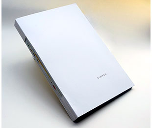
Stained
Text by Deborah Sibony
Kensington + Berkeley, California: Liminal Press, 2018. Edition of 10.
10 x 15"; 56 pages. Text, photographic collages, letterpress printing and binding by Camden M. Richards. Monotypes designed and pulled on Rives BFK 250gsm at Studio 1509 by Sibony on a Takach etching press. Photographic collages created by Richards and ink jet printed on Canson Vidalon Vellum 90gsm at Minuteman Press on an Epson Stylus Pro 9600. Text set in Zuzana Licko’s Mrs Eaves. Written, designed and letterpress printed by Richards at Liminal Press + Bindery on a Vandercook 4 proofing press. Handmade paper with inclusions by Patti Harden. Bound with a buttonhole stitch. Housed in a custom box with hand painted book cloth by Sibony. Box construction by John DeMerritt. Numbered. Signed by Richards and Sibony.
Camden Richards: "'Stained' is a collaborative book of word and image, pigment and fiber, documenting the emotional experience—bright lightness, dark depths—and reckoning of motherhood.
"Monotypes pulled in counterpoint to the text and photographs by Deborah Sibony."
Text excerpt:
In color theory,
we are taught about
the additive and subtractive
color spaces.
In the additive color space,
In the subtractive color space,
the sum of all colors is
these wavelengths of light
bright, pure white
are absorbed
As such, it is not actually
and reflected
a singular color, but rather a
at varying degrees to
composite of the full spectrum,
render pigments,
which in itself is a
the sum of all which results in
dispersion and projection
rich, deep black.
of wavelengths of light.
And, so, what are seemingly opposites
–blazing brightness,
velvety darkness–
are in fact one and the same:
light
$1,400 (Last Copy) |

Click image for more
|
| |
|
| |
|
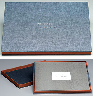
The Space Between
By Camden Richards
Kensington, California: Liminal Press, 2018. Edition of 13.
11 x 7.5 inches, 24 pages. Consists of ten monotypes printed by Deborah Sibony at Studio 1509 on a Takach press, digitally reproduced by Coast Litho on Grafix matte drafting film. Text set in Mark Simonson’s Goldenbook; typographic layout, die-cut, and letterpress printed by Camden Richards at Liminal Press + Bindery on Somerset Book paper with a Vandercook 4 proofing press. Handmade paper embedded with local Bay Area plant fibers by Pam DeLuco of Shotwell Paper Mill. Bound in bonderized steel covers and housed in a custom box by John DeMerritt. Includes separate document "On the Making of The Space Between and the History of the San Francisco-Oakland Bay Bridge". Book plus document housed in cloth covered tray box. Colophon tipped in on bottom of tray box. Numbered. Signed by Richards and Sibony.
Liminal Press: "The Space Between is a collaborative book which uses the evolution of a bridge as a lens through which to explore the thresholds between built environments and the natural world, to ultimately illuminate the multifaceted, transitory roles of the human experience.
"The images throughout The Space Between are reproduced from Sibony’s original monotypes, which were inspired by the gradual removal of the eastern span of the San Francisco-Oakland Bay Bridge. They depicted new dimensions of space and time that appeared as the bridge was dismantled. Sibony’s monotypes are fragments of isolated moments illustrating the act of transition in motion; a metamorphosis of wood, concrete, and steel showcasing the marks we make on nature: what vanishes and what remains.
"In The Space Between, the monotypes experience their own physical transition. Reimagined from two-dimensional print form to three-dimensional book form, Richards paired the images with prose inspired by a poem by Charles Koppelman, and created an interplay of shape, texture and word through the use of letterpress printing, translucent substrate and die-cuts. As the reader turns the pages, the images simultaneously build upon one another and retreat, creating a transitory evolution of meaning.
"The Space Between is made utilizing both machined and organic materials — from sheet metal covers to drafting film to handmade paper embedded with local Bay Area plant fibers — materials which ground it squarely in space and time as both a human and natural byproduct. The result is a physical and metaphorical exploration, and experience, of thresholds between that which we physically create, that which nature creates for us, and the emotional space in which we exist.
"As such, The Space Between reveals the liminality of existence when physical spaces are neither here nor there, neither built nor unbuilt; when emotional spaces are evolving; and when everything is suspended, weaving through the space between."
$1,300 (Last 3 copies) |

Click image for more
|
| |
|
| |
|
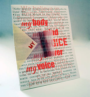
Choice
By Camden Richards
[Kensington, California]: [Liminal Press], 2017. Edition of 25.
8 x 10" closed, 16"x 10" open. Pamphlet with sewn binding. Papers: Zerkall paper, paper vellum. Letterpress printed text with ink-jet printed images. Die cut pages. Numbered and signed by the artist.
Liminal Press: "'Choice', an initial study for a larger forthcoming book project, is a folio that focuses on the different landscapes of choice in the external-public world vs the internal-private world. "The initial layers of the printed image in 'Choice' came from another recent collaboration, 'Folium'. I created the art and poem fragment in the final stages of the 2016 presidential elections believing that we would soon be electing our first female president. My mood was hopeful. Shortly after the elections, as I was cleaning up my studio, I realized I had a pile of extra prints (with cutting errors), prints begging to be put to use in some other format. Over the next month or two, and after no shortage of debates with various (male) friends about what guarantees a woman's right to choose, I realized that my poem fragment on the surface was about the end of my childbearing years, but underneath, it was really about choosing the role of mother for myself, when and where I wanted it. It was about my privilege to make that choice.
"To convey that in this new iteration of the folio, I collaborated with Marguerite Richards, a writer and woman just beginning the process of choosing motherhood. With our words (the 'before' and 'after' of choice) serving as bookends, at the center is a vintage illustration of mother earth, but with her baby separated from her, designating the reproductive choice that is literally again hanging in the balance, cut out and dissected in the public arena. The debate, the noise, and the chatter of the outside world and the language that serves to defend this 'right' (constitutional amendments, women's manifestos, ACLU briefing papers) is juxtaposed against the quiet interior landscape of this very personal and private choice, with simple poems and symbolic images. On the outside, each of our eyes, printed on paper vellum, is ever present, looking out from the inside and looking in from the outside, watching, intently."
$75 |
 Click image for more
Click here for the link to Instagram |
| |
|
|
| Camden Richards SOLD / Out of Print Titles: |
|
| |
|
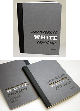
Uncovering White Privilege
A Primer
Text by Rachel K. Laser
Design and production by Camden M. Richards
Kensington, California: Liminal Press, 2019. Edition of 50.
45 pages; 25 cm. Includes black graphite pencil. Title on pencil and back cover "White privilege: if you can't see it you've got it." Set in Cast Iron, Flood, Magallanes Condensed and Nexa Rust Slab + Sans typefaces. Text block printed digitally by Coast Litho on Mohawk Strathmore Premium Wove paper and Apollo Transparency Film with hand set inclusions. Cover die-cut and letterpress printed by Richards on Neenah Environment cover stock with a Vandercook 4 proofing press. Illustrations printed from scans of original linocut carvings by McAleer-Keeler. Saddle stitched. Stretch band closure with pencil attached.
Liminal Press: "Uncovering White Privilege: A Primer is a collaborative book which seeks to help readers uncover white privilege and understand how to challenge it. Text by Rachel Laser; lawyer, advocate and strategist who has dedicated her career to making our country more inclusive. Design and production by Camden M. Richards; book artist and graphic designer. Illustrations by Kerry McAleer-Keeler; book artist, printmaker and Associate Professor for George Washington University."
Table of contents:
Ground rules - for reading this book
Jumping in - a warm up exercise
White privilege -what is it, exactly?
Yes you can have white privilege - even if you do not have socioeconomic privilege
White privilege is real - and it is also another side of racism
Challenging privilege and racism - see it, acknowledge it, change it Works cited.
Ground Rules for Reading this book:
Stay Open to what you are reading
it may stir up a lot of emotions, but stay curious
Try to understand how and why other people feel the way they do-do this even if you are feeling defensive or can think of counter-examples
Do not feel attacked
understand that the motivation behind this book is to
help open our eyes to what we do no ordinarily see so
that we can then be part of the solution
Be okay with feeling uncomfortable it's a normal reaction and worth asking yourself why
A custom pencil is provided which is "perfect for making copious notes about how you will utilize your privilege to create change."
(SOLD/ Out of Print) |

Click image for more
Click here for the link to Instagram
|
| |
|
| |
|
Page update: 08.04.2022
|
