Protean
Press ~
California
(Terry Horrigan)
|
Share this page:
|
| |
|
| Jane Brenner: "Perhaps one of the reason for the artistic success of Protean Press is that Terry is able to envision her projects in their completed state, though she frequently calls upon the skills of other artists to aid her in achieving the desired finished look. Her overall concept of a project demands a grasp not only of content, style, and materials, but of those areas in which she will need the assistance of others … For every project Terry keeps a diary to record the process and to preserve the technical information. … With her background in English and history and her inquiring mind, Terry has the temperament and inclination for producing printed information. The subject matter is often inspired by pre-literate marks, e.g. Mayan hieroglyph, stone-masons' marks, ancient Italian rock engravings, and the signs used by hoboes. Behind this preoccupation with the story of symbols is a letter lover whose taste ranges from stone carved letters to inky calligraphy to wood and metal type." |
| |
|
Broadsides
Poetry Books
Alphabet & Counting Books
Travel & Journals |
|
| |
|
Textures
By Terry Horrigan
San Francisco, California: Protean Press, 2016. Edition of 7.
11 x 15"; 11 loose leaves. Ten etchings, each signed, named, and numbered by the artist. Laid in a portfolio of Lokta Heavyweight Black paper with bone and paper closure.
Terry Horrigan: "Over the years I have taken many photographs of natural and manmade subjects: photos of steps and walls, windows and doorways, animal tracks and flowers – anything that evidenced rhythm in the play of sunlight and shadow. I found I was thinking with my eyes. I was attempting to capture some of the ways in which the world reveals itself. My choices were informed by the textures apparent in the patterns of light and dark and in the physical relationships between forms.
"This suite of etchings is a selection from those photographs. I used solar plates to transfer the photographs using the etching process to BFK Rives paper. The ten etchings reproduce photographs of a wall (Cuzco, Peru); a kiva ladder (New Mexico); roof trusses (Sepik River, Papua New Guinea); the Cypress Grove boardwalk (California); a coiled "Flemish" rope from the S.S. Noordam; pine cones and a puddle with sticks (King's Canyon, California); steps from St. Christophe (France); a rail fence (New England); and clamshells (Point Reyes, California). "
$240 |
 Click image for more
 |
| |
|
| |
|
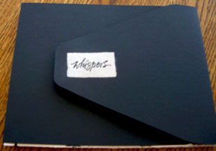
Whispers
By Terry Horrigan with sumi-e markings by Ann Miller
San Francisco, California: Protean Press, 2009. Edition of 25 variants.
9.5 x 7.125"; 4 leaves. Arches Paper. Collage. Side sewn. Laid in a black paper portfolio with tab slip closure. Title calligraphy by Ann Miller. Numbered on last page.
Terry Horrigan, colophon: "Many years ago a package arrived from China wrapped for protective purposes in layers of oriental paper written upon in kanji, a writing system for Japanese that uses pictorial characters based largely on Chinese ideograms. I was uncertain what the information on the papers meant but it was clear that it was ‘waste paper,’ not intended for any use other than packing. The markings on the papers fascinated me. I could not read them but their beauty led me to flatten and keep them for years. I had a sense that someone from another time was whispering to me.
"In 2004 a friend took some copies along with her on a trip to Japan for her brother to look at. His response: . . .most are completely unreadable. . .archaic language and writing styles. So in a sense you are safe to use them since no one else will be able to read them either. Some of the kanji may be Buddhist scripture, most likely in Chinese. Both Japanese and Chinese use forms of kanji.
"In 2009 I decided to use the papers in collaboration with Ann Miller, a local calligrapher and designer whose work I admire and whose skills I have used in many past projects. She used sumi and a Chinese rooster feather brush to make marks on Arches paper. I collaged the Chinese/Japanese papers on top of her marks and bound them into small booklets ... Each of the booklets is unique, both in Ann’s marks and in the scraps of the oriental papers."
$155 (Last Copy) |
Click image for more |
| |
|
| |
|
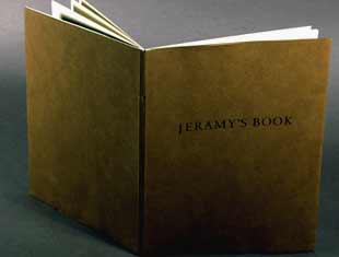
Jeramy's Book
By Stephanie Loux
San Francisco: Protean Press, 1985. Edition of 90.
6.25 x 9.2" Printed using Spectrum on Mohawk Letterpress paper. Nine linoleum-cut illustrations including two fold-outs.
A chapbook by Stephanie Loux inspired by a nephew's stories of his early experiences at school.
$85 (Last Copy) |
Click image for more |
| |
|
|
| Travel & Journals |
|
| |
|
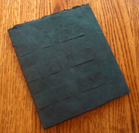
Promenades,
A Journal
By Terry Horrigan
San Francisco: Protean Press, 2011. Edition of 40.
6.5 x 7.5"; 54 pages. 21 text pages; 20 illustration pages. Printed and hand-colored by the artist. Letterpress printed on Mohawk Superfine paper using computer generated 9 point Lucida Sans. Hand sewn into a cover of Lokta fiber paper.
Terry Horrigan, colophon: "It is my habit to keep a journal whenever we travel. This small journal was written during a trip we took to France in October, 1998. For it I made sixty little drawings, some of which were made on the trip, some upon our return. Promenades describes our days walking in Paris and Lyon and driving in the country between the two cities."
$160 |
 Click image for more
 |
| |
|
| |
|
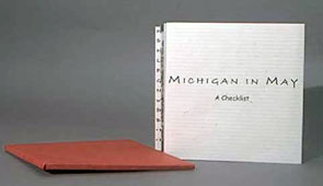
Michigan in May
By Terry Horrigan
San Francisco: Protean Press, 2005. Limited.
4 x 4.25" Designed, compiled, printed and bound by Terry Horrigan. types used Bradley Hand, Comic Sans, and Antique Olive. Uses multiple structures to show illustrations and text. Photographs scanned and printed using an Epson CX5200. Laid in letter folded paper case with tuck in closure.
A small edition by Terry Horrigan done in celebration of a trip through Michigan in May and June of 2005. Horrigan says it was still winter when they arrived. She and her husband were snowed upon as they walked the dunes by the edge of Lake Michigan. During the days that followed they watched Spring begin. They watched new life appear as barren trees budded, grasses sprouted, flowers bloomed, birds sang. This is her celebration of that time.
$53 |
 Click image for more
 |
| |
|
|
Alphabet and Counting Systems:
Terry Horrigan, perhaps because she is a printer, has researched recordkeeping and alphabet development for several cultures. |
| |
|
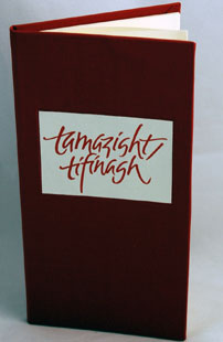
Tamazight/Tifinagh
By Terry Horrigan
San Francisco, California: Protean Press, 2012. Edition of 30.
8.5 X 4.25"; 14 pages. Accordion structure extending from front pastedown. Letterpress printed using 12 point Goudy Light Old Style on Ingres Fabriano paper. Case bound in Japanese bookcloth-covered boards with title on cover. Calligraphy by Ann Miller.
Terry Horrigan: "Tamazight/Tifinagh is about the recently-designed written form of an ancient Berber language. The incentive for it was research I did prior to our trip to Spain and Morocco in April. The language, Tamazight, had just been made an official language of Morocco. I was enticed into finding out more about it; the symbols of the language illustrate the book."
www.wikepedia.com: "Central Atlas Tamazight is one of the most-spoken Berber languages, along with Kabyle, Shilha, Riff, and Shawiya, and in Morocco it rivals Shilha as the most-spoken. All five languages may be referred to as 'Tamazight,' but Central Atlas speakers are the only ones who use the term exclusively....
"Central Atlas Tamazight ... had no known significant writing tradition until the 20th century. It is now officially written in the Tifinagh script for instruction in Moroccan schools, ..."
$165 |
 Click image for more
 |
| |
|
| |
|
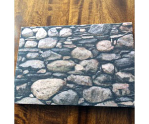
Something Sheepish
By E. B. White
San Francisco: Protean Press, 2003. Edition of 60.
8 x 11"; 26 pages. 15 colored illustrations with pochoir. Printed letterpress on BFK Rives paper using Stone and Stone Sans. Computer generated and made into photopolymer plates. Hand sewn and handbound in cloth over boards. Design, printing, coloring and binding by Horrigan.
Book designer Terry Horrigan was enchanted by the rhythm of the Celtic sheep counting numerals and so contact EB White's estate to get permission to print this essay in the limited fashion of this letterpress book.
After the images of counting sheep there is an eight page letterpress printed essay. It is a reprint of "A Shepherd's Life" pages 124-128 of 'One Man's Meat,' originally published in hardcover by Harper Colophon Books, Harper & Row, Publishers, (1938).
Colophon: "One, day, listening to a tape of E. B. White's essays (White on White, read by his son Joel), I was enchanted by the rhythm of the Celtic sheep-counting numerals. The idea of combining a drawing of sheep and the words themselves would not stop nibbling at the edges of my mind. I contacted the literary executor of the estate, Allene White, who generously extended permission to use the essay in the limited fashion of this letterpress book. To quote the publisher, Jennifer Elliot, (with whom I corresponded and who was E.B. White's 'Sunday Help' for a couple of years before he died): There were still sheep in the pen next to the barn, geese gossiping, and Charlotte's descendents spinning webs everywhere. One of the things (Mr. White) enjoyed most as his health and memory failed was having someone read his own work aloud to him."
$125 (Last Copy) |
Click image for more
|
| |
|
|
| Poetry Books |
|
| |
|
World Made of Desire
By Carolyn Miller
San Francisco, California: Protean Press, 2014. Edition of 30.
6.5 x 6.5"; 56 pages. Printed by Terry Horrigan on Mohawk Letterpress paper with Baskerville type. Hand-bound in gray cloth-covered book boards with rose-red end papers. Frontispiece, a reproduction of a painting by the Carolyn Miller, tipped in. Signed on the title page by the poet. Numbered on the colophon.
Terry Horrigan: "Beginning with the winter solstice, the thirty-three evocative poems in this beautiful book follow the seasons through a year in San Francisco, from rain falling on the cable cars and quince blossoms in a truck in Chinatown to the roses of Indian summer and a late autumnal garden."
Carolyn Miller is a San Francisco poet. Protean Press has published other books of her poetry including "Constant Lover" in 2001 and "This is Mine" in 2004.
$175 |
 Click image for more
 |
| |
|
| |
|
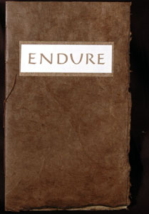
Endure
By Naomi Shihab Nye
San Francisco: Protean Press, 2010. Edition of 80.
5 x 8.75"; 12 pages. Printed on Fabriano Ingres paper using 13 point Poliphilus type. Wrapped in a cover of Lokta paper from Nepal with title label on front cover. Title calligraphy by Ann Miller.Numbered on the colophon page. Design, printing and binding by Terry Horrigan.
Terry Horrigan: "I first read Naomi Shihab Nye's poetry when my grown daughter and I were shopping at her local co-op grocery and found, posted over the produce, 'The Shopper.' We read it aloud to each other, enjoying the words, the rhythms, the message. Since she and I 'bless ourselves' with poetry and with sharing it, she has regularly mailed others of Nye's poems to me. I wrote Ms. Nye with a request: might she have a poem that she had been saving to have printed in a limited edition? Might she consider sharing it with me? She sent me 'Endure.' It pleases me to present it to you."
Prospectus: "'Endure' by Naomi Shihab Nye is a single poem enclosed in a chapbook which includes short biographies of Naomi Shihab Nye and of Mahmoud Darwish, the poet to whom 'Endure' is dedicated."
Mahmoud Darwish (1941-2008) is considered by some Palestine's most eminent poet.
$60 |
 Click image for more
 |
| |
|
| |
|
This is Mine
By Carolyn Miller
San Francisco: Protean Press, 2004. Edition of 60.
9.5 x 7" with 26 pages. Design, printing, and binding by Terry Horrigan. The title page illustration, "Studio Window, Green Street," is an Epson print of an original monoprint by Carolyn Miller. The text typeface is 13-point Poliphilus and Blado. Printed letterpress on Mohawk Superfine. Cover wrappers of Dove Blue Lokta fiber paper from Nepal.
The title of this selection of Miller's poetry comes from the poem "A March Day in Jeanne's Backyard."
$87 (Last 2 copies) |
|
| |
|
| |
|
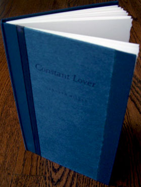
Constant Lover
Poems by Carolyn Miller
San Francisco, California: Protean Press, 2001. Edition of 50.
15 x 24 cm. Letterpress from Romulus and Romulus Oblique type on Zerkall natural white paper in black text ink with deep violet titles. Casebound in navy Japanese book cloth with ultramarine and deep violet Japanese endpapers. Portfolio print of giclée illustration. Designed and printed by Terry Horrigan.
Califia Books: "Horrigan first printed Miller's poetry in Protean's delightful collection, A Small Box of Poets (1994 ). She writes, There is no way to adequately categorize Carolyn's writing; each poem evokes its own unique response. Phrases from these poems stay with me for days as they resonate within the patterns of my own life.
"Horrigan has arranged this selection of thirty-eight poems from Miller's latest manuscript according to seasons—both the seasons of the year and the seasons of life. The poems record a passage through time, space and awareness—from recollections of a childhood in Missouri; to reflections on family, relationships, and living in San Francisco; onto ruminations about age and change, loss and grief, and finally acceptance, through the seasons of growth in adulthood. The frontispiece is a giclée reproduction of Miller's painting, Invisible Purple Tulips, Comet."
$215 (Last copy with portfolio print of frontispiece) |
Click image for more |
| |
|
| |
|
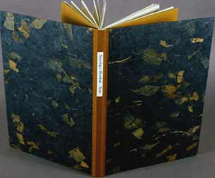
Entomologist's Dreambook
By Sherron Norlen.
San Francisco: Protean Press, 1998. Edition of 200.
6 x 9.75” Letterpress on Mohawk Superfine in Deepdene type. Twenty-six poems bound in a sewn board covers wrapped in blue, leaf-strewn, Thai Mango paper. Linoleum block prints by Kim Norlen on Thai Mulberry paper. Title-page calligraphy by Ann Miller. Signed by the poet. Numbered. Designed, printed, bound by Terry Horrigan.
As a child, Norlen wanted to become an entomologist, until she learned that the work involved pest control. Years later, in a retreat, she was directed to sit eight hours a day under a Montana pine tree: no talking, reading, writing, music, or meditating—just sit. The insects that had fascinated her as a child came to visit and inspired these poems.
$95 (Last Copy) |
 Click image for more
 |
| |
|
| |
|
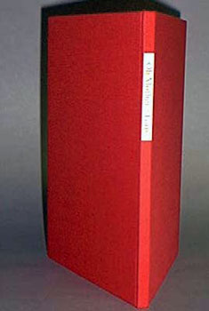
Oh Mother and Other Poems
By Stephanie Loux
San Francisco: Protean Press, 1991. Edition of 70.
8.75 x 5.75" with 24 pages, bound in red cloth boards with paper titles on spine. Printed on Mohawk Letterpress paper using various sizes of Spectrum type. The photoengraved illustrations are from line drawings by Rik Olson. Title-page calligraphy by Ann Miller.
Stephanie Loux's poems focus on her relationships with family - her parents, brothers & sister, her husband & sons - and her friends. The poems do not appear in chronological order. They were written from 1983 to 1989. She found her return to college after an absence of fifteen years to be a period of exploration and reevaluation.
Yes, Mother, I see you.
You are being the Perfect Grandmother.
And yes, my son is enjoying being with you.
But how much more he would enjoy it
if you were there with him.
Oh Mother. Oh Mother,
what you keep looking for in my face
you would find
if you would only look at his.
$72 (Last Copy) |
Click image for more
|
| |
|
|
| Broadsides |
|
| |
|
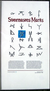
Stonemasons' Marks
By Terry Horrigan
San Francisco, California: Protean Press, 2004. Edition of 50.
13.1875 x 24.25" Single sheet. Univers type on Rives BFK. Stonemarks combine photoengravings and pochoir; title from a linoleum block. In paper letterfold case with corner fold to slip into. Legend of the stonemason marks included in separate printing on the folder.
A broadside of twenty-three stonemasons' identifying marks inspired by marks copied from the walls of castles and churches in the British Isles and western Europe.
From the text: "Marks cut upon the dressed stones of a building (though rarely seen on tracery or carved work), were apparently the personal trade marks of the masons working the stone at the banker (Italian: banco) or stonecutter's bench. They are found in the British Isles and west Europe on stonework that dates from Roman times to the present, but are seen most frequently on medieval work, when they were cut on the exposed face of the stone; after the 15th century the marks were cut on the bed to avoid disfigurement..."
$40 (Last Copy) |
 Click image to enlarge
|
| |
|
| |
|
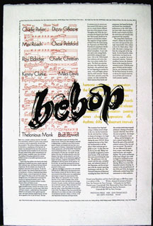
bebop
By Terry Horrigan
San Francisco, California: Protean Press, 1997. Edition of 50.
13.1875 x 24.25" Single sheet, text in three colors. On Rives BFK using Deepdene and Sans Serif Light types. Calligraphy by Carl Rohrs. Illustrated with a listing of musicians, the pertinent terms which define bebop, and a photoengraving of a musical score; a partial bibliography frames the text block. Color was printed using pochoir.
Terry Horrigan: "A broadside reflecting on Charlie Parker and his influences on music of the time. It was inspired by listening to Parker's work and the reading that followed. The text evolved into 'blocks' because that is what I heard' as I listened to bebop."
Excerpt from the broadside: "Bebop was a uniquely American creation - the result of an extraordinary outburst of creative energy produced in reaction to, and yet supported by, the jazz styles that preceded it. The evolution of bebop can most easily be described as a simplification of the big band: the trumpet was substituted for the entire brass section of the swing band and the saxophone for the reed section. The most common bebop quintet instrumentation consisted of trumpet, saxophone, piano, bass and drums. The smallness of the group permitted the constant feedback necessary to successful experimentation and improvisation."
$68 (Last copy) |
 Click image to enlarge
 |
| |
|
|
| Protean Press Out of Print Title: |
|
| |
|
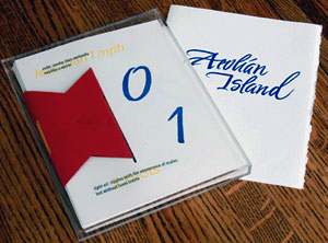
Aeolian Island
By Terry Horrigan
San Francisco, California: Protean Press, 2007. Edition of 30.
6.25 x 7.75 x .5"; 12 pages. Calligraphy by Ann Miller. Type: Univers in Roman and Italic, Medium Condensed. Printed in black, yellow, and blue inks on BFK Rives paper. Colored papers: Canford Buttercup, Ocean Blue, and Bright Red. Housed in Plexiglass slipcase, allowing a preview of the binding, Horrigan's rendition of Janus Press' "Sing Weaving." Design, printing, and binding by Terry Horrigan.
Terry Horrigan: "Aeolian Island was inspired by Beaufort's and Petersen's Scales: written descriptions of the force of wind as understood in land and marine weather warnings (miles per hour or mean speed in knots)....
"I gathered information from Webster's Dictionary (1983) and The Met Office in the United Kingdom. Much more is available on various sites on the 'web.' Aeolus was the god of the wind to the Greeks; also known by the epithet Hippotades of 'reiner of horses.' The winds, known as the 'Thracian Horses,' were Boreas: the north wind; Euros: the east wind; Notus: the south wind; Zephyrus: the west wind. Shu was the god of the wind, the atmosphere, the space between the sky and the earth, the divisions between day and night and between the underworld and the living world to the Egyptians. In the Vedic religion the god the wind was Vaya. To the Hopi, Pueblo descendents of the Anasazi, Yaponcha was the wind god. ...
"The calligraphed number on each page signifies the 'force' of the wind described, e.g. 'Force O' equates with 'calm.' ... The colors chosen reflect those used in the signal flags which 'broadcast' weather warnings across the United States; local authorities use these colors in a variety of patterns."
(SOLD) |
Click image for more
|
| |
|
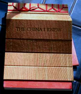
The China I Knew
By Rose Covarrubias
San Francisco: Protean Press, 2005. Edition of 60.
9.5 x 6" Casebound in Japanese book-cloth over boards; endpapers of Lokta fiber paper from Nepal. Illustrated with nine photoengraved line-drawings by Miguel Covarrubias. Botan White paper by Awagami using Joanna, Roman and Italic types.
A journal by Rose Covarrubias of the trip taken by her and her husband to China in 1933-34. Inspired by Adriana Williams, a friend of the Covarrubiases.
(SOLD)
|
 Click image for more
 |
| |
|
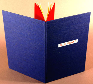
Ellis Island
By Terry Horrigan
San Francisco: Protean Press, 1995. Edition of 50.
Printed in Univers type on Mohawk Superfine and bound in blue cloth over boards with red Moriki endpapers. Title calligraphy and marks by Ann Miller.
Written and printed by Terry Horrigan following a visit to the famous gateway island. This slim volume gives a brief history of the principal immigrant receiving station for the U.S. including a description of how people were processed for entry, plus a list of some pertinent legislation. A foldout spread of runelike, chalk markings that medical inspectors used to designate a person's apparent health is visually compelling and haunting. Though not the final word on whether someone would be admitted to the country, these letters were placed on the lapel if, after a cursory examination, the person was suspected of having any "contagious disease, mental disability or physical affliction that might cause an individual to become a public charge."
(SOLD/Out of Print) |
Click image for more
|
| |
|
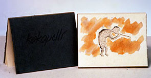
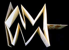
Kokopelli
By Terry Horrigan
San Francisco: Protean Press, 1992. Edition of 60.
7.8 x 6.1" with 12 pages in paper covers. Letterpress printed on Mohawk Letterpress using Spectrum type. Photoengraving with a watercolor wash on Lana Royal. Sewn into paper-wrapped boards using blue and gray brown Roma. Title-page calligraphy by Ann Miller. Numbered on the colophon page.
A monograph by Terry Horrigan about the deific figure known as the Hunchbacked Flute player. Kokopelli discusses the meaning ascribed to the symbol and one attitude regarding the interpretation of rock art. An abbreviated bibliography of rock art of the Southwest is also included.
"Rock art in the American Southwest was produced by two methods. Pictographs were created by painting or coloring upon the surface of the rock. Petroglyphs were engraved into the stone; the lighter-colored stone was revealed by pecking, scratching, or abrading the dark, weathered rock surface. Some rock art combined the two techniques."
(SOLD) |
|
| |
|
Luis Barragan: An Inner Life/Recollections
By Adriana Williams
San Francisco: Protean Press, 2002. Edition of 60.
64 pages, six black and white images and 15 color images reproduced using the current computerized techniques. Printed letterpress at Protean Press on cream colored Somerset heavy paper using Poppi-Laudatio type, polymer plates. Hand sewn and bound in grey flannel over boards with endpapers of rosso and giallo oro Ingres and encased in a black portfolio.
A memoir of Adriana Williams, who recounts her view of his inner life; of the interests they shared and talked about, of his likes and dislikes, of his artistic, musical, and literary passions, of the artists and works that inspired him.
(SOLD/Out of Print)
|
|
| |
|
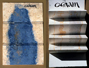
Ogham
By Terry Horrigan
San Francisco: Protean Press, 1997. Edition of 50.
4.7 x 9.4" casebound book. Letterpress printed on BFK Rives using Univers type. Accordion-folded book enclosed in a board covered with handmade paper. Paper made by Terry Horrigan. Calligraphy by Ann Miller. Illustrated with a photoengraving of a memorial stone with watercolor wash.
A short essay about the stone-inscribed form of the Ogham alphabet, which alphabet is only found on memorial stones from the fourth to seventh centuries AD in those areas of Britain where the Irish language was in use. Essay by Terry Horrigan.
(SOLD) |
Click image to enlarge |
| |
|
|
|
|
| |
Page last update: 01.21.2022
|
