Prototype Press ~ Maryland |
|
| Prototype Press: "The Prototype Press is the new moniker for Sharp Teeth Press and is operated by Mark Sarigianis and David Johnston(1985-2015) in Oakland, California. The goal of the publishing program is to produce first-edition works by local authors and artists, completely in-house." | |
| Sharp Teeth Press publications | |
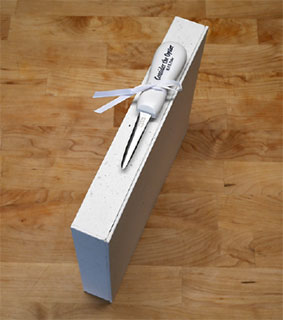
Consider the Oyster [Indian Head, Maryland]: Prototype Press, 2021. Edition of 52. 11.5 x 9.5”; 84 pages plus freeend pages and pastedowns. Printed letterpress on custom paper from the Saint-Armand paper mill. 12pt Monotype Goudy Light typeface. Blue headline typeface handset Windsor Elongated in a variety of sizes. Blue illustrated endpapers Book and clam-shell book box covered in two additional papers from the mill. Quarterbound in white, foil stamped goat leather. A custom oyster shucking knife accompanies each book to assist with opening the book box. Cast, printed and bound by the press. Numbered. Mark Sarigianis: "I first discovered M. F. K. Fisher’s ‘Consider the Oyster’ in 2018 while browsing the cookbook section of the Mills College library. It was a first edition, and given the reverence held for Fisher, especially in the bay area, it should have been in the special collections department. Even though it was written in 1941, I was immediately struck by the passionate ‘foodie’ sensibilities with which she waxed poetic about oysters. In fact, she made any modern writer of the subject seem incredibly boring. A serendipitous connection led me to be able to ask M. F. K. Fisher’s daughter, Kennedy Golden, directly for permission to print the work. Between then and now the press and all of its 50k pounds of equipment were moved to a new home in Southern Maryland. Following a year of construction, the new studio was powered up and production of ‘Consider the Oyster’ was on its way. "Martin Mazorra is a Brooklyn based artist originally from West Virginia. He works chiefly in woodcut and letterpress, from small books, prints on paper, large prints on fabric, to site specific print-based installations. His work is in the collections of the Yale Beinecke Library, the San Francisco Museum of Modern Art, the Taubman Museum, the Block Museum, and the Fort Wayne Museum of Art. “His anthropomorphic illustrations for ‘Consider the Oyster’ were drawn to capture the playful ways in which oysters in the book reveal the art of eating and the human experience, through humor and anecdotal ruminations." |
|
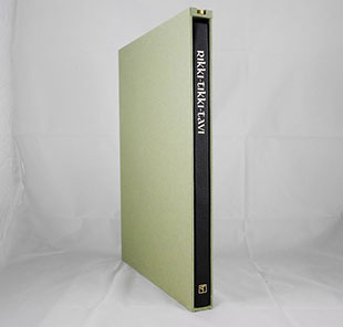
Rikki-Tikki-Tavi. 11 x 15”; pages. The typeface used for the text is handset Italian Old Style, designed by Frederic Goudy, which has a storybook quality suitable for Kipling. The gold-foiled typeface in various sizes is Libra, designed by Sjoerd Henrik de Roos, which was chosen to reference the use of an Uncial typeface in the movie. The pages were printed damp on custom handmade cotton paper from The Saint-Armand paper mill. It is half-bound in black goat leather. A copy of the 1975 animated film by Chuck Jones is included on a USB drive and is housed in the slipcase. Cast, printed & bound by the press. Numbered. Mark Sarigianis: “My first introduction to Kipling’s ‘Rikki-tikki-tavi’ was through the Chuck Jones animated film. Although it was made before my time, a home-recorded VHS from a network rerun was in my childhood home. Even at an early age, I knew there was something serious and cared for in the art direction and style, especially when compared to the standard Saturday morning cartoons of the day. When my oldest child fell in love with the cartoon last year, printing an edition of the original story seemed like an easy choice for the press. “It was not until reaching out to the Chuck Jones estate that the project took on an unusual direction for a fine press edition. The estate did a fantastic job archiving early sketches that Chuck made for the movie, and as I looked through them, I was drawn to a series focused specifically on the evolution of the titular character and his movements. This is the series that made it into the book, printed from photopolymer plates made from high resolution scans of the sketches. The artwork focuses on Rikki-Tikki-Tavi, while the books design elements are meant to evoke the stories king cobra villains, Nag and Nagaina. The black leather binding is meant to represent their skin, and the design of the colophon their hood. Their famous hood markings are also watermarked in the paper. “In a career spanning over 70 years, American animator-director Charles Martin Jones (1912-2002), more famously known as, Chuck Jones, forged a legacy during the Golden Age of Animation, creating some of the most acclaimed and brilliantly designed cartoons and films during his lifetime. He made more than 300 animated films, winning three Oscars as director and in 1996 an honorary Oscar for Lifetime Achievement. Among the many awards and recognitions, one of those most valued was the honorary life membership of the Directors Guild of America. Jones's animation mastery was unparalleled. His character creations, such as Bugs Bunny, Daffy Duck, Road Runner and Wile E. Coyote, have possibly inspired more laughter across the globe over six generations than any other film maker.” |
|
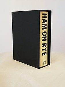
Ham on Rye 11.25 x 8"; 364 pages. 12 pt Goudy Powell typeface for text. 13 pt Headline Bold for the running heads. 15 line Condensed Gothic Bold typeface for chapter numbers and title page. Printed on custom handmade cotton paper from St. Armand. Two watermarks in paper: 'CB" for the author; "HC" for the author's alter-ego, Henry Chinaski. Illustrations printed from carved wood blocks. Quarter bound in foil-stamped pig leather with handmade black paper from St. Armand over boards. In black slipcase with title on spine. Numbered. A new printing of the Charles Bukowski {1920-1994] novel Ham on Rye with woodcuts by Mississippi artist Sean Starwars. Ham on Rye, wikipedia: "Ham on Rye is a 1982 semi-autobiographical novel by American author and poet Charles Bukowski. Written in the first person, the novel follows Henry Chinaski, Bukowski's thinly veiled alter ego, during his early years. ...[T]he novel tells of his coming-of-age in Los Angeles during the Great Depression." Sean Starwars is a printmaker living and working in Laurel, Mississippi. He is a relief printmaking artist specializing in woodcuts. |
|
Me, Myself and the Monkeyface Eel |
|
| Sharp Teeth Press Publications Prototype Press, History: "Since 2012, in his garage in San Francisco, David has been acquiring letterpress and typecasting equipment, printing and publishing books, and producing editioned prints with local artists." |
|
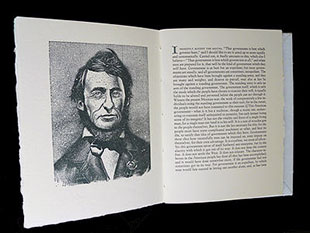
Civil Disobedience |
|
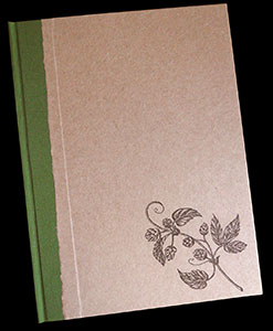
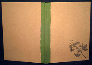
Why Beer Matters |
|
| Out of print titles by Prototype Press: | |
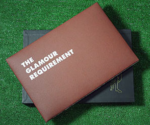
| The Glamour Requirement The 2014 Buffalo Jills Etiquette Guide Editorial by Stefanie Kalem Illustrations by Whitney Coffin Shaw Oakland, California: Prototype Press, 2015. Edition of 30. 15 x 10"; 40 pages. Printed in three colors on Rives BFK from Monotype 20th Century and hand-set Futura types Images printed from photopolymer plates. Bound in Coptic style with a cover made from imitation football leather. Housed in a slipcase. Signed by Kalem and Shaw. Numbered. Prototype Press: "In April 2014, the Buffalo Bills were sued by their cheerleading squad, the Buffalo Jills, for several labor law violations, some as basic as minimum wage rate of pay. In the ensuing law suit, a document titled 'Buffalo Jills Glamour Etiquette Hygiene Rules' became public and was published online. The appalling and insulting document is reproduced here with an editorial by Stefanie Kalem and illustrations by Whitney Coffin Shaw." $950 (Last Copy) |
|
Page last update: 04.14.2024
Home | About Us | Contact Us | New Arrivals | Fine Press & Artists' Books | Broadsides |Resource Books | Order/Inquiry
Copyright © 2021 Vamp & Tramp, Booksellers, LLC. All rights reserved.
