|
Preacher's Biscuit Books
~ New York |
Share this page: |
| Preacher's Biscuit Books: "Publications reliant on the material book as a metaphor to create meaning in works by visual, sound and language artists." Tate Shaw: "I make books to directly connect with other people and to learn something about the limits of connectivity. There isn’t a central subject to my work other than a concern for structure and a way of connecting to people through ideas. My work comes into being through the collaboration of a reader and a book may always be further reenacted, and reinterpreted, and this makes it an ongoing thing. We simply accept that analog books are lasting objects but in order to last they call for our continual participation." |
|
Book done at Small Craft Advisory Press |
|
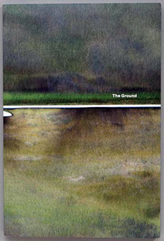
| The Ground By Tate Shaw Rochester, New York: Visual Studies Workshop Press, 2013. Edition of 500. 12 x 8"; 124 pages with 2 gatefolds. Color. Soft cover. Preacher Biscuit's Books: "Tate Shaw's The Ground started with photographs made between 2010 and 2012 in a geothermal area of Iceland and at hydrofracking and former coal mining sites in Pennsylvania. The photographs were printed with an inkjet printer on heavy printmaking paper and then water was applied to wash out areas of the ink. The resulting images are interwoven with a personal essay where Tate recounts a period when he lived in a pastoral part of Pennsylvania now inundated by the natural gas industry. This essay book is about personal and historical failures to access the ground – both literally and metaphorically – as a source of energy and grasp its power." Western New York Book Arts Center: "The Ground is an essay book including photographs made between 2010 and 2012 in a geothermal area of Iceland and at hydrofracking sites in Tioga County, Pennsylvania, as well as writing that documents failures both personal and historical to access the ground as a source of energy and to grasp its power. Images from The Ground are failures in their own right made to show something of the futility of trying to fix an image on a ground in any permanent way. "The photographs featured in the book were printed with an inkjet printer on a heavy printmaking paper then water was applied to wash out areas of the ink. The results are then digitally scanned to make a new image. Water is a medium to access the core subject, as in the energy mining processes depicted. A geothermal power plant has boreholes drilled deep into the ground that converts steam under enormous pressure into energy. For fracking over ten thousand gallons of chemicals is mixed with over a million gallons of water and a heavy amount of sand is injected underground to release natural gas deposits." $40 |
|
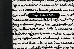
| Things I Wanted To Tell You By Kristen Merola Rochester, New York: Preacher's Biscuits Books, 2010. Edition of 150. 5 x 7.5"; 96 pages. Digital offset printed on matte paper. Case bound in paper over boards with cloth spine. Paper title label on front cover board. Preacher Biscuit's Books: "Things I Wanted To Tell You by Kristen Merola is a project based on the compulsion to free oneself of ideas and thoughts believed to be unproductive, although significant. Kristen has photographed her many diaries and notebooks where compulsive entries are written over the top of one another thereby erasing ideas, thoughts, and emotive feelings through the act of writing. The obsessive need to write diaristically is glaringly revealed even if the words themselves are unreadable. The photographs poetically paced in this volume divulge seasons of the mind that frame a code of jumbled, overwritten thoughts. In the end, Kristen's work is illuminated through obstruction." Aaron Cohick, Text, Image, Writing, Reading, JAB 27: "Things I Wanted to Tell You is driven by the relationships between text and image. ...To read this book we must move continuously between two discontinuous worlds, two means of representing a world, the world. We fall easily into one, but the other is just beneath the surface of the first, impenetrable, reflecting and deflecting our reading back at us, back into our world, a world, the world.... "It is possible to put forward a metaphoric reading of the book. We could start at the title, Things I Wanted to Tell You, and assume that the illegible writing represents those 'things,' and that those things have been made unspeakable, either through their own urgency or through the layered complexities of delay and time. This then, would be a book about a relationship, a relationship ended or suspended, with many things unsaid. We could put forward such a reading, if we like our books to end when we put them down. Or we could elaborate a different reading, one based in the relationship between the images and the text, a reading of the ways those elements interact, and such a reading could be extended productively, infinitely. We want our books to keep going after we put them down. We are concerned with the real book, the book in our hands, and the processes that it enacts." $125 |
|
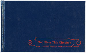
| God Bless This Circuitry By Andrew Salle & Tate Shaw Rochester, New York: Preacher's Biscuit Books, 2007. 5.75" x 9.5"; 92 pages with 4 foldouts, 2 inserts, and a compact disc. Offset printing. Full color. Smyth binding in hard covers. Preacher's Biscuit Books: "God Bless This Circuitry is a collaborative project between musician and composer Andrew Sallee and Tate Shaw. The result is a book with a cd component. The cd, meant to be synchronized with the reading experience, purposefully competes with the reader's internal brain voice. Andrew's recordings include found sounds, whirling drones, and old hymns, expanding upon Tate's story of a churchgoing father and son who only connect through machines. A found collection of culturally significant religious tracts provide humor and illustrations throughout. The project's title, and much of its subject matter, is inspired by an era of patriotism and religious fervor in the United States, just after the 9/11 attacks, when God was being asked to bless everything from cigarettes to car stereos." Review, JAB (Journal of Artists' Books) Spring 2008, Issue 23: "God Bless This Circuitry weaves quite a few tales. At the onset ... creator Tate Shaw offers a false promise of effortless navigation through its mass of content in the form of an owner's manual-style instruction page for its use. However, upon progressing one is deluged by hundreds of images of religious ephemera blended with bits about cars, computers, and machinery and linked together with a rhizomatic configuration of lines. With the addition of Andrew Sallee's soundtrack the reader/listener has more aural and visual information than could possibly be consumed in chorus. This seems to be exactly what the artists want. "... Through these carefully plotted distractions God Bless This Circuitry engages with a larger cultural narrative - more specifically the deconstruction of the long-held cultural myth that information is the remedy for unawareness, and communication can cure misunderstanding. It seems to dangle in front of the reader the question of where along the circuit the breakdown is occurring. Pop in the CD, navigate the book, and try to stay focused on the story of a boy whose mission is to stay distracted, and you'll quite soon have your answer." $150 |
|
| Tate Shaw: “’The Placeholders’ is a series of film-like photobooks of small ambient moments in immense cities. They often show the city as made of people and their movements through it.” | |
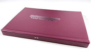
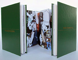
The Placeholders Volume 1 8.5" x 5.5"; 122 pages. Full color. Codex bound. Magenta boards with titles in white. Placeholders is a project of three books about digitization and globalization by way of clothing and body movement. Tate Shaw: "'The Placeholders' is a series of film-like photobooks of small ambient moments in immense cities. They often show the city as made of people and their movements through it. Volume 1 is multi-directional and uses the book's gutter as the stairwell entry and exit of New York subways." |
|
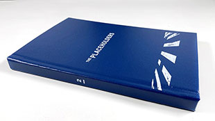
The Placeholders Volume 2 8.5" x 5.5"; 122 pages. Full color. Codex bound. Blue boards with titles in white. Volume 2 of “The Placeholders” series by Kristen Merola is one long moving shot on a drive through Los Angeles. |
|
| The Placeholders Volume 3 By Tate Shaw Rochester, New York: Preacher's Biscuit Books, 2007. 8.5" x 5.5"; 108 pages. Full color. Codex bound hard cover with title in gilt on front board. Signed by the artist. Preacher's Biscuit Books: "The Placeholders Volume 3 places us in the overfull context of Shibuya in Tokyo. We are crossing the world's most populated intersection, affected by the flow of people, and aware of the great potential for connectedness. Each hand-drawn person in the scene has, in the shape of their clothing, a passage of photographs from some other locale. Each page opening is paradoxical – forward is backward, left is right, top is bottom, and the beginning is the ending. With more potential for movement, everything has the potential to show you the way, and so to continually be seeking out a connection becomes the end goal." $90 |
|
| Projects and collaborations with other artists. | |
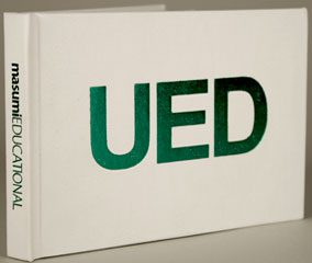
| UED The Pocket Masumi Educational Uncertain English Dictionary By Masumi Shibata, Editor in Chief Rochester, New York: Preacher's Biscuits Books, 2008. 6.25 x 4.75"; 63 pages. Offset printed. Case bound in white boards with embossed metallic green title on front cover and titles in green on spine. Preacher Biscuit's Books: "Produced in collaboration with masumiEDUCATIONAL, UED is the accepted authority on the evolution of the English language. It visually creates and defines a wide range of expressions every international English speaker wanted but previously thought indefinable. UED covers words from across the emotional spectrum while simultaneously providing graphically poetic interpretations. It also offers space for hand writing practice and includes mE's International Phonetic Alphabet for rehearsing vocal pronunciation." Rebecca Kish, Center for Book Arts, blog: “UED stands for Uncertain English Dictionary. Shibata’s creative vision not only incorporates design and clean and sturdy case bound technique, but the content is crucial in its necessity to form a connection through a universal symptom of disconnect. "The UED is a gathering of cultural diversifications of the English language and seeks to inform the reader of a growing acceptance of an umbrella of linguistic interpretations- a culture not created from the deviation of one root, but a celebration of differences. Gathered and prepared for a new articulation, the UED provides space in which to practice writing out new understandings, as well as pronunciation of words. "The Uncertain English Dictionary varies from a standard index in that it is not the consensus of a consortium of authorities, but the expressed opinion of one individual. Shibata makes no excuses for this primary authority, instead seeming to offer a window into his language, with hopes that the wide reach of non-verbal inferences will be apparent to the viewer. Below the title is both the assertion of Masumi Shibata as Editor in Chief and the logo of MasumiEducational, the branding under which Shibata’s other efforts fall. "The graphic design component is also significant. Shibata uses the clean and non-threatening efficiency of Helvetica, yet skews the writing by clean cutting it in half and re-assembling stalks of stems, bowls, arms and legs. The result is a hard to identify combination of fonted flurry, negating the simplicity and asserting the disconnect that the viewer/reader must work through to extract meaning. The definition, however, is expressed in clear and simple language. Shibata may be playing with the role of graphics in our interpretation of language, or merely leading us through a process that shows us the patience of decoding symbols, leading us through mental exercise." $80 |
|
| Finite Sets By Julie Buck Rochester, New York: Preacher's Biscuits Books. 9 x 7"; 100 pages. Case bound in silver boards with image embossed on front board. Preacher Biscuit's Books: "Julie Buck has a lot of friends. For Finite Sets she sorts her friends from various times, places, and circumstances into Venn diagrams. A Venn diagram represents separate, closed sets in circles and shows the sets relations by overlapping regions. Inside each of Julie's circles is a self-portrait and within every friend-set a change in identity shows clearly on her stark, silhouetted face. So while the term has temporarily crept into our vocabulary, consider this a facebook that shows a friend network, as well as identity’s ever-changing face, within a set of connections." Julie Buck is a collage artist and photographer, who lives in New York City. $80 |
|
| Preacher’s Biscuits Books Out of print and SOLD titles: | |
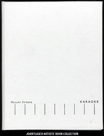
| Karaoke By Masumi Shibata Rochester, New York: Preacher's Biscuits Books, 2005. 11 x 8.5"; 48 pages. Case bound. Preacher Biscuit's Books: "In 2004, Masumi Shibata created a darkroom setup that enabled him to make photogram images of music. His book Karaoke is part science experiment, part fiction. It is a book of translations: sound into image, speech into writing, machine into book, one culture into another. As is often the case when translating languages, there is no direct image equivalent of sounds through the medium of water; sound waves become liquid ripples and swells. You can see the music pulse, the volume increase and grow quiet. And Masumi has put the words right there so you can sing along." Elizabeth Long, JAB 25: "Shibata's Karaoke works as a linear progression. Driven by the sound and rhythms of a song, it move relentlessly forward – the tick marks standing like telephone poles along an imagined highway of sound. Driven by the distance of his home land of Japan, missing the karaoke box that brings him such pleasure, Shibata engaged in a project to convert sound into image without using any type of digital translation. This was to be a direct visual manifestation of the karaoke experience. His solution was simple while creatively unique – turn a speaker on its back, place trays of water on its face, and using light-sensitive paper submerged in the water, use a flash to record the patterns the water makes as it vibrates to the music – a photogram of sound. The flash was triggered, every ten seconds through the duration of the song. "The codex format is then used to house this linear narrative, the compositional structure of the book deriving from the rhythmic structure of the song. The pace is divided by visual markers and the words to the song distributed above them accordingly. "The progression of images have a certain beauty, running from light grey pages with barely a ripple to dark thunderous pages where the ripples intersect and fracture into various patterns. "Part of what makes Karaoke successful is the combination of inventiveness of the project and the mutability of the images. The layout of the book creates a lower horizon that allows the sound waves to double as representations of the sky, electric with energy, radio waves, and any of the other invisible components that we intellectually know exist but which we can never see with our eyes." (SOLD) |
|
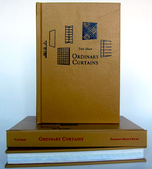
Ordinary Curtains 8.75" x 6"; 214 pages. Full color. Offset printing. Codex bound with hard covers. Title on front board. Preacher's Biscuit Books: "Ordinary Curtains is a complex collection of several stories, each of which has its own characters, distinct reading approach, and singular, found visual material. A central design element of Ordinary Curtains is the tromp l’oeil representation of different types of everyday papers—newsprint, legal pad, graph paper, etc.—to denote different sections of the book. This richly layered effect of paper printed on paper can be seen as a philosophical schema that illustrates the book’s connective themes of absence, distance, separation, and confusion." Review, JAB (Journal of Artists Books) Spring 2007, Issue 21: "One of the strength of books-as-art is that the form lends itself to complexity: sustained performances in book form can become very intricate lively experiences, full of rewarding detail and engaging sub-themes. One of of our complaints is that too few artists' books attempt to do this: make long, engaging works where substantial development occurs. Shaw's Ordinary Curtains is an example of a rich, rewarding exploration that is given the space to evolve. "Ostensibly, Shaw's book is a stage for a collection of stories, a selection of narratives on a range of topics hovering around themes of autobiography. Each narrative is given its own identity through the use of various papers and visual handling. They draw on dramatic clichés to frame narratives: vaudeville, hypnotism, and magician's assistants weave in and out of the stories. The entire book is, in fact, beautiful bricolage: found images, drawings from photographs, found texts, scraps and textures are tinkered together to create a space for exploring how the material experience of a book interacts with memory, desire, and absence. "This is a complex work, rich with a deep exploration of the book as a medium and suffused with a melancholy sense of loss and gain." |
|
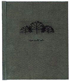
| SprawlCode: descriptions By Christopher Burnett Rochester, New York: Preacher's Biscuits Books, 2006. Edition of 100. 5.75 x 5"; 402 pages. Set in Monaco and Minion Pro. Includes bibliographical references and index. Bound in black boards with blind embossed title on front board. SprawlCode: "The text of this book was set using custom software to assign, with HTML tags, grayscale values to each letter. The pages were converted to the RTF format and laid out in Adobe InDesign for publication." Preacher's Biscuits: "Chris Burnett has been wrestling with language in relation to places since the early 1990's. Over time, he developed a software that enabled him to make pictures of places out of bodies of texts. For Burnett, these word-pictures 'form a patter, a linguistic snapshot of sprawl ... an unruly growth principle, interlinking the edges of city and highway, story and image, computer code and text.' SprawlCode: descriptions is his most comprehensive statement to date. It is an enigmatic manual that brings together over 350 descriptions of sprawl in 14 separate chapters with an illuminating preface and image index." Chris Burnett, foreword: "As in a literary stream of consciousness, gaps and dropouts punctuate the landscape. The flow is an effect of standing away in time and taking it in at a distance, just as the lo-res picture on each page of this book may only come clear by holding the book at arm’s length and squinting one's eyes. The discontinuities are not just spaces between marks but also gaps left by signs and things that drop away and are forgotten. In terms of sprawl-places, such absences may be odd lots, bull-dozed neighborhoods, or extinct features of the landscape. In terms of language-use on the Net, they may be obsolete words, anachronistic expressions, out-of-date articles, and textual remnants of archives. Whole languages that are becoming extinct in global culture may have the Web as their only place of refuge. Like a television image from a distant signal fading-in and fading-out, potentially extinct forms of language may appear and disappear in the Web. This book attempts to fix some of them on the page while also suggesting their transitoriness.... "As a textual form of flânerie and image capture, this book finally poses sprawl as a theory of experience. Experience is no more and no less than a vibrant, scattered process of urban becoming that gives rise to associated patterns of thought and language behavior. Though already obsolete, I hope this book will provide a suggestive manual for a landscape text that is yet to be." (SOLD/Out of Print) |
|
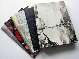
String Lessons |
|
Page last update:05.08.2025
Home | About Us | Contact Us | New Arrivals | Fine Press & Artists' Books | Broadsides |Resource Books | Order/Inquiry
Copyright © 2021 Vamp & Tramp, Booksellers, LLC. All rights reserved.
