
|
|
Share this page:
|
| Artist Statement: "Inge's work revolves around the idea of the book — the book as object, artifact and cultural icon. She makes artist’s books, fine press publications, prints, and other text-based art that investigates our personal and collective relationship to the shifting role of the book, print media and text in our world today. Inge has an avid interest in the history of the French livre d'artiste and the contemporary artist's book in France." | |
| INK-A! Press: “Inge makes fine press artist's books under her imprint INK-A! Press, artist's books, text-based art exploring the textual landscape we are surrounded by, and installation work that investigates the book as a cultural icon and artifact.” | |
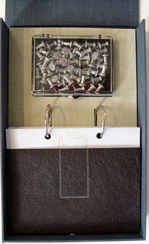
A Crisis Ethicist's Directions for Use 12 x 7 x 3.5" cloth covered box with string and metal button closure. Contains plastic box of chrome thumbtacks and a ring-bound 5 x 5.5" booklet in a handmade paper slipcase. Text and image are printed from hand-processed photopolymer plates and hand-set type on Zerkall paper. Design, imagery, and structure by Inge Bruggeman. INK-A! Press: "Inside this Fluxus-inspired box structure resides a plastic box of chrome thumbtacks and a ring-bound booklet ... The text pages of the booklet fold out to show the transformation of text into architectural building blocks mixed with other imagery ... Images on the back of each page make up an architectural plan that can be reconstructed with the thumbtacks on a wall if the viewer / reader is so inclined." |
 Click image to enlarge |
| Out of print / Sold titles by Inge Bruggemann: | |
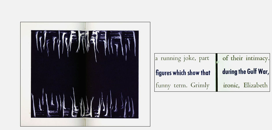
Bad News 28 cm; 41 pages. Letterpress printed from handset Centaur and Futura Medium Condensed. Images began as small clay structures which were photographed and printed from hand-processed polymer plates. Soft cover with printed wrapper. Design, image, and structure by Inge Bruggeman. Inge Bruggeman: "The design of the book, its structure, typography and the prints within it all work together to inflect a visual and tactile reading of the book. The prints evoke the mental landscape of the main character's psyche. The typography and page layout with its huge margins nestles the text (the main character's world) inside a more protected environment, farther away from reality of the edge of the page. Also the reader/viewer is forced to read across the fissure made by the exposed spine (coptic) sewing structure. This is meant to create a mild tension while reading.” Featured in the Type section of the New York Public Library's Ninety from the Nineties exhibit: "Inge Bruggeman used typography and colored ink to separate a story broadcast on the New York news radio station 1010 WINS from the text of the short story by Lynne Tillman."
|
Click image for more |
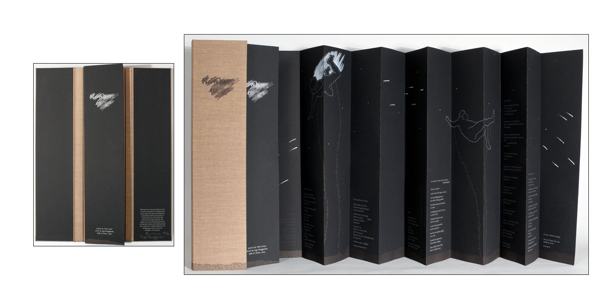
| Nowhere to Go By Alan Loney Portland, Oregon: Ink-A! Press, 2009. Edition of 30. 18.75 x 4.5 x 1"; 24 pages. Double-sided accordion structure. Letterpress printed from hand-set Joanna type on Hahnemühle German Etching paper. Imagery printed from hand-processed photopolymer plates. Includes hand-painting in gouache and circular punch cuts. Laid in cloth bound portfolio. Ink-A! Press: "This book features poems by Alan Loney – it is an attempt at capturing the beauty, brevity, and fragility of life through words, image, and structure. In this case it is a life lived through the book, the body, and the act of writing itself." Loney is the 2011 recipient of a Janet Frame Literary Trust Award for Poetry. Here is part of the award citation: "Poet, printer, and editor Alan Loney … is a New Zealander who has lived in Melbourne, Australia, in recent years, although retaining strong literary ties on both sides of the Tasman. Born in 1940, Loney's first book of poetry was published in 1971. He won a NZ Book Award for his 1976 collection dear Mondrian. US poet Robert Creeley said of the collection Sidetracks: Notebooks 1976-1991, that "Alan Loney's work has always been at the cutting edge of world literature. His mastery has become a resource for us all. "Alongside an influential career as printer, editor and publisher, Loney has an extensive bibliography of his own poetry and prose published in many countries. He has four titles forthcoming in 2011: Anne of the Iron Door (a novella from Black Pepper Press, Melbourne) as well as three new poetry volumes with Rubicon Press (Canada), Ninja Press (California) and Chax Press (Arizona). The Falling: A Memoir was released by Auckland University Press in 2001." (SOLD) |
|
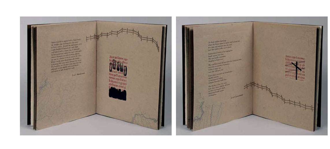
One of a Thousand Fires 13.5 x 10 x .75"; 10 pages. Soft cover book bound using Roma paper and sewn onto printed paper straps that are woven through the covers. The binding is a unique structure with the fold at the fore-edge and the book being sewn through folded tabs. The book slides easily in and out of a cloth covered slipcase. The text pages are letterpress printed using hand-set Goudy Old Style type on paper handmade by Bridget O'Malley of Cave Paper. The poems are encased by blind-scored boxes and surrounded by imagery that appears to flow around and behind the poems. The imagery is made from drawings and appropriated imagery from incunabula (early printed texts) and is printed from hand-processed photopolymer plates, as are the hand-drawn titles. Design, imagery, and structure by Inge Bruggeman. Inge Bruggeman: "This book is about a modern day Eve, long ago cast out of the Garden and trying to find faith in a contemporary everyday life." On the images: "I wanted to use the text as pattern, texture, and structure. It is also referential: all of this text comes from an incunabulum, early printed manuscript in the downtown [Portland, Oregon] rare book room's collection. In appropriating this text I am attempting to reference the history of the book as art and cultural icon. Because the character Eve comes from the bible, the book that is THE word, the most important historical text to many and an important literary work to others, I decided to try to link up this use of text as image and use it as a binder to the past. Looking at one page spread example, 'Eve's Flight' - that image is a photograph of one of the pages in this manuscript, I overlapped two pieces of film and twisted them slightly to blur the image - in the poem, Eve is looking out of the window of a plane at night down at the lit streets - so the structure of the printed page begins to look like the structure of the city streets at night. "I think also in taking this text that is perhaps the word of God and rendering it illegible, it may show how people are able to interpret it differently, or how those words get used out of context and change meaning over time, but that is something that is not so obvious. "I could note also that the binding is one that I don't think anyone else has done before. The binding is supposed to feel good in the hands and kind of manuscript like in its soft bound state. It is sewn on printed paper straps with the same text to make a reference to a connection to the history of a book, or its past, like when you find an old book coming apart at the spine and you find that it's spine was made from previously printed book pages. The book is printed in folios, each folio is sewn through a tab then glued closed and you can see this by peaking into the insides - the binding is meant to be very transparent." |
|
The Quickest Forever 6.75 x 10"; 38 pages. Letterpress printed from handset type and photopolymer plate on both Zerkall paper and handmade paper from Cave Paper. Handsewn binding. In cloth bag with illustration on front side and title printed on flap. Signed and numbered by the artist. Inge Bruggeman: "This project was initially inspired by the life and work of Orra White Hitchcock (1796-1863), one of America’s earliest women botanical and scientific illustrators and artists. The book became a meditation on the passage of time, both geologic time and individual time. It also draws a connection to the book as a kind of geological artifact in itself. It is an object that represents the passage of time through the turning of pages, and within it our stories and narratives have accumulated over the centuries. The short narrative in the book is printed from hand-set metal type and designed to be read as image captions over a series of pages, and through gaps in time that the material and space of the book provide. The smooth white sheets are interspersed with textured landscapes suggesting a trajectory through the book as well as a journey over space and time. The simple poetic narrative is broken up with stenciled text imagery representing the accumulation of verbal deposits and the somewhat fallible nature of words to truly capture our experiences. Black thread also plays a prominent place in the visual narrative of the book. Thread is knotted, braided, and looped to create imagery that might reflect something done to calculate, control, or otherwise capture the passage of time. This imagery was inspired by the quipu, or knotted recording devices, developed during the Inca Empire." Inge Bruggeman, interview University of Utah: "Similar to how some poets build their poems on references to others’ writing, I enjoy having a conversation with other moments or people in history with my artist book projects…. The Quickest Forever was inspired by Orra White Hitchcock’s incredible illustrations on linen for use in her husband’s (Professor Edward Hitchcock’s) classes on geology and natural history. These illustrations were made in the early-mid 1800’s, and she was one of America’s earliest woman artist to produce botanical and scientific illustrations. "At first I was simply struck by the illustrations of geological strata, their design and use of color and how that translated onto linen. They were meant to be purely utilitarian, however they emanate much more. I started to think about their metaphorical qualities and about the relationship between her and her husband, between her era and my era, about time, about communication (both graphic and textual) and her inspiration has taken me on a journey of my own. This book project is about the book as a time based, physical media – the book encapsulates and tells our histories and narratives. Like the land itself, the book is evidence of time passing. This project hopefully makes the reader/viewer aware of the book as a kind of strata and accumulation of its own, of pages, of language, of ideas; it can make a person very aware of time as each page is turned and particularly when we get to the end, the final closure." |
|
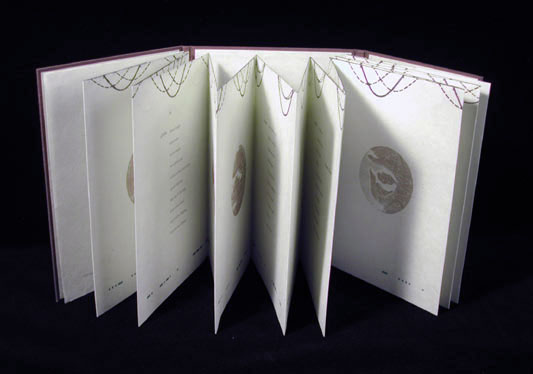
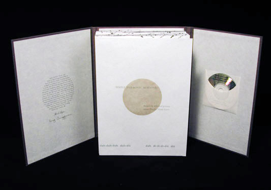
Simple Harmonic Motions 7.75 x 10.25", 32 pages. Letterpress printed on Kitakata paper. Typeface for poems: Spectrum. Morse code font created by Bill Morrison. Text and image are printed from hand-processed photopolymer plates. Inks are muted browns and greys. Book laid-in case which includes compact disc of the author reading the poems and performing them with The Alabama Poetry Ensemble. Design, image, and structure by Inge Bruggeman. Signed by Bruggeman and Lazer. Based on selected poems by Hank Lazer from his larger body of work Days. These verbal sound excursions rely more on beat than image, jazz exploration than narrative construction. The binding structure of the book is a cross between French-fold and accordion, printed on both sides, so the book circles back on itself. One side features each selected ten-line poem with a Morse Coded message spanning the bottom of the linked spreads. The opposite side copies the poems in reverse order, but the words are scratched to obscurity, clearly words but unreadable, a visual expression that evokes the sound of scratching itself, suggests a high-pitched screech. Across the bottom is a sound play: "dah-dit-dah-dit di-dah dah-di-dit" etc. Sound waves are printed along and straddle the folded tops of the pages. Halftone images of mouths—some more photonegative reproduction than photo positive—are layered with a variety of graphed measurements in a printed circle. Includes a miniature compact disc (the same size as the circular images) of the author reading and performing the poems with the Alabama Poetry Ensemble. |
Click image to enlarge |

Page last update: 02.22.2020
Home | About Us | Contact Us | New Arrivals | Fine Press & Artists' Books | Broadsides |Resource Books | Order/Inquiry
Copyright © 2019 Vamp & Tramp, Booksellers, LLC. All rights reserved.