
|
Romano Hänni ~ Switzerland |
Share this page: |
Minnesota Center for the Book: "Educated at the Basel School of Design, [Romano] Hänni returns to the core values of traditional printing technique and modernist European design. The strict limitations of hand typesetting are his cornerstone, everything composed from the incremental units of type and spacing available in the type shop. Hänni's work encompasses a wide range of fields in visual communication, from books, magazines, catalogs and newspapers to drawings, photography and journalism about design and everyday culture." “It is Bitter to leave your home” has been included in the Artist’s Book Unshelved series produced by BIMA. This session is “Images of All Sorts” |
|
Publications that document the work of Romano Hänni. |
|
Gebäudetechnikpanorama Standard: 8 x 11.75" chipboard slipcase containing Tausend und eine Aufgabe; Das Auftragsbuch [The Order Book]; and "Pictorial Supplement with Translation in American English." Title label on spine. Concept, design, text, hand composing, printing, and binding by Willi Haldemann and Romano Hänni. Tausend Und eine Aufgabe: 7.5 x 11.5", 14 pages; letterpress printed on hand proofing press in six colors. Das Auftragsbuch: 7.5 x 11.5", 32 pages; digital printing, saddle stitch binding. Special volume (sold/out of print): 19.4 x 2.3 cm; 14 pages. Letterpress printed in red, green, orange, blue, violet, and black inks. Volume made from proofs and superimpositions. Each page and each cover unique. Willi Haldemann, "Pictorial Supplement …": "This order book documents my independent work as an engineer for building engineering since 1984. I am very pleased to have this opportunity to present the 1000 tasks, which Haldemann Basel handled successfully until 2012, in the form of this book. This book was hand composed and printed in six colors on a hand proofing press. "Ordering parties can find their specific order using the enclosed booklet. The order number, project with site, building type, ordering party, project completion, and executed project phases are listed in annual tables. You can find supplementary information and pictures about the production process of this book starting from page 27 of the booklet. "This order book (The 1001 Tasks) was produced as a leporello. As a result, the information chart extending over several pages with the 1001 tasks can be viewed in different ways. On one hand, you can leaf through the pages as in a conventional book (the individual tasks with the color areas composed of individual brass pieces and the topic areas with the color symbols composed of lines are in the foreground), and on the other hand the content pages (after removal of the dust jacket) can be folded out as a single strip of paper. "Experience the 1000 individual rectangles with printed symbols as a colorful building engineering panorama." Haldemann Basel is an engineering company for building engineering providing objective consulting services. |
|
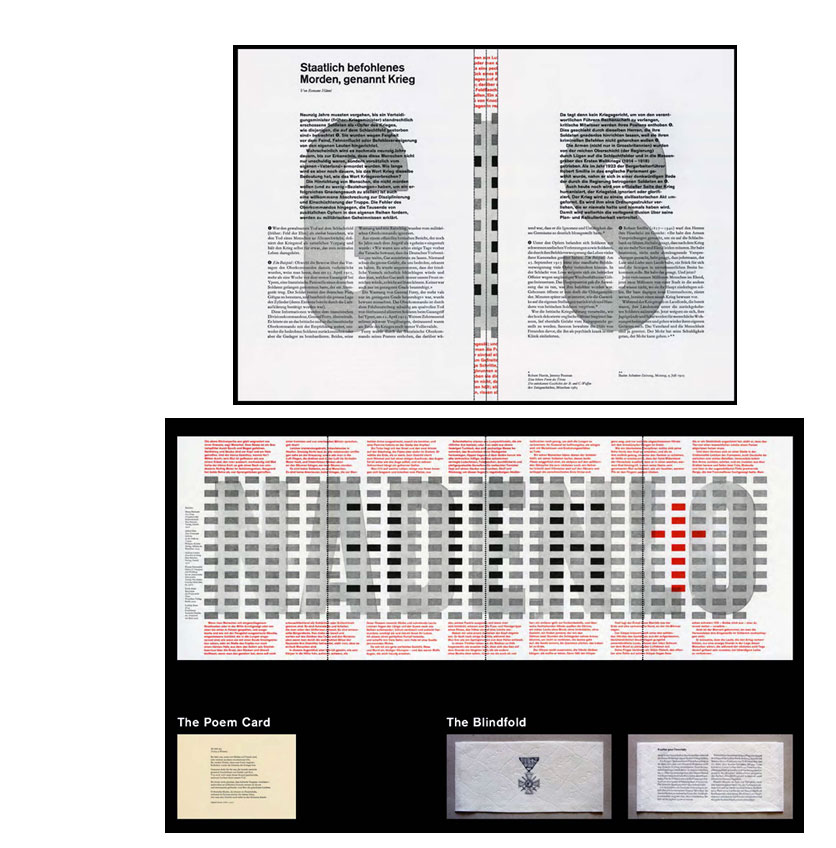
Gnadenlos hinrichten. Freundlich begnadigen. 8.25 x 11.75"; 8 page altar-fold plus poem card, banderole, and pictorial supplement with translation in American English. Printed in two colors. The altar-fold, poem, and banderole are hand-composed and handprinted. Supplement ink jet printed. Housed in printed paper envelope. This description of Gnadenlos hinrichten appears in 2nd Part: Romano Hänni, Handprinted Books 1992 - 2010: "In August 2006, an article was published in a daily newspaper with the headline: Shot at Dawn, Pardoned 90 Years On. Three hundred and six British soldiers were court-martialed and shot during World War I by their comrades. The complete text from the German Press Agency is printed on the front of the altar-fold. "Merciless Execution. Friendly Pardon. is composed of three parts. The jacket around the altar-fold with a French Military Cross, the gate fold or altar-fold with eight pages, and a card with a poem. This letterpress work is dedicated to showing that war is cardinally a criminal act. "Number[s] 1 to 120 are part of a box named Colorless - Colored. Merciless - Friendly. The box was published during the 8th Book and Handprinting Fair in Frauenfeld/ Switzerland, in 2006. Enclosed with the letterpress work numbers 121 to 306 is an eight-page pictorial supplement translated into American "The two flaps of the altar fold with the capitals G and S from the word GNADENLOS (merciless). In the middle, the inner pages with parts of the red text can be seen Altar fold because the two flaps are opened like a priest opens the two wings of an altar. The text on the two flaps is a statement with footnotes that proves the incompetence of the High Command, their lies to the men in the trenches and the families at home. The statement is entitled 'State-ordered Murder, called War.' "On the right page, the enclosed card with the poem 'Glory of Women' by Siegfried Sassoon (1881 - 1967). "The banderole represents the blindfold of the executed men. The wood engraving of a French Military Cross, produced in Paris around 1915, is printed on French toilet paper, in order to show its true value. On the back of the banderole is a statement about four French soldiers who were court-martialed and shot on March 17, 1915. Humphrey Cobb was inspired by the story when he wrote his novel Paths of Glory, as was Stanley Kubrick when he made the film of the same name in 1957, starring Kirk Douglas." |
|
| Publications that document the work of Romano Hänni. | |
| 27 Jahre Bleisatz Handpressen büchlein 1984-2010 27 Years Hot Type Handprinted Books 1984-2010 |
|
| By Romano Hänni Basel, Switzerland: Romano Hänni Verlag, 2011. Edition of 60. 9.125 x 11.75"; 122 pages. Offset, inkjet and letterpress, six colours. German and English. Bound in paper covered bookboard. Back pastedown with corner pocket contain a supplement to the book, a special print of the newspaper Helvetische Typographia, October 1993. Text in German and English. An in-depth look across 27 years of the printer/artist's work. Introduction, Creating something of your own: "It contains handprinted works Romano Hänni created between 1984 and 2010. In addition, sketches, drafts and photos of the production process are shown, as well as projects realized in class. "The two parts of this book are offprints of articles published in the Swiss Typographic Magazine (STM). The first part, about the handprinted books from 1984 to 1991, was published in STM 2/1992. The second part, about the handprinted books from 1992 to 2010, was published in STM 3/4/2010. Already in 1994, a book on the handprinted books from 1984 to 1991 was produced. At the time, the imprint stated an edition of 300 numbered copies. However, because of financial reasons, only 200 were bound. A total of 300 were printed, so 100 remained unbound. From these, 60 copies (number 211 - 270) were used for this book." $220 |
|
| 2ter Teil: Romano Hänni, Handpressenbüchlein 1992-2010 2nd Part: Romano Hänni, Handprinted Books 1992 - 2010 |
|
| By Romano Hänni Basel, Switzerland: Romano Hänni Verlag, 2011. Edition of 180. 9.125 x 11.75"; 98 pages. Offset, inkjet, and letterpress. Seven colours. Bound in paper covered boards. End pastedown with corner pocket containing 13 x 8.5" folded sheet of typography examples. Text in German and English. An in-depth look at the second phase of the printer/artist's work. Originally Hänni produced a catalog of his work spanning 1984 to 1991. In 2011 he issued this catalog about his work from 1992 to 2010. Note: 27 Jahre Bleisatz Handpressen büchlein 1984-2010 contains both catalogs and spans Hänni's career to 2010. Lukas Hartmann, editor Swiss Typographic Magazine, introduction Marvels of visual poetry: "Anyone accusing Romano Hänni of being a hot type nostalgic has misunderstood most of his work - or has never held and read one of his handprinted books. These books are little marvels full of visual poetry. The technical effort behind them can only be divined by somebody who has pursued training in hot type printing. ... Hänni enjoys passing on his knowledge and skills, ensuring that centuries-old manual techniques are not only kept in museums." $140 hardback (editioned) |
|
Hänni with type and symbols creates beautifully letterpressed and expressive books proving that words can make the infinite finite. He has published a series of books with a variation on the theme of "Words make the infinite finite". Romano Hänni, Catalog: "Although language can be explanatory, only signs and symbols evoke notions. They are capable of simultaneously incorporating all levels of human existence. Reaching down to the unfathomable depths of the soul, signs and symbols grow their roots. Like a gentle breeze, language only touches the surface of understanding. Words make the infinite finite, signs and symbols carry off the spirit into the realms of the infinite world of being. They evoke notions, are signs of the unspeakable, and are equally inexhaustible. "Without signs or symbols, even the most modern of world views becomes impoverished. The division of soul and spirit has much to do with Gutenberg’s invention. For the sake of the modern, supposedly unnecessary yet reliable and irreplaceable things are often sacrificed. Access to signs and symbols could lead to peace of mind in which all unconscious is not anxiously blocked out and avoided but embraced as a way of expanding consciousness. In this manner, the spirit could find a way out of self-isolation, in which it is held captive by its unconditional worship of science and technology." Romano Hänni: "When I have started with the first volume I did not know that I will start this series. So when I saw the 7 semi circles on the book spine I thought maybe this can be the beginning of a series. It starts with volume 7 (2008), then number 6 (2015), and the new one is number 5 (2018). It counts backwards." |
|
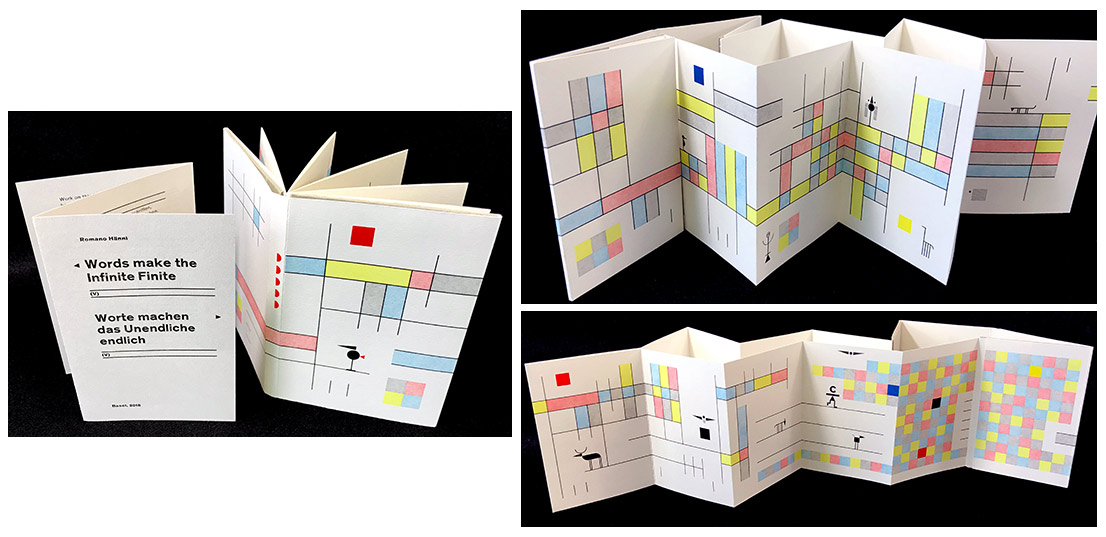
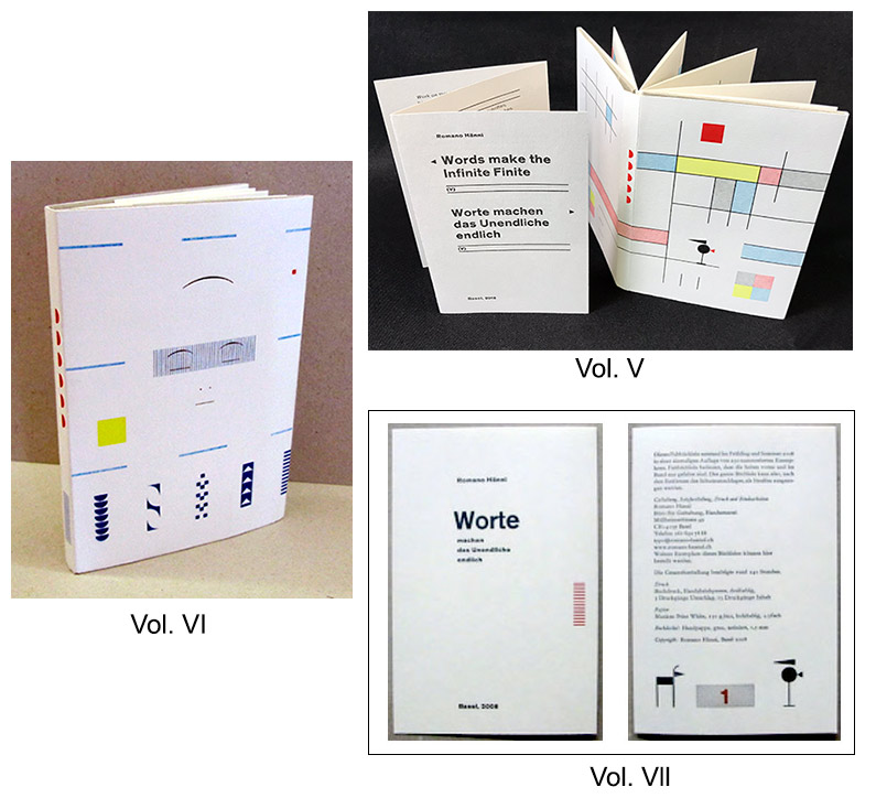
| Worte Machen das Unendlich enlich (VI) Words make the Infinite Finite (VI) By Romano Hänni Basel, Switzerland: Studio for Design, 2015. Standard Edition of 187 copies; Unikat Edition of 50 copies. 3.25 x 4.75"; 10 pages. Leporello structure. Hand composed and handprinted in four colors: black, red, blue, and yellow. Striped paper band closure. Numbered. Text in German and English. Romano Hänni, information booklet: "Work on this folding book (leporello), began in September 2014, was interrupted by commissioned work , and lasted until April 2015. Folding book means that the pages at the front and at the binding are only folded. After removing the book jacket the twelve pages of the content can be folded into one strip. A standard edition, 187 copies, and a special unikat edition, 50 books, was made. The unikat edition houses together with the standard edition in a slipcase. "Preparation of the printing form. Handcomposing with lead type, synthetic type, brass lines and geometrical signs. Every printing form is composed with single pieces. "Print: Letterpress, hand proofing press, four-color. "Unikat edition (50 books). Made from proofs and superimpositions from selected printing forms, numbered 1 to 50. Each page and each book is unique. "Standard edition (187 copies). Numbers 1 to 50 in slipcase together with the unikat edition. Numbers 51 to 187 as single books available only. Supplement: folded six page paper with title, imprint and book number. Number of printing runs for the bookjacket: 9 (books number 1 to 50), 10 (book number 51 to 187). Two printed sheets content pages: 24 printing forms, 25 printing runs. "Slipcase (50 pieces). Each slipcase contains one book of the unikat edition and one book of the standard edition. Supplement to each edition: folded six page paper (composed by hand, printed in letterpress) with title, imprint and book number, such as a twelve page booklet with pictures from the work process (the booklet was produced from digital data in inkjet print). "Book cover. Mill board, gr, satin, 100 percent recovered paper, 1.5 mm "Paper for bookjacket and content. Daunendruck (down print) Natural 1.5, 150 g/m2. Special mat and rought, natural white, woodfree." $ 130 Standard $ 420 Unikat |
|
| Romano Hänni Out of Print Title: | |
It is bitter to leave your home Each volume: 23.5 x 26.6 cm (9.25 x 10.8"); 64 pages. Text in German, English, and Japanese. Hand-composed and handprinted. Letterpress printed on paper towels. Materials used: lead characters, synthetics and wood, brass lines and geometrical signs. Printing forms composed from individual parts and printed on a hand proofing press. Japanese text cast and composed in the type foundry Sasaki Katsuji in Tokyo. Bound by hand with thread. In dust jacket. Numbered. Standard edition: Dust jacket letterpress printed with titles and images on exterior, reverse side with additional text. Includes manufacturing process booklet: 12 pages, digital printing. Slipcased. Numbered. Deluxe edition (out of print): Includes standard volume, booklet and unikat volume. Unikat: composed from proofs and superimpositions. Each volume of unikat unique. Slipcased. Numbered. The book concerns the disaster at Japan's Fukushima Daiichi nuclear power plant that occurred on March 11, 2011, and the ongoing impact of radioactive contamination. Text excerpts:
(SOLD/Out of Print) |
|
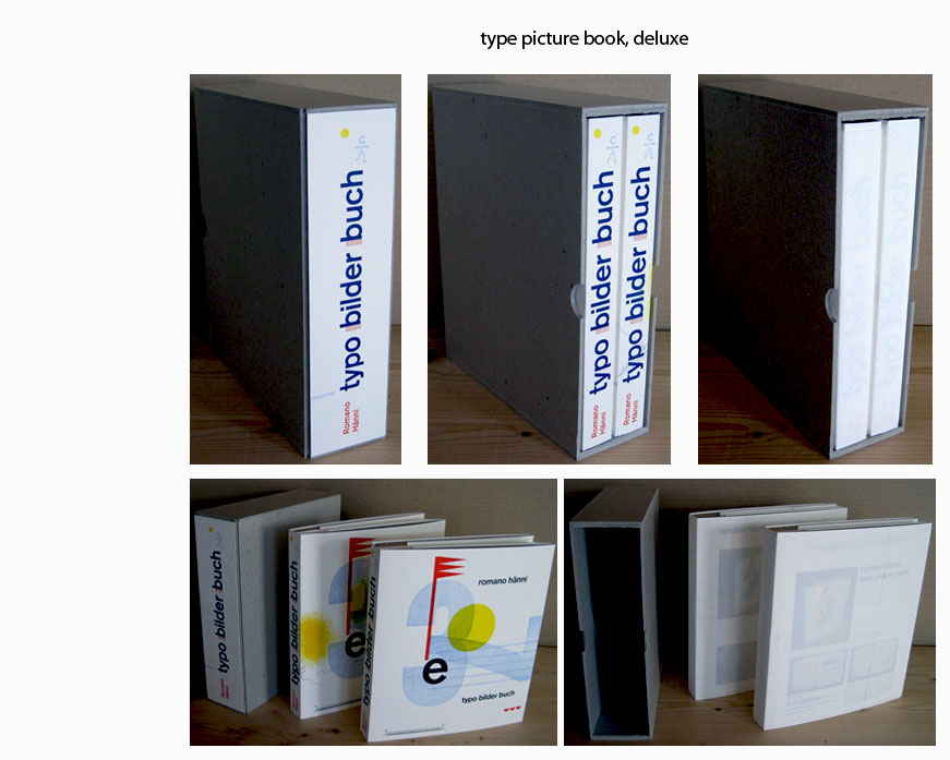
typo bilder buch Deluxe Edition: two volumes in a cardboard slipcase, one of the edition of 65, numbered 1-7 and one of the unique books with a corresponding number (e.g., 1/65 and 1/7, 2/65 and 2/7). |
|
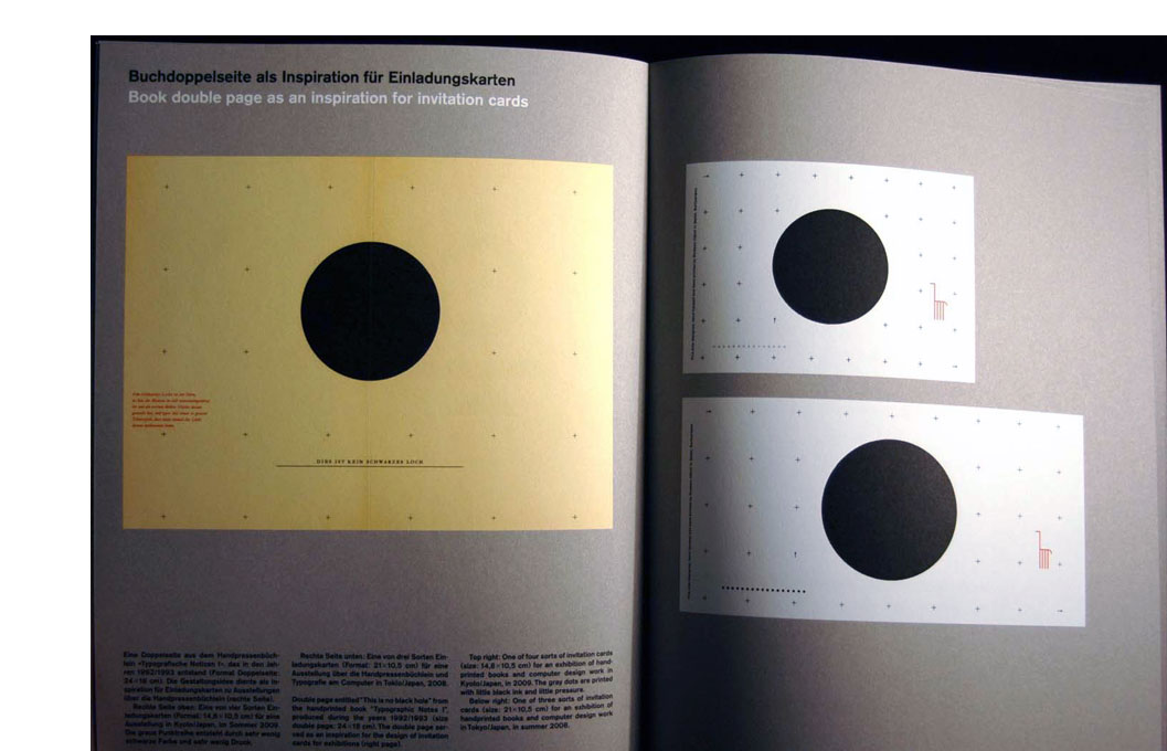
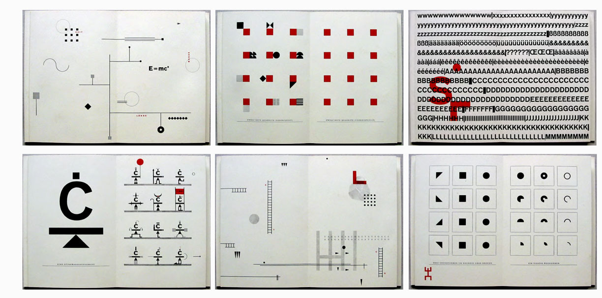
| Typografische Notizen I Typographic Notes I By Romano Hänni Basel, Switzerland: Studio for Design, 1992/1993. Edition of 175. 12 x 18 cm (4.875 x 7.125"); 28 pages. Accordion fold structure. Hand composed and handprinted in two colors, black and red. Printed on SK6 postcard paper. Bound in Mill board. Striped paper band closure. Text in German and supplemental pictorial booklet translation in English. Romano Hänni, Catalog: "The proportions of this handprinted book are 2:3, and the height and the width of the paper are divided into a grid of twelve parts. The intention was to prepare and present action, vision, thought, and reading via manual typesetting and printing on a hand press. The design considers what is available in the type shop: letters, typographic signs, brass lines and wood engravings that were manufactured in Paris around the year 1915. Each double page is an illustration of a visual, social, mathematical, or scientific theme. "After removing the dust jacket, you can fold the pages out as one strip with a length of 336 centimeters. The strip is composed of four printing sheets." (SOLD) |
|
| Typografische Notizen II Typographic Notes II By Romano Hänni Switzerland: Studio for Design, 2009/2010. Edition of 175. 5 x 7.25"; 28 pages. Accordion fold structure. Hand composed and handprinted in four colors (black, red, blue and gold). Printed on Munken Print Cream. Bound in Mill board. Striped paper band closure. Text in German and supplemental pictorial booklet translation in English. Numbered. Romano Hänni, Catalog: "Seventeen years after creating the first part, the second part of 'Typographic Notes' was produced in the years 2009/2010. Its content deals with topics such as justice, perception, reality, and mentatlities. "As a preamble, a part of Utopia written by Thomas More in the year 1516 is printed. In the text, the ruthless scheming of the rich is revealed. Today’s manager capitalism is the result of this ruthless scheming, an economy of self-enrichment. "The global exploitation of the people is carried out by private transcontinental companies of the industry, service, trade, and banking sectors. Profit is their religion, world domination their goal." (SOLD) |
|
Worte machen das Unendlich enlich (V) / Version V: 3.25 x 4.75"; 10 pages. Accordion structure after removing the book jacket. Letterpress printed with hand proofing press in four colors. Handcomposing with lead type, brass lines, and geometrical signs. Paper band closure. Cover printed with 10 printing forms in 12 printing runs. Interior printed in 19 printing forms with 22 printing runs. Bound in grey satin mill board of 100 percent recovered paper. Text paper and cover papers Daunsndruck Natural 1.5,150 g/m2 special mat and rough, natural white, woodfree. Includes 6 page supplement containing colophon information. Numbered. |
 Click image for more |
| Worte machen das Unendlich enlich (VII) Words make the infinite finite (VII) By Romano Hänni Switzerland: Studio for Design, 2008. Edition of 290. 3.25 x 4.75"; 10 pages. Accordion structure. Hand composed and handprinted in three colors: black, red and blue. Striped paper band closure. Numbered and printed on the supplement in red ink with the title and imprint. (SOLD) |
 Click image for more |
Worte machen das Unendlich enlich Three volumes: 3.25 x 4.75"; 10 pages each. Leporello structure. Hand composed and handprinted. Numbered. Text in German and English. A set of the first three volumes in the "Words make the infinite finite" series. |
 Click image for more |


Page update: 04.14.2024
Home | About Us | Contact Us | New Arrivals | Fine Press & Artists' Books | Broadsides |Resource Books | Order/Inquiry
Copyright © 2021 Vamp & Tramp, Booksellers, LLC. All rights reserved.